Google is constantly updating the Play Store. The look, function and it’s appreciated for the most part when you look at how far Google Play has come since it launched as the Android Market back in 2008. In the latest update, there’s not much new functionality, but it certainly looks a bit prettier as shown off by designer Kirill Grouchnikov on Google+.
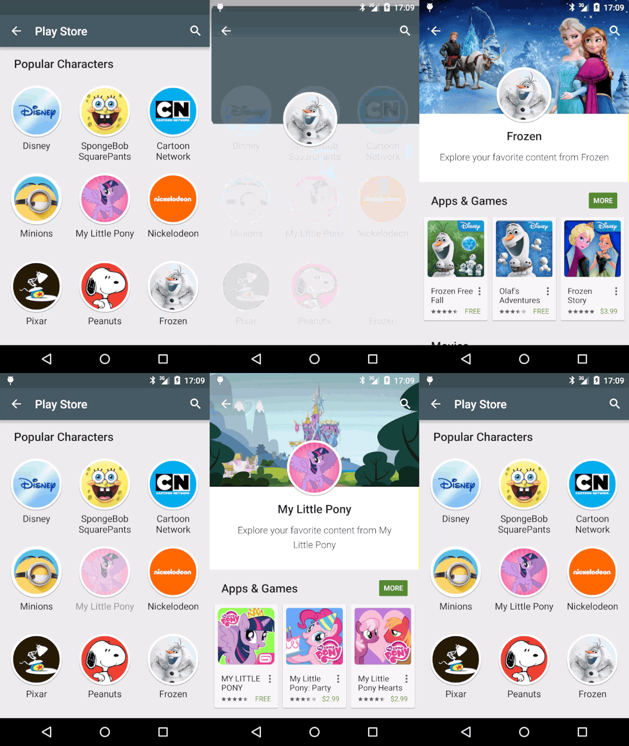
The first update shows a new animation on the Characters page which Google introduced in their ‘Families’ section. The new animation slides the character icon up to the middle of the screen on opening the sub-section with the corresponding apps, games, videos, books and music associated with that character.

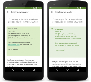
A secondary, and more a refinement than improvement is a change to the ‘What’s New’ section. The change is simply a change of colour of text from black to green, as well the background colour of the box surrounding the text has been changed to a lighter green, there’s also an added icon next to the ‘What’s New’ title.
The new Play Store version will roll out slowly, but if you really can’t wait to get your hands on the new animation and What’s New layout, you can always grab it early.


