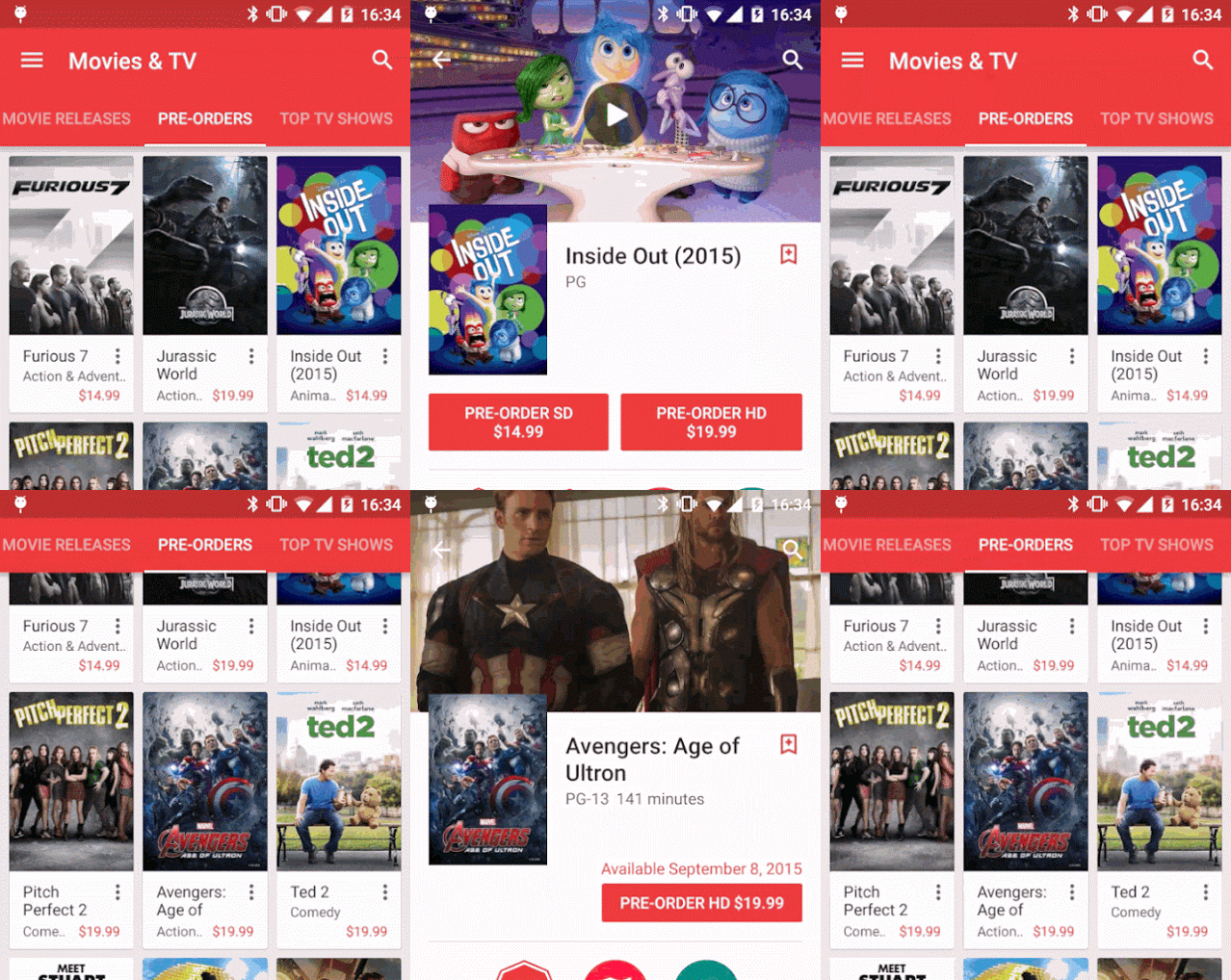
We all love Google Play, but the design is often tweaked to not only keep it fresh, but to make it as easy as possible to navigate through the store with a natural ease. Google Android Interface Engineer Kirill Grouchnikov has shown off the latest design change to Google Play, which will roll out in the latest update.
Kirill has shown off the animation in a high-resolution video, which shows the transition from Hamburger (or Hotdog) menu icon to a back arrow and back again.
He further went on to demonstrate that in ‘cases where the drawer icon is not showing in the source (as the toolbar is scrolled away), the back arrow fades in instead’.

The update to Google Play should be arriving soon on your handset, so keep an eye out for that lovely new animation – and let us know if you spot any other changes.


