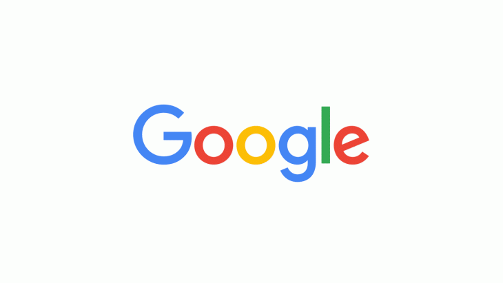
With the move to their own company under the parent Alphabet, Google has today announced a new logo to go with the transition, showcasing evolution as befits the companies journey over the last 17 years.
The new look logo will be rolled out across all the companies products soon, replacing some of the well known icons like the blue mic icon will now become a four-coloured G.
Today we’re introducing a new logo and identity family that reflects this reality and shows you when the Google magic is working for you, even on the tiniest screens. As you’ll see, we’ve taken the Google logo and branding, which were originally built for a single desktop browser page, and updated them for a world of seamless computing across an endless number of devices and different kinds of inputs (such as tap, type and talk).
How long this logo will stay around for is anyone’s guess, Google is an ever changing and evolving company, which is where their flair for innovation and addressing new problems and markets comes from. You can watch the evolution of the Google logo in this video:


New google maps logo to go with it in the latest update too.
Shaded with a slight serif and hint of drop shadow was best.
This looks like it might be on a toy for 4 year olds. And that G is just plain wrong.
I don’t really like it. Too cartoon like. It’s probably better than the dated old one though!
I like it. Old one was too busy with serif font.
Fancy, I’d have said ugly. Can’t stand this new look!
– text too bold
– overly colourful and cartoony
Geez I hope this is a very short new style for Google
The evolution of the logo is actually at the beginning of the video (it’s embedded to start at 32s)