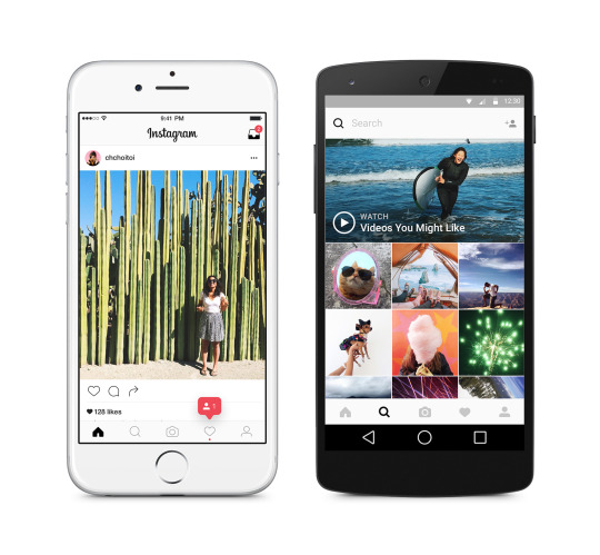
Instagram is rolling out a re-design to their mobile apps, including an update to the iconic app icon.
The new look is a conglomeration of the rainbow colours from the original, laid out in a gradient. The new look also extends to their other apps including Boomerang and Layout (and Hyperlapse on iOS).

The new look is a more staid design, eschewing the familiar blue and white icons and going to a more basic, monochramatic design with a lot more white. Instagram says that the new design is to ‘more focus on your photos and videos’ but won’t change the way you navigate the app.

Instagram is rolling out the update from today, so keep an eye out for an update notification in Google Play when it’s ready to rock.
Source: Instagram.


I see no difference to the app at all, it’s still the stock blue at the top of the screen… Am I missing something?
The update hasn’t hit your phone yet. It’ll come 🙂
“going to a more basic, monochramatic design”
Someone needs to double check the word monochromatic before hitting publish. I definitely see more than one colour 😉
I actually don’t mind the change. Needed it to be honest.