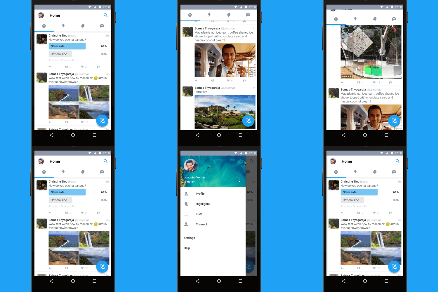
Twitter for Android is getting a very modern makeover starting from today. Twitter has announced that their mobile app is going to start looking more modern and in line with Material Design.
The latest update includes swipeable columns at the top which is a big improvement and as with any Material Design update a floating action button (FAB). Twitter has listed the highlights in the new update, which include:
- Tab bar at the top of the screen with swipe functionality so you can quickly move between your Home timeline, Notifications, Direct Messages, and more.
- Navigation menu that slides out from the side for access to your profile, Highlights, lists, the Connect tab, and settings.
- New floating action button so you can always easily send a Tweet.

The update looks a lot better than what has previously been used which was fast becoming a bit of a mess to be honest – seems having Joaquim Vergès from Falcon Pro onboard as an official Twitter dev is working!
Twitter has advised that the update will begin rolling out to users from today, but as with most updates of popular apps it will very likely be a progressive update so keep an eye on your Google Play update notifications.


Has this been in testing with the beta version because I’ve had this look for months. I’ve forgotten what apps I’m in beta with so just curious.
Pretty sure that it has been in testing a while Mark. It’s good to see it entering the general release app though!