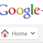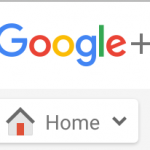
In September last year, in the wake of the Alphabet announcement Google updated their logo to a new, more up to date one. Also in late 2015, Google introduced a new Google+ interface, while I never adopted that new interface, it always bugged me that the Google+ Classic web view was still using the ‘old’ Google logo even nearly a year later. But, no more as it seems that Google is starting to update that logo.
The updated logo is showing up in Google+ Classic view on my Gmail account, but not on my Google Apps account, so whether there’s a pattern, rhyme or reason to it, I can’t tell – it’s also showing up on the Ausdroid account page as well.
The older one looks incredibly dated and, well not as high resolution, you can see it in the comparison of the old vs the new logos:
It’s not clear whether this is a very slow or staggered update and I`m being called a dinosaur for not adopting the new interface by my colleagues here, but darn it I like the old view. It’s a small change, but one I`m happy to see.


