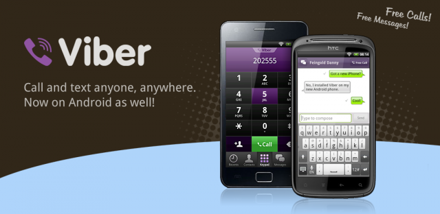
Viber is one of the most successful cross platform messaging clients, offering a free messaging option to all your friends regardless of their chosen platform and currently the Android and iOS apps are currently getting a new coat of paint along with a bunch of performance improvements.

Regular users will immediately notice the new colour scheme, sticking with the previously used purple colouring but moving to a pale colour from the previous version. But you’ll soon also notice the improved performance and stability you get from the update.
As a heavy user of Viber I’m happy to see they’re continuing to work hard at improving the user experience.
What would you like to see from your messaging app of choice to improve its functionality?


I stopped using Viber because of all the spam rubbish and constant nagging about installing new stickers. Who the heck cares about new stickers?
Agree. I don’t mind the stickers being there and all, but the constant nagging of the “red dot” in the hamburger menu appearing every few days with new stickers etc… becomes annoying. I get they have to make money somehow, but shoving things in your face will turn users away to more cleaner and faster and nag free alternatives such as Whatsapp etc.. I use a fair few chat apps to communicate with family and friends overseas and Viber and BBM are by far the most intrusive apps. Whatsapp and Hangouts are completely are the cleanest from my own experience… Read more »