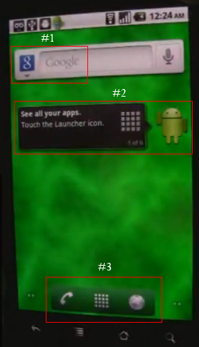
In a video on YouTube showing an Adobe employee giving a demo of Flash 10.1 running on a Nexus One (smoothly!), he then pops back to the Android homescreen which is not that found in any of the current versions of Android (See above).
Read after the break for a round up of what can be seen.

- An arrow that looks as if to give you an option of more search providers than Google. Possibly for Bing or Yahoo, or maybe incorporate Wikipedia search..etc..
- A user-guide for new users to get the most out of their new device if they’ve never used Android before or if Android 2.2 is quite different form previous versions
- The “App Drawer” icon now has company, a dailer & browser quick launch icon. Good idea!
What do you guys think? Let me know in the comments below.


the “company” for the drawer icon has already been implemented in hacks of eclair launcher- by anderweb (ADW launcher) and ruqqq (helix launcher) and theirs can have up to either 4 or 6 icons accompanying the drawer launcher.
I just want the JIT compiler for MOAR speed! can’t wait for Google I/O. hopefully it is all announced then
Still, it’s nice to see froyo in operation. Can’t wait to see what the guys at xda can do with it 😀 This is why i got a nexus one- cutting edge android development!