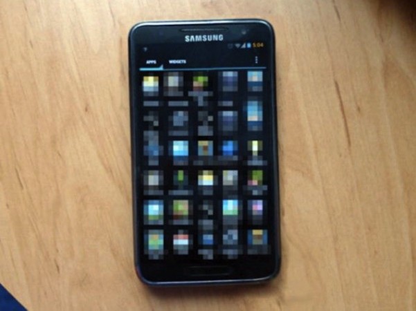
Add this one to the pile of surely-not-real Samsung Galaxy S III renders. This photo comes from a site by the name of Tech Snapr. If this is what Samsung is going to feed to the masses, they better have a bloody good marketing campaign, because it’s certainly not a looker — not that this photo does the device much justice anyway.
It does line up with rumours of a 5-column UI (yes, there was a rumour about the number of columns) though this could easily be a photoshopped version of a Samsung Galaxy Note. The home button is elongated, but if you look closely enough you it looks as though it’s been stretched with some software tool.
Samsung, if you’re reading this, stick with the original design that leaked. That thing has me signed up already.


Looks like an s2 4g running cm9 with custom launcher prob nova cos that’s not the touchwiz colours
I think you’re on the money; exterior is too small for a Note. CM9 on an S2 4G sounds fitting with those crazy colours.
I love how the time — of all things — is orange.
And I’m pretty sure Elvis is taking the photo…
Lol that is definitely a badly shopped note.
Yep, especially the bottom bit, you can see the discolouration where it was joined from another phone and it’s crooked as well.