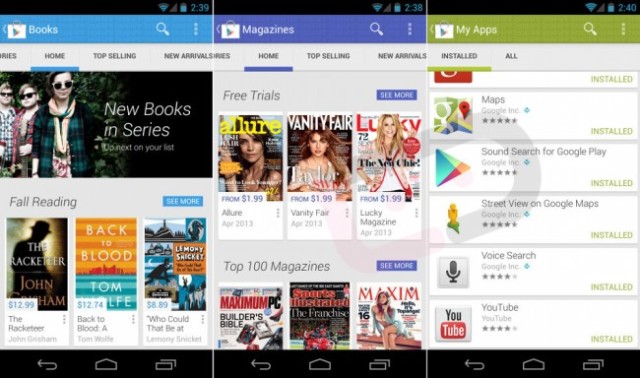
Looks like an update to Google Play could be on its way, at least according to some screenshots and a new video that have surfaced. While not all the links work there is certainly enough content there to see what the new store will look like.
The Holo style re-design is showing off a much lighter design which certainly looks a lot cleaner with some very Google Now stylings. The post on Droid-Life includes a heap more screenshots as well as a video review to walk you through.
While there is no APK to download to have a look at this yourself as yet. However, this being Android, the possibility of it showing up on XDA at some stage is pretty high. No telling if this latest Google Play upgrade will be released as a stand-alone update or part of an Android OS update. Perhaps we’ll see something about this released at Google IO.


Looks great. I hated that “Keep Shopping” window that popped up every time I installed an app.
YES! Google Play is probably the ugliest of the Google Apps. This is much better. I must have it now.
You know what would be a great redesign? GOOGLE MUSIC!
I love that they have gotten rid of the metro ‘hide things off the screen’ menu thing.