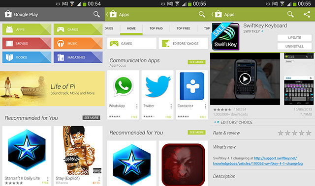
Google has done a little bit of a refresh of the Google Play Store, adding not much in terms of functionality, but there are a few UI tweaks that are welcomed. The content section buttons on the main screen have a new design that’s a little more fresh and less flat-design. The open/install/update/uninstall buttons are always tweaked which is a nice addition.
Although it can’t be seen, there’s likely some architectural changes under the hood in case of any new additions, should they be launched at Google I/O. *cough* Google Gaming *cough*. The new Play Store will be pushed out automagically, but if you’re in a hurry, it can be downloaded and installed here: Google Play Store APK.
Source: Android Police.


Nice to have a bit more colour on the first screen, but I don’t understand why the subpage doesn’t have the same style buttons, e.g. Apps -> Games, Editors choice, but uses the old style.
Bigger install buttons are nice too, but still a little small for my fat fingers.