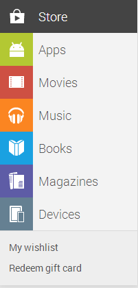
The Google Play store web interface has been updated a short time ago, the new interface is very familiar and in keeping with the ‘card theme’ that Google has been pushing with Google Now.
The new menu system on the left hand side mirrors the updated Play Store Android app which surfaced just prior to Google IO in May. The new design is quite refreshing and clean, the sections are a little more prominently displayed as are the ‘Wishlist’ and ‘Redeem gift card’ sections.

Users will notice that the card them has also brought about a small restructure in the front page display. Recommended items are a mix of books, apps, music and magazines suited to the purchases you’ve already made and the other lists as you scroll down the screen is much more comprehensive than ever before.
What do you think of the new UI? Is anything you want to see missing, or have Google nailed it? Let us know your thoughts in the comments below


Viewing reviews is stuffed up now: can’t filter by star rating, view for only current version, by date, etc. And what’s with word wrapping the text in the middle of a word!?!?
I agree that the my apps section is currently borked. Can’t tell what’s actually installed on your device or not.
However, ignoring that, the design and new layout is stunning. If this is along the lines of what Android 5.0 will look like, we’re in for a treat. Suddenly the blue/grey look of stock Android 4.0 looks boring and stale.
Yep, looks good!
I wish there was a way to delete apps from your Google account. I’ve got 10 pages of apps in My Settings, some going back almost 3 years, and many of them are things that I’ve tried, didn’t like, deleted from phone, but they won’t go away from my account!
Google would be doing their servers a favour if you could permanently delete apps.
You can remove the apps in the Play Store App on your device. My Apps > All Apps > Hit the X on each app you want to remove. It’s a bit painful if you have loads to delete, but it’s doable.
If you tap and hold you can then select multiple apps and delete them all at once.
Good tip!
I’ve been doing that, and you are right, it is a pain!
That removes the app from Google Play when accessed via your phone, but in the Play Web Store from your computer, they are still there in the “My Orders” pages.
Go figure! I have 173 apps according to Play Store (phone), but over 300 apps according to Play Store (web/computer)). I know that Play Store web/computer also takes into account music and books, but the discrepancy is there.
Not just being able to remove apps, but also devices.
It’s LONG overdue that we should be able to remove dumped devices and apps from our lists.
Yes, what’s up with that? Some sort of crazy is happening there, but overall I do like the look of the new Store.
Literally 10 minutes before this update went live, I went onto the play store and told my phone and tablet to update specific apps that had available updates, after first perusing the “what’s new” and “permissions”. I was able to do this on a per device basis. Now, I can only see what apps I have installed at some point on some device with my account on it. With no differentiation for which device it’s on. I once had the ADW launcher installed on a device, probably 2 or more years ago on a device I no longer have and… Read more »
You’re absolutely right. I love the card look, but this functionality is broken. Broken hard. Clicking on the ‘My Apps’ section just gives me a list of everything that I’ve ever installed, ever! Not helpful. Of the 15 applications shown on the first screen, I have none currently installed on any of my devices.
Thanks, Google. This is why we can’t have nice things.
I’d love to know who was smoking what, when they came up with this defective redesign.
In the My Apps section, there is no longer any indication as to which Android devices you have, No way to select which Android device you are working on, nor any way to see what you have installed on which device.
Fail, F-, 0/10, for Play Apps.