It appears that Italian site Tutto Android has gotten themselves quite the source on the Nexus 5 and Kit Kat, with more information being published which reveals more about the look and feel of Android 4.4 as well as some accounts on the look and feel of the hardware on the Nexus 5.
To start with a picture of the front of the device reveals the rounded speaker at the top of the phone, with the design being similar to those pictures that have already been leaked although a little more squared. The device is said to be ‘much lighter in weight’ than the Nexus 4 as well.

There are many descriptions of the hardware, including the boot animation which is described as basically that of the Google Play Edition Samsung Galaxy S4 and HTC One, which we saw in the video taken of the Nexus 5 left charging in a bar.
The tipster described the display on the Nexus 5 as ‘really bright, vivid colors’. The tipster describes the sound quality, which comes from dual speaker grills at the bottom of the phone as :
The audio quality is good, the volume is more or less like that of the Nexus 4, maybe slightly higher. The dual speaker seems to give a good feeling, not like HTC One but something similar.
Performance wise, the Nexus 5 is described as much faster than the Nexus 4, which you’d expect with a Snapdragon 800 SoC with 2GB RAM. The other good news is that the rumoured OIS that was also found in the leaked Service manual seems to be present and functioning quite well :
There seems to be an image stabilization system, which helps a lot when we hand shaking during shooting. I do not know if it is an optical image stabilization (OIS in this case) or digital. The fact is that it works very well. The quality should not differ from that of the Nexus 4 so blatantly.
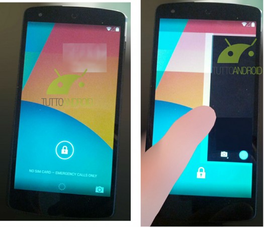
In terms of software there are many things that can be discerned by the pictures as well as the descriptions given of the device. Starting off with the Lockscreen which shows the addition of a camera icon at the bottom right of the screen, according to the leak, the camera can still be opened by swiping from the right but the additional visual indicator that the icon gives could prompt users to access the camera this way as well.

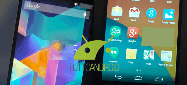
Also notable in the lockscreen image and indeed all the other images, is the white coloured icons for battery, cellular signal strength and Wi-Fi, as well as the transparent notification tray.
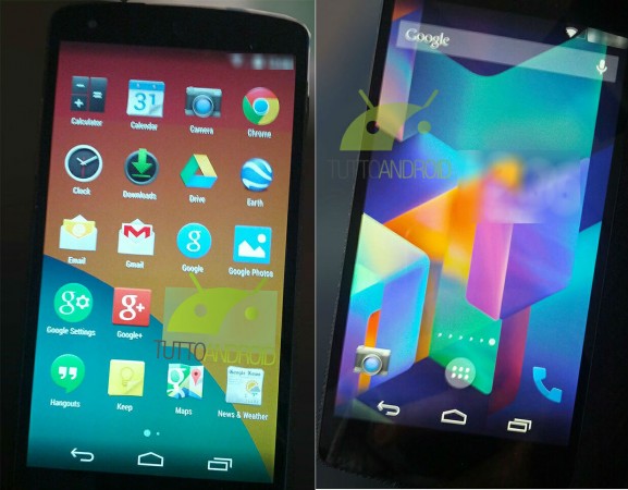
The App tray has also seen an overhaul with the black background replaced by a transparent view of the home screen, gone too is the widget tab, which will apparently revert back to being accessed by a long press on the homescreen, a reversion to pre-Ice Cream Sandwich usage. The grid of Apps has been changed from 5×5 on Jelly Bean, to a 5×4 grid in Android 4.4.

The homescreens are shown with 6 screens, however it’s not known if this is the default or if it was changed by the tipster but apparently the number of homescreens can be adjusted by the end user. The divider line between the Quick Launch bar and the home screen has been removed and the App Tray Icon now appears as a semi-transparent filled in circle.
When the Moto X was launched it was speculated that Google was using the launch of the handset to trial the always-on listening feature for use in the upcoming Nexus 5/Android 4.4 and it appears that this was indeed the case, with the tipster advising that simply saying ‘Ok Google’ activates the search function from the homescreen. The familiar swipe up to access Google Now still works and a new swipe gesture has also been added – ‘swype to left starting with the last homescreen left’.
Last but not least, the rumoured SMS integration is apparently present in the Hangouts App, but the tipster was not able to try the function out, whether this was due to a lack of SIM card in the device – as seen from the ‘No SIM card’ message in the lock screen screenshot – or some other reason is not known.
It’s a pretty comprehensive leak, maybe this will be the second year in a row that the upcoming Nexus phone is reviewed almost in full before the actual announcement. We’ll certainly be keeping an eye on Tutto Android for any further leaks.


Also doesn’t display a messenger app, once more pointing towards Hangouts as default. I’d be interested to know what apps are hidden under that watermark
Could this be the first vanilla release of Android that gets me to go Google? Very interesting.
It’s taking all my willpower not to allow myself to buy a Nexus 5 when it’s released, my wallet can’t handle a new Nexus purchase every year! I’ll be waiting for whatever the Nexus 6 turns out to be, I really don’t mind LG as a manufacturer, but I’m hoping that the Nexus 6 is manufactured by someone else (for a bit of variety)… a Sony Nexus 6 would be awesome!
Am looking at this after viewing pictures of the Galaxy Note 3’s UI. Will Samsung ever move away from that old, tired look? Never mind, there’s a Nexus coming very soon with an interface design that’s lovely and fresh. I’m looking forward to it!
The on screen buttons have a semi transparent background. Not bad. 🙂
Can’t wait and pls release on Galaxy Nexus! 😀
So much suspense. Unbelievable. Absolutely cannot wait for this phone and, in particular, Android 4.4.
Me want me want.. please..