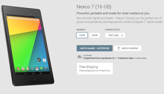
Google have quietly updated the design of the ‘Devices’ section of the Play Store, making it cleaner and easier to navigate when selecting the variations of a device. So far it has only rolled out to the Nexus 7, though it’s certain to hit all future devices as well — where’s that new Nexus everyone is talking about?
The new design allows you to choose which storage variations as well as connectivity options if they’re available. If you choose a 32GB model with LTE, but then swap back to a 16GB model, you’ll be notified that LTE isn’t available on that device should you wish to continue. Just a nice clean, easy to use interface.
Source: Play Store (Nexus 7).
Via: Android Police.


I have also noticed since yesterday that when I go into the play store I used to hit the Menu button on my Note-II and would see the option at the top called “my apps” I used to press that and look for updates.
It is now gone, and the only way I can get to it now is to swipe right which gives a side menu which has the “my apps” option there.
There are a couple little minor changes I have noticed too.