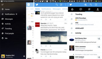
If you’re a Twitter beta tester, you may have been disappointed this morning when you went to load up the app, as the company has decided to scrap the newly announced app redesign. In its place, Twitter have decided to construct a hybrid version, mixing the best of the newly announced app and what is currently available to users.

While it might be a surprise to beta users, it isn’t really a surprise to others, having recently scrapped the new design it previewed and launched to intrepid early adopters in September and brought its older look back.
Beta users are reportedly seeing that the familiar menu buttons are back in their place at the top of the app screen, replacing the sidebar menu option that allowed testers to swipe their way from one screen to another. Beta users are also reporting that they are seeing an entirely different Discover section within the hybrid app version, that features a basic list view and a detailed view that shows sample tweets. Also, the pop up prompt that comes up when sending a tweet comes up with “Are you in [city, state]?” below “What’s happening?” according to a report on TechCrunch.
While it appears that Twitter has taken parts from the existing or current version of the app along with what it was proposing under the re-designed app, users are still venting their frustration along with feedback about the app to TechCrunch. Although there is no official word from the company for the reason why they scrapped the redesigned app and the replacement hybrid version, we shall wait and see what the company states.
Are you one of the Twitter Alpha / Beta team members? Are you using the hybrid version? What do you like or dislike about the new hybrid app? We would love to hear your feedback and thoughts in the comments section below.


Pffft, Tweet Lanes FTW