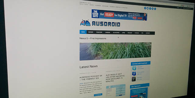
This morning, Ausdroid has taken the wraps off a project it has been working on for a little while. Our goal has been to make Ausdroid faster, more responsive and easier to read on the run (whether via our recently released mobile app, or via a web browser). So, without further delay, please put your hands together for Ausdroid 4.0.
Key elements of this new design include:
- Clean, white interface with fewer graphic elements — this means faster load time.
- Responsive layout — looks great on mobiles, tablets and desktops without clumsy mobile themes.
- Ease of maintenance, meaning less time with things not working properly.
There’s a few places that show off some of the special features of the theme, so amongst everything else, make sure you check out:
Most importantly, though, we want your feedback on this new look. Please tell us what looks great, what doesn’t, and any suggestions you have which would make Ausdroid easier to read and enjoy for all.


Oh – and would it be hard to add a search box at the top somewhere?
I like the new look on my mobile (LG G2). Agree with others’ comments that 2 columns don’t look good on PC.
Hi Team, Thanks for your continued efforts on bringing visual improvements and great Android content. Just love it. The new look is quite clean on both the PC and phone and I am adjusting to the new look favourably. However some points of note/suggestions for improvement: PC 1. The lines separating articles need to be bolder i.e. try scrolling quickly down page and you will see what I mean. The current color palette and line are good. It would be improved in my opinion if it were thicker. 2. Please consider daily sales updates as an article per the mobile… Read more »
Not good on firefox 25.0.1
Don’t mean to jump on the band wagon, but I MUCH prefer Ausdroid with a single column. Thanks for listening!
I agree that the 2 columns just doesn’t work, at all. Very messy and not easy to glance at. Another issue is that big waste of space up the top, just for the date. It puts a gap of around 100px (at a guess) from the top of the page, to the top of the ad. It’s the first thing I noticed. The banner ad location is awful too (I know it’s a prime spot). It ruins the look of the front page. The first article headline doesn’t even start until literally halfway down my page (2048×1152 res). The sub… Read more »
Hey David, thanks for the feedback. I agree — the top navigation really is superfluous, and for now, it’s gone. We’ve also changed the CSS around the header ad, so those who want to use AdBlock won’t see a waste of space. Ordinarily, I’d rather annoy adblock users, because frankly, they’re costing us revenue which we need to survive, but hey, let’s try the honesty system, so now when adblock is run, the whitespace will disappear. With changes to this layout, the first article header is just on a quarter of the way into the page on your display layout..… Read more »
You’ve obviously changed it since this morning – but it’s still a fat girl in a small dress. Honestly, have far too far too much wasted space. Currently the front page is a 218px x 350px image scaled to 862px x 1383px. looking like sh*t and taking up basically every bit of space. I’m sure someone told you you needed to make things bigger for mobile users, but frankly I didn’t buy FullHD screens so you can fill them with f*ck all. You have ONE story, on 4.4 rollout to Nexus devices taking up the ENTIRE window. In terms of… Read more »
Well, I have to say, if it’s by chance or you are actually listening, you are reacting to what’s put forward. Therefore, I say, it you are using Masonry, there is nothing that says things have to be laid out as either simple two columns, or simple single rows. Masonry gives you quite a bit of flexibility. Couple some “how important is this story” (part input, part comment number) with the flexibility it has, and you can end up with some interesting stuff. You can break that damn rectilinear grid for a start. I’ll give one hint – there’s content… Read more »
Hmmm….I replied agian but it didn’t work :/ I don’t use an ad blocker myself. I do occasionally click your ads 🙂 One column is now much better. There still feels like too much stuff at the top (or its just too big). On the home page I see less than 2 articles without scrolling down. On a page like Neowin, I can see 3 and thats with extra image links to other articles above them. I just prefer minimalistic themes like Neowin. Far more content in one page. The articles on the home page just seem too large.But I… Read more »
I don’t personally use an ad blocker. I do click on your ads from time to time 🙂 I like the changes you’ve made today. Single column much better. Still feels like too much “stuff” up top. Now I only see the stuff at the top and one article without scrolling down. I prefer the minimalistic look. Look at Neowin – I see over 3 articles before I need to scroll, and thats with extra image links to other stores above them. Their header is a far better size. Though I guess it’s because you use a much larger “everything”.… Read more »
I’m on Chrome for Windows here: I’m all for new things, but I loved the old layout. This one is ugly, boring and uninspired. Two columns for stories absolutely sucks (and I mean REALLY sucks). All caps for headings sucks. Top of the website looks stupid for people using AdBlock. Just don’t understand the need to change it. The old one looked great, no matter what device it was used on. Upon loading the site up on Chrome Beta on my I9505, I agree; I do like the mobile view (bar the CAPITAL HEADERS). But I just can’t deal with… Read more »
Hi Brad, thanks for your feedback. The old layout was getting past it’s time — it was a pig to maintain, and required a lot of behind the scenes work. We need something more flexible and more responsive… and this is the best compromise we’ve found. Onto the constructive feedback, I agree, two columns doesn’t really work. Let’s experiment with one. We’ve also lost the all-caps, and the blank space left vacant when people use adblock will now disappear. If people aren’t going to view our ads (and help keep us running) then we might as well roll up that… Read more »
So much respect for taking readers comments onboard and acting on it quickly. Great staff here.
Homepage has a bug on Safari for Windows. The page numbers are overlaying the comment count on the bottom most stories, rendering that article’ link on the comments count inaccessible. My opinion of the new layout, I do not like it. Suggestions: Go back to 1 column for the articles. Make a dark theme for the site. Think power saving on devices. Wide screen and narrow site is a waste of space. Make a site theme that is made for wide screens, which uses the full screen width. The ad space above the Ausdroid logo is more wasted space. You… Read more »
Hi Jeni. Thanks for your thoughts. As per my earlier comments, we’ll experiment with the single column and more of an excerpt so people can get more of a feel for the article before reading on. A dark theme we’ll think about. As for a wide-screen theme… I’m a bit hot and cold on this; too wide a site is hard to read, and certainly from asking only a narrow group of people, reading text that’s more than a few inches wide is more taxing, and less preferable, though we’re open to different ideas. The blank space above the logo… Read more »
Chris, the bug I reported on in Safari for Windows is still present, but now it’s even worse with this redesign. Posted screenshot on the Ausdroid G+
With the themes, I was thinking of having them as options available, but not being set as default.
On my 1920×1200 desktop, the current Ausdroid page layout only uses the centre one-third of the screen. That means the bulk of the screen width is being wasted doing absolutely nothing. A widescreen theme would be a way to use up that wasted space.
I didn’t realise how useless skyscraper ads had proven. I was simply thinking of them as an alternative to the banner ad, to use up the wasted space below the latest site comments section on every page.
Looks neat and flat. Now what you should do is get rid of that gradient in your logo and make it flat as well. Consistency.
Love the new look, very clean and refreshing. My only suggestion would be to differentiate between the stories on the homepage a bit more, I wasnt quite sure where one story ended and another began. Maybe put them on Cards? that would be cool
They’re gone! 🙂
Great! I’m really impressed by the degree that you actually implemented feedback from this thread! Nice work!
Fun little javascript games with the columns there.
Shuffling things into 1, 2 or 3 columns as you resize your browser window.
I’ll have to look in the sourcecode to see what you are using to do that.
It’s a library called masonry.
I’ll look into it. I have a page that could use that.
Yeah nice. Easier to read. Neater. Good good on the phone too.
I will agree that it’s a bit large of a blank space at the top.
EDIT: I just turned off Adblock… ahh yes. Now the space at the top makes sense.
It says November 21st at the top but its the 22nd.
Other than that awesome stuff! I like the colour scheme looks nice. Although I agree a single column is easier to read.
We got rid of the date completely. Wasn’t really useful 🙂
Cool, nice work, the changes you made to the final design looks great!
I agree there is a bit to much screen realestate devoted at the top to shares, ads etc. In my opinion, just move the date/share links to the right of the Ausdroid banner and just decrease the gap size a little between everything up there.
Other than that, looks good to me. I like seeing more stories at one glance in the 3 column page. It looks cleaner with a touch of the google simplicity about it 🙂
(viewing on a 24″ portrait mode).
Agghhh, a horrible mess. * Far too much space wasted at the top of the page, there absolutely ZERO visible content above the fold, the top line is pointless, the advert obtrusive (and the space doesn’t collapse for those with adblock sensibly turned on), the title is too big, the menu line wraps unless you have a certain width (hardly responsive), the right hand column is offensively big and useless. * I know the red braces brigade love blocks of colour – but they are blockheads and it look terrible, particularly with combined with oversized fonts. Even android doesn’t look… Read more »
Heaps clean… great job! But have to agree single column is easier to follow. Also on the front page slider I’m occasionally getting strange headings (see image attached). Using Chome on OS X.
agreed, look nice and clean/light… BUT I don’t like the 2 columns at all, would be much better with a single column again.
Dont like. Waste of space.
like
Looks great, is there going to be a full text feed?
Very tidy. Love seeing so many articles per page.
It looks very sleek and clean. Great job guys.
First impression on my Mac…looks great
Feels a bit sluggish but I do have a Galaxy Nexus…. And when I opened up this article on the mobile website, it asked me whether I wanted to open it in different browsers or PocketCasts. 😛
ABSOLUTELY LOVE IT!!! :D:D
Looks good on the Nexus 7. I like the new look.
Not a fan of the two columns on the main page.
Yep, as for Luke, I don’t really like the two columns on the main page, as it messes with the sequential listing pattern. Otherwise, nice and clean, easy to read.
I like it, nice and clean on my phone.
I like it. Only immediate thing would be ausdroid logo and menu at the top above the ad (mobile site) instead of beneath…and that when you scroll it stays there too(?) -instead of disappewring when you scroll. [PREF]
This except the it disappears for me.
Sorry folks, I’m not sure I follow — what’s staying there too instead of disappearing when scrolling? On my N5, everything scrolls off the page when scrolling; there’s no permanent menu etc.
Yea it scrolls off the page for me, edited my post. 😛
It just looks oddly placed. Maybe if the ausdroid logo and ad were switched or if the ad was right at the top?
Switching the ad and logo so logo is at top but treating the logo like a permanent banner so when you scroll the page it stays at the top of the browser instead of disappearing and scrolling off screen. So you can always click menu drop down etc