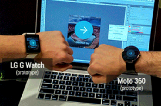
Google IO is coming in just a few weeks and it seems that there we will see a lot of Android Wear content. The two proponents of Android Wear that we definitely know about at this stage is the LG G Watch and the Moto 360. Although not much is known about specs etc, there have been rumours. Both manufacturers have shown us the devices although not in as much detail as we would like and never together so we can compare the two. We have not been told the dimensions of each watch so it is difficult to decide whether it is going to look like something that belongs on your wrist or something that should be hanging from your neck ala Flavor Flav.
Last night on the Android developers blog, Roman Nurik and Timothy Jordan (now famous after his Android wear discussion last week) blogged about how they created an easy Android Wear app that works on both a square screen (LG G Watch) and a round screen (Moto 360). They talk about the app creation which they believe is easy to do, but it does require a lot of thought about the notifications the developer should provide and where to provide them on the display. They talk about fitting the notifications in the same place and changing the padding around the notifications so the view of an app on one device is very similar to the other.
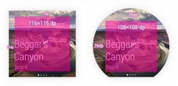

Of course they just had to show off to us a bit more and I’m glad they did. Roman wrote:
Luckily, Timothy and I both had test devices—I sported an LG G Watch prototype and Timothy carried a Moto 360 prototype.
This is where it got interesting with both watches making an appearance as well as a gif of them side by side (click on the gif file to view it properly).
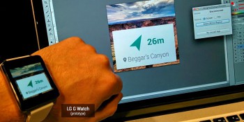
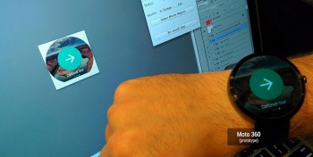
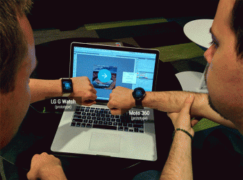
For me, seeing them side by side actually makes the LG G Watch seem more attractive than I first thought. The Moto 360 appears to be a big watch. Hopefully they will both arrive in bricks and mortar stores here in Australia so we can try them out before buying.
Do these pictures change anyone else’s minds? Does anyone now favour the G Watch or is the Moto 360 still the clubhouse leader?

Both are a big (with an emphasis on big) nope.
Calculator watches were less nerdish.
Glance is better as it stands, although even that seems like a solution in search of a problem.
Thanks very much Scott.
The photos in this article are the ones I have been waiting on.
Being able to see just how these two newest smartwatches look when worn makes it easier to decide which one to consider getting.