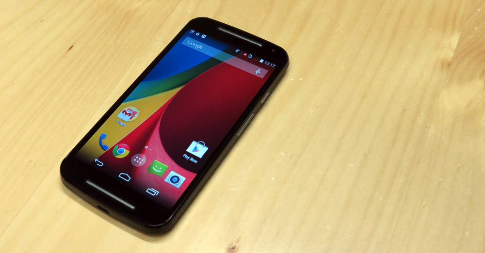
Motorola surprised everyone when they announced the Moto G towards the end of 2013. Rather than aiming for a premium price point and falling short on specs, the Moto G was an unapologetic shot at the midrange market that delivered the essentials for a basic smartphone experience and nothing more at a $230 price point.
We loved it, and so did a lot of others. The Moto G became Motorola’s best selling phone, and arguably even saved the company’s balance sheet after lacklustre market performance from its high-end sibling, the Moto X.
The Moto G could get away with a reputation of being a “tiny Nexus phone” – in spirit if not in name – with Motorola’s newfound enthusiasm for quick software updates and forgoing most manufacturer customisations in favour of a “pure Google experience”.
Motorola wasn’t done with the low end of the market, though – they decided they could get the price of an Android-powered smartphone down even further and delivered the Moto E a few months ago, leaving the Moto G somewhat stranded in the mid-range.
It’s only about 10 months since the Moto G hit the market, and we’re already looking at its successor. How do you follow up a best-selling midrange device, when the core components in your price range haven’t really changed? It’s time to move the Moto G from the revolution trail to the more well-trodden evolution path and see how it fares.
- Still a great price point
- Comfortable to hold in the hand
- Front facing speaker
- Screen performs poorly in sunlight
- Lack of 4G hurts in major cities
- 5-inch screen feels like a step too far
Hardware
The first generation of Moto G was a revelation in terms of hardware accomplishments at a low price point. In many ways, it set the standard for many of 2014’s low- and mid-range devices, as other manufacturers scrambled to catch Motorola’s early lead in the space. It’s not surprising then, that the second generation Moto G builds on the design and aesthetics of the first, while mixing in some of Motorola’s newer design traits.
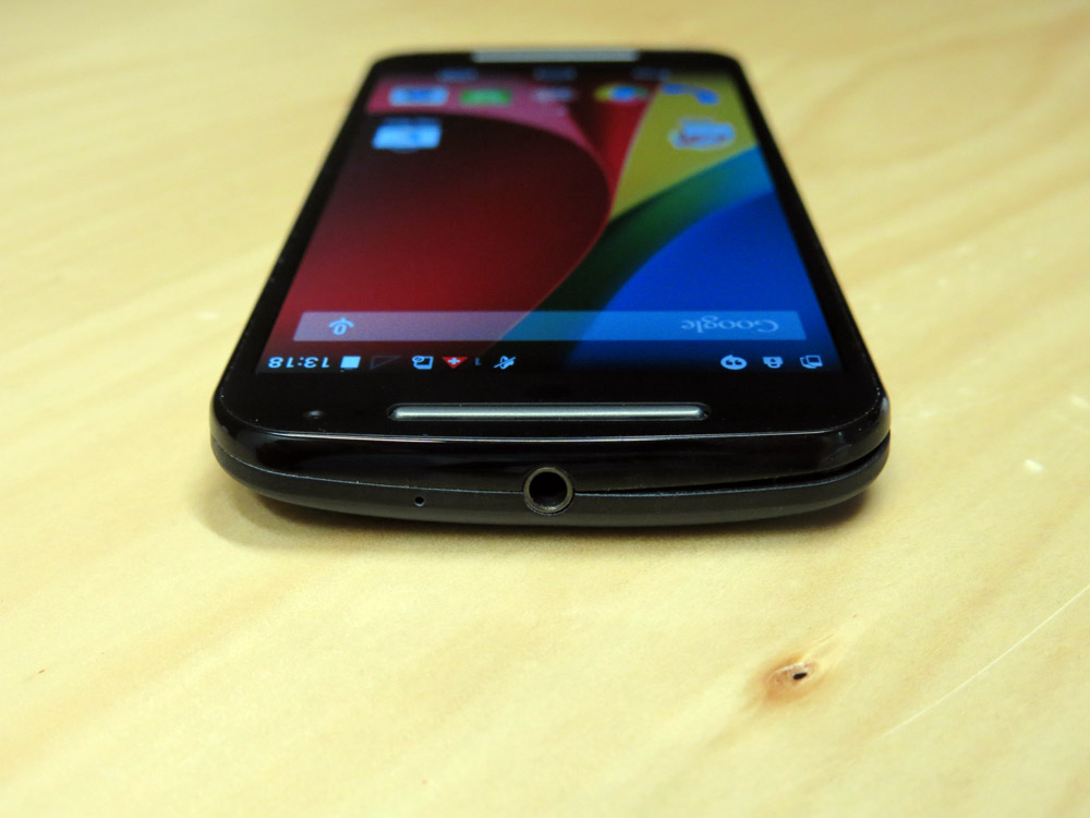
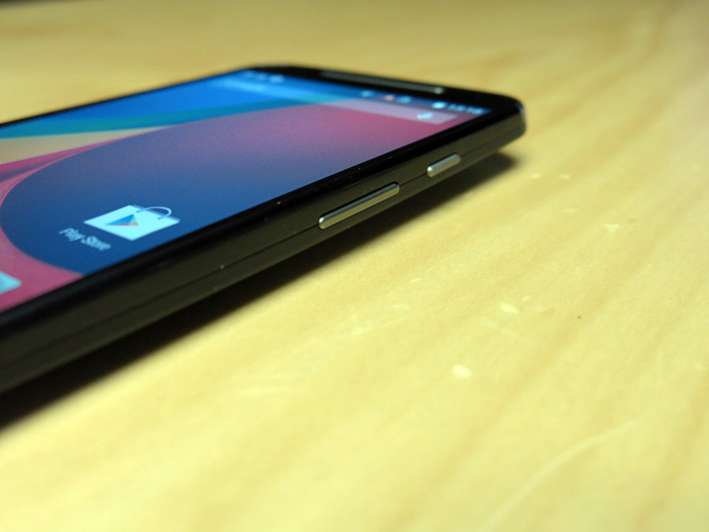
As before, the face of the phone sports a Nexus-like shape, with rounded corners and a gentle taper at the top and bottom of the front. The left edge is bare, with the power button and volume rocker – now plastic instead of chromed – on the right edge. The headphone jack is dead center at the top, matching the Micro USB port on the bottom (Motorola continues to get the USB port orientation “right”, by the way).
The 5-inch screen of course dominates the face of the phone, but it’s flanked at the top and bottom by new plastic bars set into a slightly smaller overall bezel. At top, the plastic bar hides the earpiece for making calls, and at bottom it’s hiding a welcome addition to the Moto G design – a front-facing speaker. These plastic bars made their first appearance on the Moto E and seem to be one of Motorola’s new design traits. They do distract a little when the screen is off, but in general use you won’t notice them.
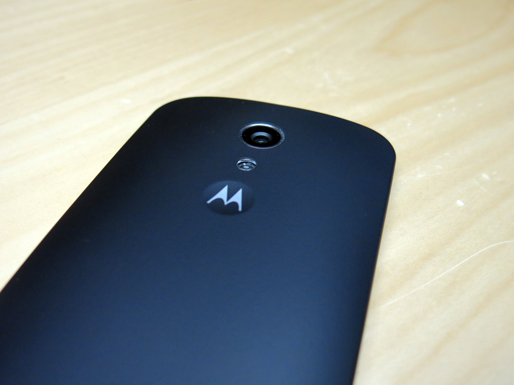
Around back, there’s a soft-touch black cover that can be removed to expose two Micro SIM slots and the SD card. Unlike the original Moto G, the back cover is a little easier to remove this time around. The “dimple” in the original Moto G’s design – which holds the Motorola “M” logo – is still present, but it’s more subtle this time around.
Inside, you’ll find practically the same guts as the original Moto G. It’s still powered by a 1.2 Ghz quad core Snapdragon 400 chipset, it’s still got 1GB of RAM and even the battery is the same.
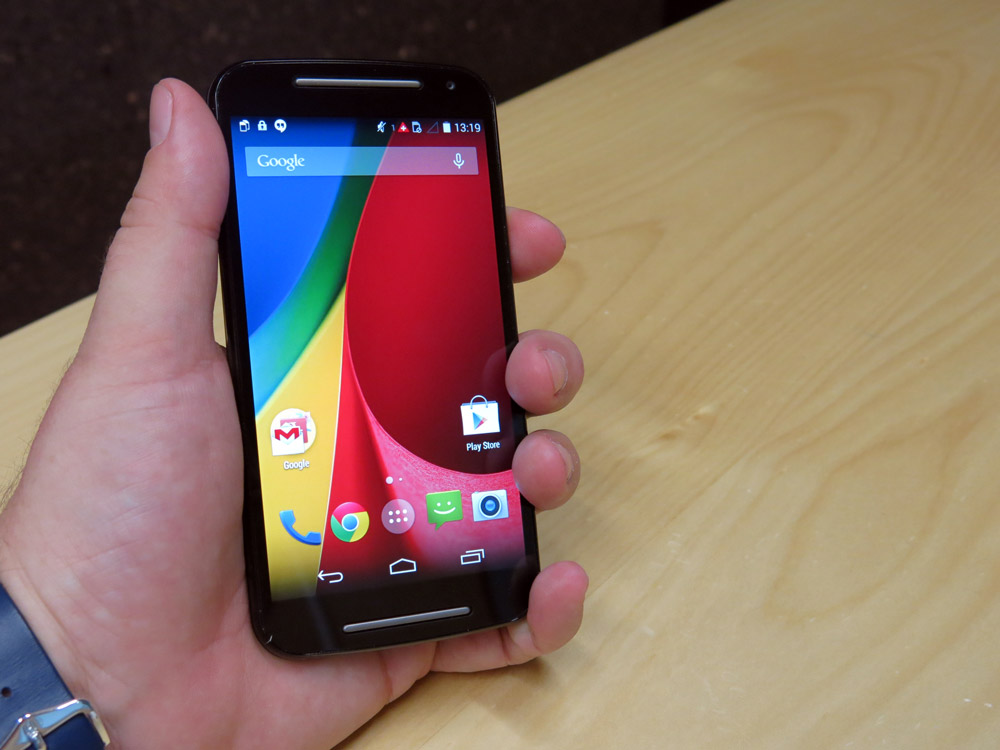
Like the original Moto G, the second generation is solid and possibly a little heavier than you’d expect, although that weight is evenly dispersed. It doesn’t bend, doesn’t flex and generally isn’t bothered by a bit of rough handling. Button placement, while perhaps nonstandard compared to other devices works out alright – in your left hand, your index and middle fingers fall fairly naturally into place, but in your right it’s a bit of a shuffle with your thumb – not too difficult, though.
What’s been lost in the jump to the new Moto G is the ease of one-handed use, and that’s disappointing. The original Moto G was a fantastic little device where you wouldn’t have a problem reaching across the screen with your thumb, but the new one has given this up. Motorola’s pushing the compact phone designation onto the Moto E, repositioning the Moto G as a budget device aimed at media consumption with a spacious 5-inch screen.
Screen
Motorola has traded the original Moto G’s 4.5 inch display for a 5.0 inch model in the new Moto G. In truth, they shouldn’t have. While the screen itself is larger and sticks with the IPS LCD technology, the pixel density is lower. Colours are also more washed-out when put next to the original.
The original’s display scored well on daylight visibility – you could see the original Moto G screen anywhere with a small boost to the brightness, including using it for a couple of weeks on the sun-drenched streets of Singapore earlier this year. The new Moto G? At max brightness, the screen is too dim out and about in Sydney, unless you’ve found some shade or it’s morning or evening time. The final nail in the coffin is the dull, washed-out view you get when you look at it off-axis.
Another issue I’ve seen with the screen is with the touch response. Occasionally while testing, the screen would completely lock up and stop responding to touches, requiring it to be switched off (the screen, not the phone) and back on again to restore its missing touch response. Otherwise though, the touch input is accurate
All in all, the screen changes are disappointing. There’s been trade-off that feels like it shouldn’t have to have been made. Motorola had this nailed last year and seems to have taken their eye off the ball this year.
Battery life
Another area in which the original Moto G excelled was battery life. I could use it for hours on end without putting a significant dent in the battery.
This hasn’t changed so much in the new Moto G – the internals are exactly the same, but with a bigger screen there’s more backlighting to be done and so the battery goes that little less of a distance.
Connectivity
Pretty much unchanged from the original Moto G – you get Wi-Fi a/b/g/n, Bluetooth 4.0 with A2DP, GPS with GLONASS support.
On the cellular connectivity front, Motorola’s again made the Moto G a 3G-only device. If you live in a metropolitan city where 3G has become useless and slow, you’re going to want to look elsewhere. There are phones in this budget range with 4G, although you might need to spend a bit more to find the parts arranged as well as they are in the Moto G.
It should also be mentioned that the GPS and compass in the new Moto G perform far better than the original. There wasn’t too much wrong with the original’s GPS, but these days it has a tendency to get stuck in one spot – perhaps a software update went wrong, or the GPS components in the original have developed a fault over time. It’s hard to tell, but it’s easy to see the better and more accurate location on the new model.
Sound
Manufacturers are starting to sit up and take notice of the success HTC’s found with their BoomSound front-facing speaker arrangement. HTC themselves have made BoomSound a near-standard feature across their entire range, and it’s even made it into the Nexus 9 tablet. People want a quality audio experience from their devices, manufacturers have worked out how to make speakers face towards the user and it’s no longer acceptable to just stick a tiny speaker on the back of a device.
One of the major design changes to this year’s Moto G is the addition of two bars above and below the screen. At first glance you could be forgiven for thinking they’re BoomSound-alike stereo speakers, but in actual fact the top one hides the earpiece for making and receiving calls, while the lower bar hides a very welcome left/right stereo speaker arrangement.
The sound coming from that speaker can go up pretty high – enough to attract the attention of onlookers in public, and enough that you can use the phone as a loudspeaker in a quiet room if you want to listen to some music. You probably won’t want to push it too hard – it’s a $300 phone after all (and there’s that excuse again) – but it’s an improvement over the original. Well played, Motorola.
Performance
We liked the performance of the orginal Moto G, and the new phone shares the same guts as the old one, still going out to a 720p screen. I guess what I’m saying is, I couldn’t really tell the difference.
We know that KitKat performs well on lower spec hardware, and you can’t help but feel this setup (a Snapdragon 400 with 1GB of RAM) was pretty much what Google’s engineers had in mind.
Apps open quickly, storagre access seems fast and the phone is responsive. You can’t ask for much more than that.
Camera
The biggest complaint about the original Moto G was undoubtedly the camera. The quality of photo that could be pulled out of the middle-of-the-road 5MP unit surprised us, but ultimately disappointed when push came to shove. “That’s OK”, we told ourselves, “the phone doesn’t even cost $300, so something’s got to give”.
Technology evolves, though. Now there are some fairly decent cameras in some fairly cheap phones. Note liberal use of the word “fairly”, there. Let’s call a spade a spade – it’s still not the best camera around, but the new Moto G’s 8MP rear camera is actually a damn sight better than the original.
Motorola’s also seen fit to upgrade the front camera on the Moto G. It’s not a huge bump though, going from a pretty average 1.2MP to a pretty average 2MP unit.
Curiously, given the company’s deference to the Google experience, Motorola’s own camera software is still running the show. With a swipey, gesture-based UI it takes some getting used to and feels like a bit of a throwback to some of the older camera UIs Google’s tried over the years in their own camera interfaces.
Swipe in from the left for a settings ring, swipe in from the right for previous snaps (on first use this function asks you to set a default from either Google’s Photos app or the on-device Gallery but neither option seems to make much of a difference). Zooming is accomplished by holding your finger anywhere on the screen and sliding it up or down. Theres a focus/exposure point you can move around the screen if you tap on it and drag your finger around, and you can take a photo by tapping anywhere on the screen.
It’s that last part that gives the camera a bit of a learning curve. We’re so used to having to press a specific button to do something, that tapping anywhere almost paralyses the user with choice. In practice, as long as you hold the phone securely it’s fine, but pressing on the screen often moves the phone and results in a blurry image (especially in HDR mode). There is an option to use the volume keys as the shutter, and you’ll probably welcome it.
Motorola’s software doesn’t offer any bells and whistles like face detection or automatic touching-up of skin blemishes. In that respect I find it refreshingly honest – whatever you see on screen is the photo that gets taken – to a degree.
The camera still doesn’t fare super well in low light, often blowing out where there are nearby light sources, but that’s really pretty consistent with what we expected.
Give it a well lit scene, handle the phone properly, and the new Moto G’s camera will do its job well enough.
Software
Android OS
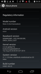
The second generation Moto G comes with a mostly untouched Android 4.4.4 onboard, and Motorola has promised an update to Lollipop.
Motorola’s been quick off the mark with Android OS updates in the past, but they usually hit US devices first and then handle the rest of the world a month or so later.
UI Customisations
As we’ve come to expect from the last few generations of Motorola phones, there’s little by way of UI customisations. What’s there is interesting, though more of a curiousity along the lines of “Oh, Motorola chose to change that”.
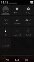
The first thing that stands out is that a lot of labels are now Proper case instead of UPPERCASE. This is most obvious in Quick Settings labels and the carrier name(s) in the notification shade and lock screen.
Just as Motorola’s camera app is its own, so is the Gallery. The Motorola Gallery is actually pretty good – it lets you slice and dice your photo collection either by the usual album (Camera, Downloads, etc) or by Timeline (which roughly divides it up by date and time. You can also see everything in a Camera Roll section, something that seems to have given Apple some pause in recent weeks.
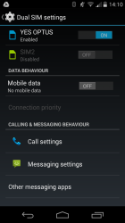
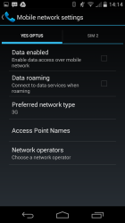
In producing a Dual SIM phone, Motorola’s also had to go it alone in terms of a Settings screen for the SIMs. You can enable and disable the individual SIMs, and their mobile data states. You also get two SIM status icons in the notification area, and these actually take up a lot more space than you’d like with a small (and probably unnecessary) “1” and “2” identifying each SIM.
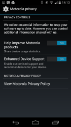
There’s also Motorola ID and Motorola Privacy screens in the Settings.
Bundled Apps
Rather than customising Android, Motorola’s been building into the OS and adding value with its own apps and services. It’s a good strategy, and one we wish more OEMs would adopt as it allows the OS to be updated more or less independently of the apps.
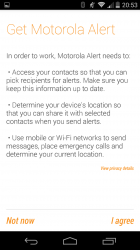
The Moto G isn’t bringing any new apps to the table, but’s Motorola Assist, Alert and Migrate apps all feature on the device. Otherwise, the only other bundled app is QuickOffice.
- 5.0 inch 720p IPS LCD (294 PPI)
- Snapdragon 400, 1.2 Ghz Cortex A7, Adreno 305
- 1GB RAM
- 8GB storage, Micro SD (max 32GB)
- 8MP rear camera, autofocus, flash
- 2MP front camera
- Wi-Fi b/g/n, Bluetooth 4.0
- GPS, GLONASS
- Cellular:
- GSM: 850 / 900 / 1800 / 1900 MHz
- WCDMA: 850 / 900 / 1900 / 2100 MHz
- 4G LTE: None
- Dual Micro SIM
- Android 4.4.4
- 2070 mAh battery, non-removable
- 141.5 x 70.7 x 11 mm, 149 grams
The low-to-mid-range market has become saturated in the last year with manufacturers taking a tilt at the space occupied by the Moto G. Nobody seems to have hit that target as well as Motorola, and their followup demonstrates a willingness to change – although not that far. The company has reposititoned the budget Moto G model in light of the subsequent launch of the even more budget-minded Moto E, but in doing so it’s lost some of the charm of the original.
The new Moto G trades away the original’s single-hand experience and a densely packed, bright screen, offering instead a media-focused 5 inch display that isn’t quite as good, and feels more like a midrange phone than the pocket rocket experience I got from the original. That sounds like I’m disappointed with the phone. I am, but I’m also not. It depends how you look at it. The phone only really suffers on these few points when compared to the original Moto G.
Taken on its own merits, the new Moto G offers a large screen with a “good enough” resolution, lets you add storage space for your own media and the soft-touch back means it’s not going to slip out of your hands.
The Moto G only really suffers in its constraint to 3G networks. That’s a problem for me living in Sydney where 3G networks are almost totally congested in the city, but it mightn’t be for you. Motorola followed up the original Moto G with a single SIM 4G variant, and I really hope they do the same for the new one.
The decision you’re faced with – once you decide the Moto G is for you – is whether you should buy the new model or the old. If you don’t like huge phones and don’t care about the SD card, you can save some money and buy the old model. If the large screen and camera performance are important to you, you’ll want to go for the new one. Either way, you won’t be paying much and you’ll get a phone that shines in its own way.






I’ve been looking for a mid-range phone for my parents and this seems to fit the bill really well. None of the major manufacturers are fitting 720p displays at this price point and that’s a real shame. However I did come across one other phone that measures up spec for spec to the new Moto G and also sells for around the same price, probably even undercutting it in some markets: the Asus Zenfone 5. When you compare the spec sheet it seems obvious why Motorola had to rush out the new G less than 12 months after It released… Read more »
Was gunna get the Mrs a 1st gen moto g, but no sd and poor camera made me wait for the 2nd gen. Those concerns have been addressed, but now it’s too dang big for her!
Since many of the specs match the last generation Moto G, a more interesting comparison may have been between this phone and the Moto G XT1039 (4G). This phone seems to be a step down in several regards (size, screen, radios), and with a higher price.
A better option might be to jump on eBay and grab a second hand phone. For less than $250, you can find an Xperia Z or even a Z1 if you’re lucky, which is also 5″, but includes a better screen, 4G and is better in just about every other way.
Good point, I just sold my Xperia Z for $250 on eBay.
What did you replace it with?
Z3 Compact.
You’ve gone from 5″ to 4.6″? Isn’t that a downgrade? 😉
Maybe in terms of screen size, not hardware wise.
Correct. I can use the Z3 Compact without having to perform hand gymnastics when I’ve only got one free hand, without fear of dropping it too. It is just as fast as my Nexus 5 and can take some really great pictures. I love that it’s waterproof but the real kicker… it lasts about 3 times as long without using any of the stamina battery saving features! The screen size really is the only downgrade.
I hear you re. battery life. I’ve just replaced my Nexus 5 with a second hand Z2 I got on eBay. I’m loving the slight increase in screen size, the 3200mAh battery, and even the Xperia interface. Sony hardware is as good as it gets. For once, I’m not planning to root a phone. I’ll keep my Nexus 5 as my business phone so that I can enjoy Lollipop on that.
Might I ask why the too low on board storage and maximum microSDHC are not listed as cons for this device?
Because 8gb with the ability to expand to 40gb is more than adequate for a $300, mid range phone.
This is about right.
It’s a cheap phone. 8GB + SD Card does the job.
You can point your music, podcasts and photos off at the SD Card and you have enough space… about 5GB… for your apps. If you need more, well, not the phone for you.
Those sample pics look nice n bright. Motorola have made some good gains with the sensor and lens setup here to achieve f/2.
I’ve been using one for 3 weeks now. I am fine with the screen. 5″ 720p does the job nicely. I know there are far better screens out there, but for a budget phone it does the job fine. I will criticise it for being a just a bit to heavy and slippery. I had no problems with a Nexus 5, but this is rather bulkier. It wants to slip out of my hand. LTE… it’s a budget phone. You’re going to stick a Boost or Amaysim SIM into it. You’re not going on some expensive Telstra plan. I don’t… Read more »
Why is it people don’t realise Vaya exists. $17 a month for 1.5g of data, sure they use 1mb units but I have never used it all and heaps of calls and txt and 4g. Sure it is Droptus 4G but still it works well. Do you really need unlimited txt and calls ? Most don’t yet they pay 40 plus a month when this 17 a month service is all they need.
This is a valid point – I finished my optus contract, moved to the vaya plan which is 1/3 the price of the exact same optus plan and the same service and now the idea of paying triple the amount per month just to get a bundled phone seems absurd. Likewise paying $600+ for a phone outright.
So this has left me looking at the moto G but I just don’t know whether to go the new one or the gen 1 4G…
Get the Moto G 4G LTE. I bought mine on the day that the Gen 2 was released in the US. I was slack-jaw shocked to see Motorola come up with the old Moto G w/front facing speakers and a slightly better camera. I expected at the very least, an improvement on the 4G. If a camera is important to you, the piddly improvement in the 2nd Gen won’t be good enough anyway. I thought about the front speakers, as I have hearing issues, but I am very happy with my 4G. What were Google and Motorola thinking? The Moto… Read more »