
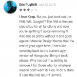
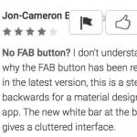
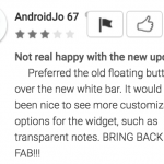
The floating action button (FAB for short) is one of the many features that Google made known when the Material Design standard was introduced but perhaps they’re not quite as excited by it as they once were; removing it from the Google Keep app in the latest update rolling out now.
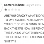
The latest update (version 3.1.294.00) comes with the usual and unhelpful changelog on the Play Store listing “bug fixes and performance improvements” and as yet, no acknowledgement that FAB has been removed or any attempt to answer the cries of loyal users in the reviews online.
Perhaps its removal is a way to make the app less confusing to new users, perhaps its an experiment (so far appears it hasn’t worked well) or perhaps its just an error. Regardless, you’d hope that the cries of users missing FAB are heard loud and clear by Google.
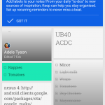
Looking past the omission of the Floating Action Button, I don’t mind (despite the step away from the standard Google created) the new interface. Its clean, quick and easy to create a note, voice note, checklist or take a photo/scan of an item and may be more friendly to new users than the FAB in the bottom right of the screen.
Do you prefer the Floating Action Button, or a well thought out; interface specifically designed for your apps?





Glad the button is gone. Faster with this new interface.
Images are in the wrong order.
Whoops, fixed. Cheers.
need to swap the images around you have them around the wrong way or change the titles, i see no reason to keep the FAB if it makes the experience easier and less clicks the FAB is an option is not a LAW of the design people need to get over this dont wanna end up like iOS putting in poor usability for design
exactly it’s an “OPTION” so give US the option to remove it or leave it there…