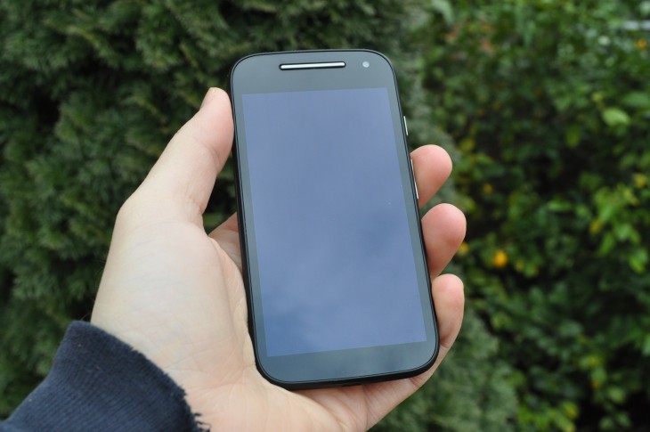
The release of a Motorola Moto series handset has become a big event whenever it happens. Though we waited for four months to finally get the Moto E Gen 2 in Australia, our previous history with the previous Moto E gives us cause to be quite interested in their latest effort.
The pricing on the new Moto E was the biggest surprise when it finally arrived here. Though the original Moto E sold at a super affordable sub-$200 price point, the Moto E Gen 2 has crept up in price to take the place of the Moto G at the mid-$200 mark. With the increased price tag comes some more hardware though, including a front-facing camera.
Like previous Moto phones, the Moto E Gen 2 is available from a range of retailers though not as a pre-paid or even contract option from any of the Australian carriers.
When Chris reviewed the Gen 1 Moto E, he found a pretty good handset for the price, though a fairly lacking camera was the major concern. There’s been some changes in hardware so whether this improves on and fixes the concerns from the original Moto E, we’ll find out.
- Camera lacking in low-light
- Missing Flash
- Battery life could be better
Hardware
Build Quality and specifications
In their second generation of the Moto E, Motorola has continues with a similar design language to the original. The Moto E Gen 2 is still comfortable to hold with a smooth plastic rear and a grippy, replaceable textured plastic band that surrounds the Moto E.
The band is removeable to allow access to the dual-SIM slots and microSD card slot beneath, but can also be replaced with coloured options to spruce up the look of the Moto E, though Motorola hasn’t released these bands in Australia – but check eBay and you’ll find options.
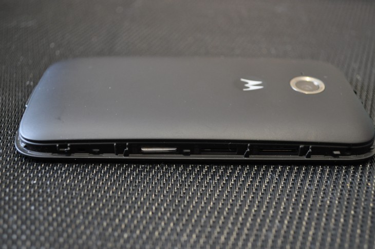
The phone is fairly chunky as you’d expect for a lower end handset, but with the plastic construction it’s not overly heavy. The plastic construction also aids in making it a little more sturdy – though I didn’t have any cause to actually test this out.
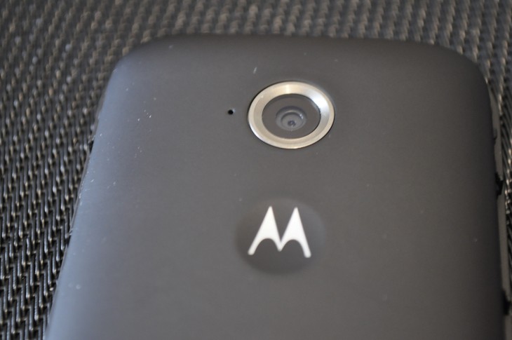
For Motorola owners, the phone has a fairly familiar setup for the button and port placement. The volume rocker and power button are on the right hand side, with the headphone jack at the top and microUSB port at the bottom. The phone has a pretty standard Motorola rear, with a centre mounted 5MP camera and the familiar Motorola dimple just below with the Motorola ‘batwing’ logo in it.
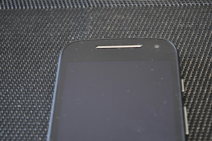
The front of the Moto E has a dual-purpose speaker/ear piece with one of the new additions to the Moto E – the front-facing camera – right next to it. Of course the front is dominated by the 4.5″ qHD (540×960) IPS display, the screen has a bit of bezel on both sides, but we’re looking at a pretty decent setup design wise.
The Moto E Gen 2 has seen a number of improvements under the hood, as well as up front. The addition of LTE to the phone has seen an update to a higher end Snapdragon 410 processor, but the RAM remains the same at 1GB.
The phone comes with double the storage of the original, with 8GB onboard but still retains the microSD card slot to add more memory.
The last major change to the Moto E Gen 2 is the update from 1980mAh battery to a more roomy 2390 mAh battery. This update could be eaten up by the larger display and addition of LTE, but does aid in getting a fairly decent battery life.
Screen
The major difference between the old Moto E and the current generation, is the change from AMOLED to LCD. With Motorola using Active Display on the Moto E, the battery life was relying on the ability of AMOLED to only light up parts of the display, saving on battery – but it doesn’t seem to have hurt it that much in that regard.
The other change is that the screen is now 0.2” larger, but still has a qHD resolution meaning the screen has gone from 256PPI to 245 – it’s a minor difference and not terribly noticeable at this level. The screen remains fairly easy to read, though late at night, it did look a little fuzzy.
The screen is quite bright and easily read inside with a fairly accurate colour reproduction with no strange hues, most likely due to the use of a decent LCD panel. You do get some issues in full sunlight, but ramp that brightness up if you need it and you’re good to go.
All up, the screen has a lower pixel density due to slightly more screen real estate, but there’s not huge amount to complain about here with the screen.
Battery life
At 2390 mAh, the Moto E Gen 2 has nearly 25% more battery than its predecessor. As previously mentioned, the major change here is that the phone now uses LCD rather than AMOLED, which does make a difference when looking at the Active Display notifications the Moto phones are famous for. That said, the battery life on the Moto E Gen 2 was surprisingly good.
The phone would regularly get most of the way through a day with full use of the phone to surf the net, listen to podcasts, social media, instant messaging and videos. When I say most of the day, that’s starting around 5am and getting to me returning home at around 7pm. But by then it was definitely time to plug in. There were days where it didn’t quite make it, but we all have heavy days and finding a charger to quickly top it off wasn’t too much of an issue.
Camera
The Moto E has a 5MP camera on the rear, and like the previous model, the camera is quite capable under the right conditions. A fully lit area will give quite an impressive shot, but try to take a photo in low-light conditions, or of an active 4 year old or a rambunctious puppy and you’ll find the limits of the camera quite quickly.
The biggest downfall to the camera – although I never use it for the camera – is the missing flash. I found myself missing the flash to use as a torch so much that I actually strapped my torch to my belt for the first time in years. Please Motorola, add a basic flash here.
The front-facing camera is similarly hamstrung, though the mere existence of the front-facing camera is something to be pleased about for anyone who uses video calling. It’s not the worlds best, or even capable ‘selfie’ cam, but in a pinch it’ll do the job.
The one great feature of the Moto E 2015 is the double wrist flick gesture to launch the camera. It lets you get quick access to take a shot when you need it. Not being a normal Motorola user, it did take a while to remember to use the gesture, but once you do, it’s great.
Connectivity
Connectivity wise, the Moto E Gen 2 has the usual Wi-Fi, Bluetooth LE, GPS (including GLONASS) and of course, with the phone aimed at emerging markets an FM radio. All these work as expected, with great reception on Bluetooth and quick connections to Wi-Fi and GPS lock.
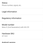
The big change in connectivity is that the Moto E Gen 2 has LTE and for Australia, the XT1521 variant has almost all the LTE bands you could want. The Moto E 2015 has FDD LTE B1 (2100MHz)/ 3 (1800MHz)/ 7 (2600MHz)/ 28 (700MHz) as well as TD LTE Band 40 (2300MHz) – the only one really missing from the list is the re-farmed 850MHz (Band 5) LTE network that Vodafone is now using.
When it comes to speedy, the Moto E is pretty darn good on speed tests on 4G on Optus, and likewise their 3G network gets pretty decent speeds as well. I regularly tether on 3G and was happily able to download quite fast.
Sound
Sound on the Moto E 2015 is pretty average. With a single dual-purpose front-facing speaker there isn’t too much to say. The sound works – it’s not terribly loud, but it’s not inaudible.
Performance
There are definitely some issues with performance when using the Moto E for high-end usage. If you’re a high-end user and you’re wanting to get this to replace your phone you’re going to be sadly disappointed, it works fine to a point.
That’s not to say that using the Moto E Gen 2 is a bad experience; far from it. The stock Android interface is a joy to navigate, it’s well laid out and for the most part basic use is fairly quick. For lower end users however the phone is simply fantastic and does an exceedingly good job. Swiping around the interface and jumping in and out of the app drawer, or loading games and apps is smooth and trouble free.
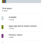
The main issue with the Moto E is a lack of space, you only have 8GB total to start with, and of that only 4.56GB user accessible. You do have the microSD card slot, so there’s that.
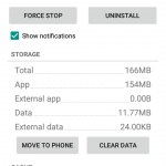
When I was reviewing the phone, I filled it with apps running from the phone and it slowed to a crawl. Once I freed up some space (at least 1GB free) the phone once again flew. Of course with an SD card slot, you can choose to move your apps to the microSD card, which somewhat alleviates the issue of low-storage, so there’s little actually wrong here.
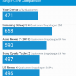
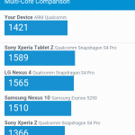
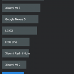
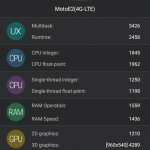
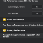
Now, as usual, we include the basic benchmarks for you to check out from GeekBench 3 and Antutu, which are installed on the phone fresh out of the box with no other software installed.
GeekBench
Antutu
Software
Android OS
Surprisingly for a current generation Motorola phone, the Moto E 2015 comes with Android 5.0.2 out of the box. Motorola has announced that an Android 5.1.1 update is on the way, though when it will hit the phone hasn’t been announced, but we know it will be soon.
Skins
There’s no skin on the Motorola phones, all you get is the pure Google Experience Launcher. After their brief association as a ‘Google Company’, Motorola adopted the concept of stock Android with useful minor additions atop the OS layer. Since their sale to Lenovo, this concept appears to have spread to Lenovo, with Lenovo adopting stock Android for their tablets at least – we hope that maybe we’ll see a stock Lenovo phone one day when/if they ever launch them here.
The additions that Motorola adopted such as Active Display, the wrist flick camera gesture all add to the user experience instead of detract. Motorola has for the most part released the majority of their apps on Google Play, with this setup they can all be updated independently of the OS. Something I saw a number of times while reviewing the phone on apps like the FM Radio app which got a Material Design makeover, as well as some new neat tricks like recording directly from the radio – that’s a trip back to my childhood – and a fancy new timer while I was reviewing the phone.
Bundled Apps
The basic apps are one thing, but it’s the lack of them too that’s startling. After using so many other phones with apps seemingly installed for no other reason than the company partnered with X software developer for $X, it’s nice to see a more customer friendly approach. That’s not to say there aren’t apps pre-installed on the Moto E though.
There’s four main apps included in the Moto E and they haven’t actually changed from the Moto E Gen 1.
- Motorola Alert allows you to specify emergency contacts and default behaviour if you find yourself in trouble. Nominate some contacts, and you can easily contact them at the press of a button if you’re in strife. You can also send contacts an SMS containing a link which allows them to see where you are, and if you enable it, the option to follow your journey. Great for kids walking home from school, or even the olds going out for the shopping, I can see this as being an option that not everyone will use, but those that need it will find it welcome.
- Assist smartens up the standard Android experience, giving you options to automatically silence the ringer during meetings, and during times when you’re usually asleep.
- Migrate makes moving into your new Moto E a breeze; identify the phone platform that you’re coming from, and follow the instructions. For Android users, you can move across your contacts, SMS, photos, videos, music and call logs, so it’s like you never left. iPhone users can bring down their data from the iCloud, making the switch to Android painless.
- Help is something that really should be on all Android handsets. If you’re new to Android, or even to smartphones, this is a godsend. Help shows you where to find things and how to use your phone, with topics like migrating from an iPhone, how to change phone settings, how to use apps, and how to read notifications just a few examples. It’s all there, and it’s really easy to follow. If this was on every phone, there’d be no need for support forums.
There’s little I’d change about the Moto E software experience, but that said, there are changes coming with the Android 5.1.1 update, when it’s released for our region. Motorola has listed all the fixes and software enhancements on their support page which mainly touch on the differences in Android 5.1 such as improvements to heads up notifications, quick settings tweaks and volume and alert notification tweaks.
Motorola Moto E Gen 2 (XT1521):
- 4.5″ qHD 540×960 (245ppi) IPS Display with Corning® Gorilla® Glass 3 and Anti-smudge coating
- Qualcomm Snapdragon 410 processor with 1.2 GHz quad-core CPU, Adreno 306 with 400 MHz GPU
- 1GB RAM
- 8GB Storage
- 5 MP Rear Camera with f/ 2.2 aperture and VGA Front-facing camera
- Wi-Fi 802.11 b/g/n, Bluetooth 4.0, GPS with AGPS+GLONASS
- Moto E – Global GSM (XT1521) – Radios:
- GSM/GPRS/EDGE (850, 900, 1800, 1900 MHz)
- UMTS/HSPA+ (850, 900, 1900, 2100 MHz)
- FDD LTE: B1 (2100MHz)/ 3 (1800MHz)/ 7 (2600MHz)/ 28 (700MHz)
- TDD LTE: Band 40 (2300MHz)
- 2390 mAh battery
- Android™ 5.0 Lollipop
- 129.9×66.8×5.2-12.3mm @ 145 grams
So, the Moto E Gen 2 is a little more expensive…ok, a lot more expensive than its predecessor. With $50 difference between models, its pertinent to point out that you do get a lot of additional hardware for the money. The Moto E Gen 2 has a faster processor, more storage, bigger screen, it’s got LTE and a front facing camera and taking all that into account, puts it into the category of where the Moto G was last year.
Times have changed and the Moto E is no longer the super-cheap phone it once was, and that’s Ok. Motorola firmly moved the Moto G 2015 into the premium mid-range market and the Moto E is filling the spot left by the Moto G quite admirably.
When it comes to whether a phone is good or not, it’s whether you want to continue using it and with the Moto E 2015 I actually do. Sure there’s times when it’s a bit of a hassle to reboot but for the most part, the Moto E 2015 offers a great experience.
The Moto E and Moto G were my go to phones for recommendations at the lower end of the market and the Moto E 2015 is definitely going to remain my go to phone recommendation at this end of the market, mainly due to the great hardware updates and continued software support.
If you have a family member, friend or even just need a well performing smartphone yourself the Moto E 2015 is the perfect phone to fill the void.
The Moto E is available from The Good Guys and Dick Smith for a RRP of $249, though you’ll find the price has been dropped to a more reasonable $239 at both stores.





What’s disappointing is that the latest 3rd gen Moto G is about the same price in the States as the Moto E is here, even taking into account the exchange rate. Maybe even cheaper at USD180… Not sure what the current rate is.
All in all a bit of an Aussie market fail for Moto. Yet again.
Picked up one of these a fortnight ago after my G3 was stolen at the pool. Fits very nicely in the hand, but I wish the screen was larger for the frame (and higher resolution, at least 720), and while I have no problems with the SoC, I’m definitely feeling the 1GB RAM. It should start at $200; yes, the $240 RRP is affordable, but it’s still quite a bit more than a comparable Windows Phone and begins to overlap with the Moto G. For the record, I picked the E because the Moto G Gen. 2 didn’t have LTE… Read more »