Google has slowly been updating many of its apps and services with Material Design and that latest to get this update is Google Fit’s website, which originally wasn’t was a bare bones affair to begin with.
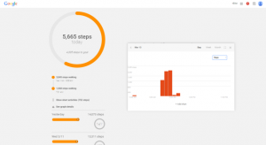
The update, brings a most distinctively Material Design flair to the site, such as a floating action button in the right hand corner of the screen along with side menu which slides out almost on top of the of other on-screen cards and elements. Talking about cards, there is now more information cards that basically slide up over the stylised Google background.

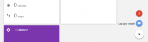
There is also now a single screen that shows how many steps you’ve taken along with how far you have travelled the calories you’ve burned, and your recent activities. That said some of this information shows up in different formats across the page helping differentiate between them. There is also a little FAB in the right hand bottom corner that enables you to also log your weight along with allowing you to add any new activities you have also completed.
Whilst functionality wise, not much has really changed but from a design perspective, its leaps and bounds ahead of what it was previously. The website is now live so you can check it out for yourself.
How much do you use Google Fit on your wrist, phone or on the web?