
It’s Monday night, which means that the Americans are finishing off their weekend. Most weekends, this means we can read a bit of insightful editorial from the folk at Android Central. This week is no exception, with a real knife to Bixby’s heart from Android Central’s Alex Dobie.
Here’s why a Bixby button is no good
We don’t want to detract from the original article, and in fact, we suggest you read it if you’re a Samsung user past or present. From our own experiences, there are a number of persuasive reasons for why the Bixby button is terrible, including:
- It automatically overides all other input, on any screen, even from locked.
- It’s ridiculously easy to accidentally press, which then shows you all of Bixby’s useless information.
- AC noted that “when you double-tap the power key to launch the camera, there’s a non-zero chance that you’ll brush the Bixby button at the same time.” We’ve done that, and it’s damned annoying.
- Bixby overides the lock screen, meaning that there’s a good chance you’ll pull the Galaxy S8 from your pocket with some useless crap from Bixby displayed, instead of what you might actually want.
Including the Bixby button this year was dumb
We agree, Bixby shows some promise, but only if it’s ever delivered. It’s worth noting that the timeframes for Bixby keep blowing out. Despite the hardware button being present on every Galaxy S8, the actual useful part of the AI only works on those sold in the US and Korea. Pointless.
When you consider how central Bixby has been to Samsung’s messaging, the actual delivery is nothing but disappointing. I positively hate that Samsung have lumped this button onto the side of the Galaxy S8, and that they’ve gimped it, preventing users from mapping any useful features to it.
Goodness knows when Bixby’s voice recognition features will actually show up anywhere else. We’re honestly expecting it to be well after February 2018, when the next Galaxy S device will likely be announced. Thus, we can only agree with AC’s conclusion — including a physical button which can’t be used for anything else, which maps to a feature which wasn’t ready at the time the product launched (and likely won’t be for months), was a monumentally shit move.
Look. We love what Samsung can do, but this idea was just so terrible that I’m personally amazed that it reached the final handset we now have in the market. It’s almost as insane as LG G5’s requirement to almost break the phone in half to change modules out …
Bixby mostly shows useless stuff
In the meantime, I find myself pining for a case manufacturer that will agree as to the inadequacy of the Bixby button, and make a case which covers the button up, preventing accidental presses.
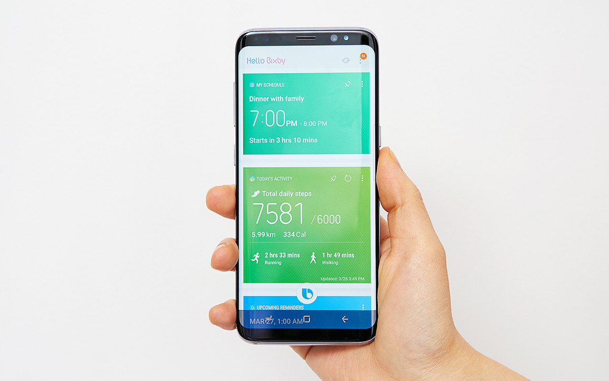
Seriously, why would I want to see these things from a dedicated hardware button:
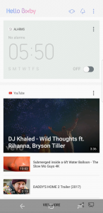
- What time I could set an alarm for — I mean, why?
- Some remarkably uninteresting YouTube video suggestions — No thanks
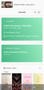
- What’s on my schedule — I can see that on my home screen with a widget
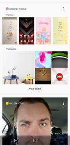
- Some Samsung themes I could choose from — puh-lease
- A photo that I took today — I was there, I remember
- Today’s weather — It’s 8pm, I’d rather see tomorrow’s
- Some news items, and today’s selection:
- “Cambodian eatery offers Pol Pot rice porridge”
- “Briton who lived secret life in Australia named by coroner as John Pritchard”
- “Australian rugby is paying the price for ignoring its grassroots”
I mean, seriously. What the f***?
Absolutely NONE of that is useful. By contrast, here’s what Google Now shows me without any real configuration (because I rarely use that, too):
- Weather tomorrow at work
- When my favourite football team is playing next
- Weather at home
- Half a dozen mobile technology news items
- Some other news which is less interesting, based on sites I’ve visited today
Four out of five items are moderately useful. The last one … not so much.
I love what Samsung has done with the Galaxy S8. Truly, I think it’s one of the best phones we’ll see this year, and have seen for some years. It really only has one or two genuine competitors. I’m still using the Galaxy S8 as my daily phone, for now, but the Bixby button truly is terrible, hence the dramatic heading for this story.
Samsung, the Bixby button is a shit idea, and we wish you’d let us change it to something (or anything) more useful. Love, your users, most of whom paid more than $1,000 for the privilege of owning this phone.



I think the Bixby button might be useful given a chance ,
at the very least Bixby when voice is enabled should not require shouting at the phone ok google ,
also if Samsung comes through with the promise of being able to activate anything on the phone that you would normally need to press a button for ……… well that would indeed be useful .
COMPLETELY agree.
Samsung just:
1) Continue to build great hardware
2) Stop trying to replicate what Google does (you WON’T beat them)
3) Move the finger print reader to the middle of the back AWAY from the camera
The vitriol in this post is outstanding!
Frankly, it needed to be said.
There’s a case on kick-starter that doesn’t have the cut out for the box by button, but it’s TPU, so will probably get accidental knocks anyway.
To be honest I haven’t accidentally pressed it yet… But now that I’ve said that!
Great summary. Yep, my experience is that by dint of systematically disabling everything within Bixby PLUS using the Bixby Remap app set to ‘immediately exit’ PLUS carefully training my muscle memory to avoid the button, I’ve managed to make things ALMOST as good as if the button didn’t exist at all.
A case which covers it up is a great idea and would totally make the problem go away!
I’ve found another similar solution; install Package Disabler Pro, disable everything with Bixby in the name, and then when you hit the button … nothing happens at all. Nothing. No screen wake up. No stupid news screen with irrelevant news from Cambodia. El Zilcho.
It worked! Omg that’s sooo relaxing. Thank you Chris!
Also, how did I not know about this app?!
Bixby is $#!+.