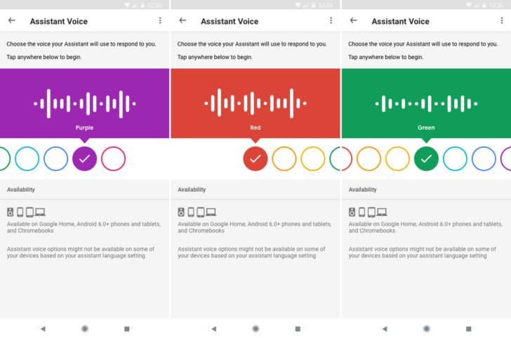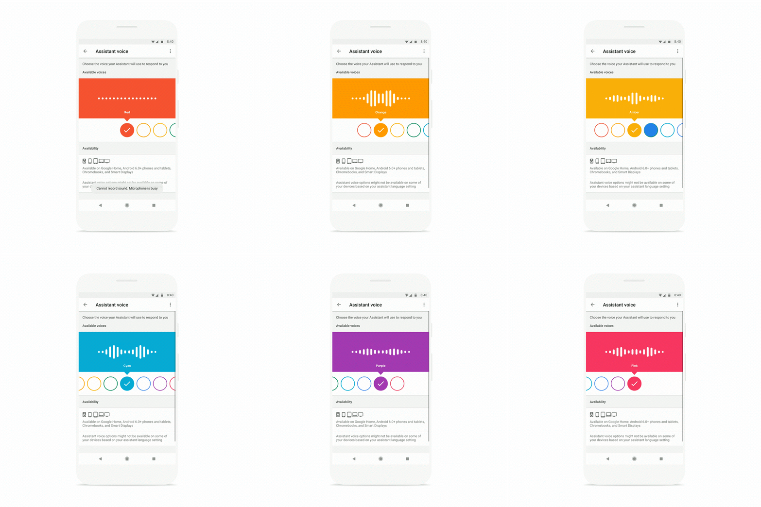
Android Police is reporting this morning that Google has released a new user interface for selecting voices for Google Assistant, giving each voice is own colour to identify them.
The new user interface has the voices in a horizontally scrollable interface (there’s eight in total, depending on your localisation). Each one has a different colour, and when you try out a voice, there’s a nice waveform animation to go along with it. The colours don’t mean anything, as such, but it’s a handy way of working out which voice is which.
You can see the new interface below:

We understand that this might just be for US English users for now, however as with most things, it’ll likely make its way here soon enough.
Source: Android Police.


Higher price for Australia and less features, why can’t the English voices be for all English speakers?
Is it a complete lie like the old one?
Google’s ‘Voice Search’ icon/shortcut on my home screen is so convenient and one voice for now is ok….untill the rest are rolled out here.
No more ask Google either via the search bar, just one press and ask the question…great.
Like most things!? Have you seen the state of what isn’t available for Australians on google home/assistant? At this point it seems pretty clear they’re not intending to roll it out anywhere other than USA. We Aussies can just look on and feel bad for now.
still waiting for Music Alarms