Google has been on a roll lately upgrading some of its core apps to a Material Design look, and the latest to get the treatment is Google Calendar. With version 6.0 – which has been released in the last day or two – the new design is everywhere, and you can load it today.
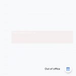
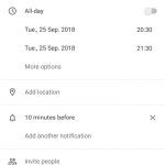
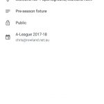
The highlight of Google Calendar’s Material Design overhaul is the mostly white look, the loss of unnecessary gray tones, and a new Google-coloured floating action button (see above). The overall design of the app has changed a bit, too, and looks a lot cleaner than it did before.
Besides the change in visual design, it doesn’t seem there’s any actual new features underneath. However, the new design is enough of a reason to upgrade, and it’s making one of the most used Android apps (well, for me, at least) look a whole lot better.
If you’ve got Google Calendar installed already, keep an eye out for the update coming soon. Otherwise you could probably grab it from APK Mirror if you can’t wait.


I dislike the design because it looks like a basic Samsung Cal app and it’s harder to use. The design before this one was a little kindergarten-ish work it’s shapes and colors but it was advanced yet easy to understand how to use. But this new one is not as easy to understand and use. It’s harder to read, see, and understand. Everyone would agree.
Certainly there are a couple of aspects that have taken a bit of getting used to .. but I still find it easier to use than third party / other OEM apps. Just about every OEM includes their own take on the calendar, and I’ve always found Google’s easier … even with this more recent change.
If you’re not using Google Calendar, which do you prefer nowadays?
Obv Chris with the A-League game there.
Wrong Sydney team though 🙂
Come on you know me better than that – this is just the first fixture I found in my calendar 😉
But the right NSW team… 🙂