Although one of the features that once set Android apart from iOS, the share menu became a bit of a bloated mess before Google cleaned it up a little while back. OEMs have their share of responsibility for making the share menu unusable, but some apps – including Google Photos – don’t use the system share intent, preferring to go with its own.
However, the Google Photos share menu has still been a bit of a mess. In good news today, Google is testing a new layout which should make it a bit easier to share photos with family and friends.
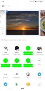
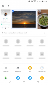
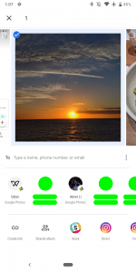
9to5Google reports Google is testing a new share menu layout in Photos which resembles that used in Google News and Google Maps. First revealed last year, the new share menu reduces the height of the share sheet, with three overall carousels:
- One showing the selected image(s)
- Another showing a list of favourite/recent contacts, with a more/overflow button
- A third showing installed apps with share targets, allowing users to share to apps
Sandwiched between is a text box allowing users to specify a name, phone number or email address to directly share photos with specified users.
You can check out the change from the old layout (left two) to the new (right) below:
This sharing layout is so new that even 9to5Google have only observed it on one of their devices; I’ve tested what I can find in my drawer and there’s no phones here displaying the update even with the latest Google Photos installed.
It’s likely that this change will appear in Google Photos in the near future. If you take a lot of photos and share them around – as we all do – you’ll no doubt welcome this change.


I hate the new share menu. To many apps in the carousel to scroll through.
That’s how iOS handles the share menus