While we like to refer to Google as an advertising company or the parent of Android, the company made its name in search. Today, Google has detailed some changes coming to search for mobile.
Google doesn’t often make big changes to search results presentation, but tends to tweak things in small increments after doing extensive A-B testing on the changes. We’re taking shades of colour, font sizes or order of options here (you’ll notice those change over time). This change is big enough for Jamie Leach, Google’s Senior Interaction Designer for Search, to take to the company blog to write about, though.
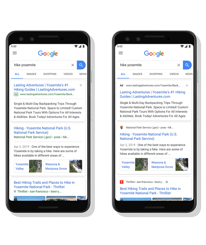
The main change at play today is swapping the order of the result’s title and hierarchy. By promoting the site’s name and breadcrumbs / URL first, it gives Google a chance to apply a site’s branding to the result.
It also lets them add the site’s icon into the results, making them more visual, and remove the horizontal line that used to separate the information about the page from the summary of it – less visual clutter opens the page up in subtle ways.
Of course, it also reduces the impact of the “Ad” branding that calls out commercial placement and places it on equal visual footing with real search results. Hmm.
It’s not quite clear where the AMP icon sits win this design now, although it’s nice to see URLs replaced with brands where it can be determined (for the example above, current Google searches actually show the Thrillist website URL rather than the site’s name).
Interestingly, while Leach calls out in his post the proliferation of information cards, images, video, 3D objects and AR in the search results page, this rearrangement of information on the most basic of search results doesn’t do much to help users navigate to the results themselves. First place in Google search doesn’t necessarily mean the same now as it has in the past:
Rank #1 in 2013 …you're 330 pixels from the top
Rank #1 in 2019 …you're 1050 pixels from the tophttps://t.co/7jYDKvKr72Interesting research by @orbiteers
— Brian Dean (@Backlinko) May 10, 2019
Still, Leach’s post offers some hope that Google will continue to work on optimising search results for mobile. We know Google tweaks things all the time, too.
Theres no reason for these updates to Google’s search result presentation to stay exclusive to mobile, but they’re rolling out first on mobile in the next few days. We’re looking forward to seeing what our own results look like by the end of the week!

Maybe Google can include a no icon, no branding option in the accessibility settings for people who feel nauseous with all that advertising