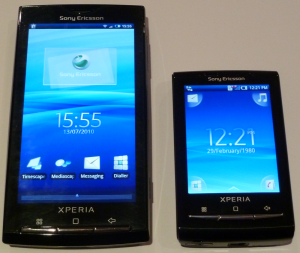
So what do you do when you make a pretty darn’ successful smart phone? You shrink it down to the point where it’s nearly not usable so small you could lose it in your pocket if it weren’t for the thickness and make it run faster than it’s big brother.
The X10 Mini is not so much a smart phone than it is a designer phone, as there are limits to what you can do with a screen measuring in at 2.55″. But hey, at least it isn’t resistive.
So let’s do this. Hit the break to get into it.
Pros
- Compact (freakin’ tiny!)
- Very speedy
- Excellent sound quality
- Hot-swappable MicroSD
- FM Radio
- Camera Flash
- Interchangeable back covers
Cons
- No access to Battery
- 230×320 Screen Resolution
- Application incompatibility
- Tiny keyboard
Unboxing/Design
The Box
Sony Ericsson are very good at making their boxes look rather appealing, and the X10 Mini is no exception to the rule. A nice small, sleek box with the X10 Mini sitting waiting for you to look at it and go, “Is that it? That tiny thing?”.
Inside the craftily made box are the following..
- Sony Ericsson X10 Mini
- MicroUSB to USB Cable
- USB Wall Charger
- In-ear earphones w/ Mic & Call/End button
- Health & Safety and Instruction Manuals
[nggallery id=34]
Design
Sony Ericsson have managed to squash the components of the X10 Mini into the smallest size possible, and they’ve done pretty well. Measuring in at 83mm heigh and 60mm wide, it certainly is small, but it’s quite thick at 16mm. The curved rear makes it sit very comfortably in your hand, but if you have big hands, I don’t recommend it.
The dedicated Camera button & volume rocker sit on the right hand side of the device, and are placed right where your fingers naturally sit when holding the device. The power sits atop the device and doesn’t stick out of the device, so sometimes you don’t know if you’ve hit it or not.
The 3 hardware buttons below the screen are exactly the same as those on the Xperia X10; Menu, Home & Back.
All the hardware buttons are as follows:
- Front
- Speaker
- Menu
- Back
- Home
- Right Side
- Volume Rocker
- Camera (hold down to open Camera app)
- Left Side
- Where you remove back cover
- Top
- Power/Lock
- Bottom
- Microphone
- MicroUSB input
- 3.5mm Headset Jack
- Microphone
- Back
- 5MP Camera
- LED Camera Flash
- Sony Ericsson Branding
[nggallery id=35]
Display
The tiny LCD display measures in at 2.55″ across, and is very responsive thanks to it being Capacitive and not Resistive. It is capable of 16M colours, but it can currently only display 64K colours due to the limitations of Android 1.6 (Donut). This limitation isn’t all that noticeable, as SE have done a good job at carefully choosing where they place gradients. But it does make some of the colours look washed out.
There is no Multitouch support on the X10 Mini, even though the hardware is _capable_ of it. Although there is nothing to miss out on as Sony Ericsson have added the new “touch & slide” zooming feature.
Clarity isn’t the best, but what do you expect for such a small display and a resolution of 240×320 pixels.
User Interface
Sony Ericsson have ported across a reduced version of UIX from the Xperia X10, which includes their flagship applications: TimeScape and MediaScape. Which is much like HTC’s Sense UI, as it completely replaces and customises all core Android menus and applications.
There can only be one widget per home screen, and we found that some widgets would force close or not work at all. Unsure of home many home screens you can have, we decided to test it out. In the end we managed 12 home screens, so you can have 12 widgets at any one time. Also, you cannot put icons on the home screens.
On the home screens are 4 permanent icons: Messages, Music Player, Phone (Dialer) & Phonebook. These are located in each of the corners. Applications can be reached by simply sliding upwards on the home screens and then sliding left and right to get to all your apps. Each “App Slide” houses 9 apps, which we found is a great number as it means the icons are large enough that you won’t miss them!
Overall, Sony Ericsson have done an unbelievably good job on the UI side of things.
[nggallery id=36]
Benchmarking
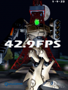
Note: Remember the X10 Mini has a smaller screen & pixel count so FPS will differ greatly compared to other devices.
|
|
Gaming on the X10 Mini? No way. This phone is in no way meant for games, but it’ll play most of your lower end games like wordfinds and all that stuff. But most game developers won’t be aiming to make their games compatible for such small displays.
Telephony
Nothing new in terms of call quality here, calls sound good & you sound good to people on the other end, and that’s all that matters. Although Mic sensitivity make pick up a bit of background noise, but nothing major.
The X10 Mini, unlike the Xperia X10, actually has a proximity sensor, or at least one that works. So no more worrying about hanging up on someone with your cheek.
Messaging
The Messaging app for both SMS/MMS is very straightforward and makes use of the limited screen space. I much prefer this layout (see below) over most that I’ve used. It’s a shame it’s on such a small display.
Adding media & extra/new recipients is a painless affair, like most things. So Sony Ericsson have done a really good job making the software intuitive and easy to use.
[nggallery id=37]
Music / Video / Images / Radio
Music Player
The Music Player is MediaScape in a smaller form, much like most of the applications. It gives you basic functionality as well as displaying cover art, but it does not fetch cover art itself, which I think is a bit of a downer. This does not mean it’s not possible, you can just download an app off the Market to do it.
Sony Ericsson’s trademark infinity (∞) symbol is present to gather more information about the selected artist as well as searching YouTube for related videos. I found this to be quite a useful feature, although it does not return information for a few artists.
And I must say, the speaker on the X10 Mini is by far the greatest speaker on an Android Device. It’s unbelievably loud & clear. I found it to perform much better than the Desire, Nexus, X10 & Optimus in both loudness & clarity.
[nggallery id=38]
FM Radio
The FM Radio on the X10 Mini is no different to that of the ones on the Desire, Galaxy S & Optimus. But I had to bring it up to mention the excellent quality of the sound when played through the speaker, this is really quite a good multimedia phone.
Camera / Video
5 mega pixels and an LED flash is all you need in a phone these days, and that is exactly what the X10 Mini has to offer. Photos come out pretty blurry though and videos are the same, but every now and then you can get a good pic. There is no face recognition or blink detection, although that’s not a massive loss.
[nggallery id=39]
Browser / Data
Honestly, the screen is too small for browsing. No doubt it’s capable, as you can see below, but surfing the net on a 2.55″ display just doesn’t feel right and kind of ruins the experience. Although mobile-enhanced websites (like Ausdroid Mobile) load just fine and are quite easy to read.
There is no flash support, and I doubt there ever will be as it’s just not viable on the display and for the 600MHz CPU.
In terms of data and speed, there are no problems at all. I found YouTube videos would stream just fine without pauses for buffering whilst on Optus & Telstra networks.
[nggallery id=40]
Battery Life
Battery life is pretty darn good. I managed to squeeze out two days of mild usage (browsing, tweeting & music). So you’ll no problems listening to music on your commutes to and from work each day 😀
Keyboard
Now, I’m extremely picky when it comes to on screen keyboards (OSKs), but I was pleasantly surprised with how usable the keyboard on the X10 Mini actually is. There is no way in hell you could use a full QWERTY layout, but the compact QWERTY works really well and has T9 support.
It also slides across to show you symbols and numbers without taking up too much space. It’s a really well thought out design by SE.
[nggallery id=41]
Conclusion
Overall I am extremely impressed with the Sony Ericsson X10 Mini. I found the screen to be it’s major downside, but that’s just me personally. It may suit some people quite well. The speaker on it is absolutely terrific, I couldn’t stop listening to music through it. The whole User Interface is designed beautifully and makes use of every inch of the screen that’s available and it’s lightening fast!
I don’t recommend it for people who want the full web experience on their smart phone or for people who want to game. But I do recommend it for people who want a small device that can do everything a smart phone should do in a “fun size” form factor.


Nice review. I bought an x10 mini on Optus pre-paid for $349. It wasn’t locked, though it has some Optus bookmarks and a Optus check your account application installed. Coming from a HTC Desire (my first Android phone), I’m pleasantly surprised at the speed of the X10 mini, it’s extremely usable. Also I’ve yet to find anything missing from running Android 1.6 that makes is a dealbreaker. I installed the ADW launcher and that gets around the one widget per screen limitation of the SE launcher. Also I’m finding that Smart Keyboard Pro is usable (within the limitations of such… Read more »
Could be interesting… I’m quite happy with my Sony Ericsson dumbphone (3 1/2 years old). The screen size wouldn’t worry me, I don’t expect a phone to double as a computer (yet), and I have several laptops and netbooks already. I’ll consider this when there’s a clear, simple, and cheap Android upgrade path.
Some things I noticed from my Pro are relating to the chrome Menu / Home / Back keys: Solid keys – if they are going to be solid keys, they should have been illuminated in some way as you can’t see them in a dark room. At least illuminate the pictures. And only a very small amount of light. I know where they are and what they do but it would’ve been that little bit extra. Too hard – The buttons are too hard to press. These are probably the hardest buttons I’ve ever had on a phone. They’re not… Read more »