
Can the style of Prada be put into a phone?
The Prada Phone by LG 3.0 is the third phone in a series designed by Prada and built by LG, however the first two phones ran Flash UI and this third phone is the first Prada branded phone to run the Android OS. LG has gone with Android 2.3.7 for this phone however an upgrade to Ice Cream Sandwich has been promised for later in the year. The Prada phone was released on April 4th online by LG on the Vodafone network in Australia and into stores on the 19th so you can now go and behold this mobile fashion accessory. Now quite frankly I’m the last person to use a fashion accessory so I’ll be trying (and probably failing)to look at this phone from a fashion standpoint as well as the usual technical aspects.
To start with the phone comes packaged in a beautifully styled black box as seen above with a simple silver Prada logo embossed on the top. The phone is sitting nestled in a foam insert atop the usual accessories. Extra accessories branded by Prada such as a cradle and bluetooth headset are available and you can view these on the Prada Phone Website.
At first looks the phone is quite nice looking and seems to be quite pleasant to hold, the textured back means it isn’t in immediate danger of slipping from your grasp and when turned on the black and white theme from the box has been continued in the software skin they’ve laid atop of Android 2.3(Gingerbread), an update to Android 4.0(Ice Cream Sandwich) is expected to be pushed out by LG later this year.
LG has supplied a number of applications like Polaris Office, Image Editor and NFC tag programmer as well as supplying black and white icons for a number of default apps such as the clock and calculator plus more, there is a persistent launcher bar which sticks even in the menu application although it does drop out once you go into an application.
- Screen
- Design
- NFC
The 4.3″ 800-nit High Brightness Nova Display is excellent as you would expect from the company who manufactures the much touted ‘Retina Display’ for the iPhone. It has crisp vibrant colours when needed and plays back video excellently, text is easy to read. The 4.3″ size is what I find personally to be a great size but can be alittle large for some people.
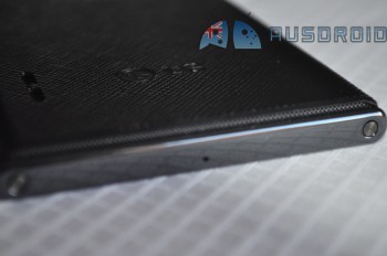
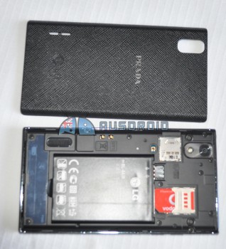
In terms of feel the phone is nicely weighted and it’s this weight that makes the phone feel very strong, the battery cover on the back of the device whilst platic is textured and makes the phone easy to grip and it sits really nicely in the hand. The camera, flash and speakers sit flush with the back cover, the phone overall has very clean lines and is nicely put together.
The 8MP Camera supplied on board the phone also allows video recording in 1080p, the UI on the camera software is basic but easy to navigate your way around, low light photos were not as good as you tend to find on some of the newer camera phones out there but is quite up to the task of being a basic point and shoot for still shots and the 1080p video capture is excellent quality.
When you first boot in, you’re greeted by a black background with a launcher full of black and white icons. The black and white theme looks visually appealing, the applications supplied have been given black and white icons to complete the theme and installed widgets have been skinned in black and white as well unfortunately this can also be negative which i`ll discuss later on.
Sound quality and volume on the Prada was excellent, the volume mostly sat around half to three quarters full which was a nice surprise coming from other phones which require a larger amount of volume just to hear the music or podcast. The speakers on the back of the phone give out a slightly tinny but mostly pretty decent sound as one would expect from a speaker as small as it is.
All of the wireless functions work extremely well, I had no issues with Bluetooth devices it paired with the Bluetooth headset I use with no issues and even when a fair distance away from the phone it continued to pump out signal. Wi-Fi was a decent strength it connected to my home network easily and maintained a connection with no issues at all.
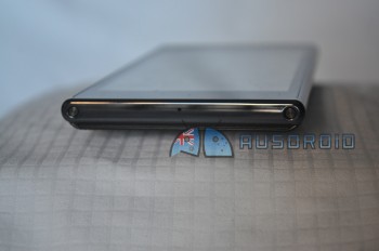
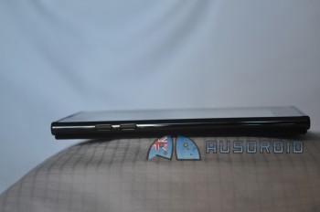
Buttons on top of the phone unfortunately have no indication as to the function they perform, I was surprised to learn that one of the buttons was in fact a dedicated camera button, whilst I like the idea of the camera button I also found its position on the top of the phone to be slightly off where I would naturally hold my hands when taking a photo. The other button on top of the phone is the power button and after coming from Samsung phones I found having to reach up to the top of the phone to turn it on a little uncomfortable with the screen size as large as it is but that is a personal thing.
The prada phone digitizer seems to be a little bit laggy in terms of scrolling and also touch response, I found times after tapping the screen or a capacative button that there was a noticeable lag between the touch and something occuring on-screen. I first thought this was due to the CPU however it seems to perform fine when under load in terms of gaming and running other applications so I am going to say the digitzer is to blame.
The screen is recessed into the bezel which means when swiping you often hit the lip and I feel if it were flush with the bezel it would have felt a little more like the higher end device that the Prada phone is aiming to be. There is also a lip a the top and bottom of the battery cover to help you remove it however when blindly reaching for the phone and encountering it, it just feels wrong, again this is a personal preference.
Battery Life on the Prada phone really depended on usage -as with all phones, however I found the 1540mAh battery was just not sufficient to hold up to even a 1/2 day usage, I was constantly topping the battery up across the working day and as soon as I started to do things like surf the internet or read through email or Twitter you could just about watch the battery meter going down, I understand that I am a power user in terms of mobiles but this was extremely noticeable.
I spoke of the black and white software theme in the Like section and I did like it, it fits with the whole theme LG and Prada are going for, unfortunately where it fails is when you add your own apps and widgets which invariably will have colour icons and widgets, this then dumps you into a halfway black and white theme with random colour icons and widgets, the App drawer contains all the black and white LG supplied apps first and as you scroll down you then find Google Apps and then your own installed apps, which means the black and white theme continues at first but as soon as you scroll down you see the colour straight away and the concept is broken.
The browser and keyboard supplied I have to say were some of the most painful things about using this phone, the browser was difficult to navigate around the menu options and I feel that many functions present on other browsers were missing, even the stock Gingerbread browser would have been much preferred over the one supplied. The keyboard was hard to use and simply finding the settings to turn off the audible tap and turn on predictive text was not as straightforward as one would like.
As with all phones these days the lack of Ice Cream Sandwich on the phone at launch is something of a miss in my opinion, the phone has quite enough hardware on board in order to run what was the latest iteration of the Android OS at launch and I feel that LG should perhaps have made more of an effort to include this exceptional version of the OS into the Prada phone to offer the higher end features they were going for on this phone, even if only to allow users access to the Chrome browser and stock ICS keyboard.
[nggallery id=135]
Prada Phone by LG 3.0
The Prada Phone by LG 3.0 is a nice try from LG, the components used are good and at times show excellent quality but as a whole it falls short of where it should be when it is aimed as an up market device which is where it was aimed at on launch on the $59 plan. Now at the $39 per month plan and aimed as a mid-range phone the Prada phone is actually quite a decent option, however with Prada branding the average user may be expecting exceptional quality and specifications and this is not always delivered across the phone as a whole.
Overall I like LG as a company, they make excellent quality components however we have yet to see this translate into a high end smartphone, their lower end Optimus One was a nice phone but their higher end offerings have suffered from issues relating to the software, I would like to see them scale back on their skinning of Android as other OEMs have begun to do and concentrate on their strong point of hardware manufacturing, perhaps the soon to be released Optimus 4X HD or Optimus Vu will be the start of good things to come.
If you want to pick up the Prada phone it is available for $0 upfront on the $39 plan with no handset repayments. Check out the Vodafone website for more information and stock availability.

I had a play with one of these – good review, only one thing that isn’t quite so obvious is that you can actually change the downloaded applications icon with the launcher into black and white to match the whole look and feel of the handset. You just press and hold on an application and let go, it will then give an edit button on the icon which you tap and it open up an icon pack for you to select. All the common apps have icons included in black and white, facebook, twitter, youtube etc.. pretty nice detail.
Wow, that was not at all obvious in the software, that is actually a nice feature, thanks for the comment it actually would be good if that was explained somewhere or more intuitive to actually do. Cheers
We just released a 3600mAh extended battery for the Prada. It has no reviews yet, so check us !
Nice review, considering that few reviewers would dare/bother with this.
Good point about the potential of this phone to set a high-end phone market, but like luxury cars we’d expect an experience that would be worthy of its price hike.
Keep up the good work ausdroid!