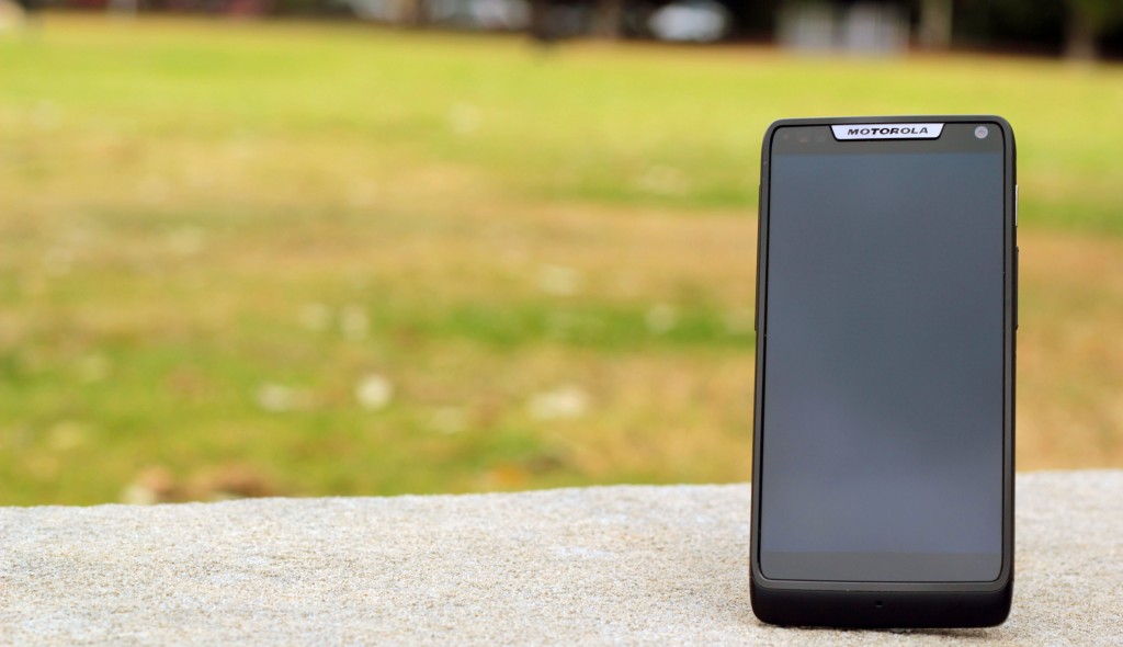
Motorola delivers a solid 4G LTE phone with a 4.3 inch edge-to-edge screen.
Motorola’s second release this month, the RAZR M is a 4.3 inch 4G LTE device. In many ways, it’s the RAZR HD’s little brother, using mostly the same internals (CPU, RAM, graphics). Where the HD brought a 4.7 inch display, huge battery and a focus on media, the M brings a smaller 4.3 inch display with minimal bezel and a respectable 2000 mAh battery. The M also misses out on HDMI output and has a lower resolution front-facing camera.
Ausdroid tested the RAZR HD earlier this month and found it to be a fantastic, well-built, capable device that would serve its prospective owners well.
In many ways the RAZR M seems to be the first real attempt to breathe life back into the 4.3 inch device class in a long time, finally bringing some serious power to the table.
The main body consists of an extremely solid “aircraft-grade” aluminum frame, with a small plastic edge at the front. The frame surrounds the front and back of the device, curving inward on the rear and making the device comfortable to hold in the hand. This phone simply will not bend.
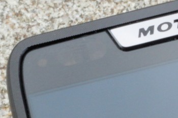
The front face is mostly screen – a 4.3 inch Super AMOLED display coated with Corning Gorilla Glass 2, with a resolution of 540×960. It’s a similar resolution to the iPhone 4/4S, although the larger screen size means the display has a lower pixel density (256ppi). Above, you’ll find a notification LED, camera and light/proximity sensors.
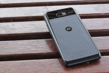
The back is covered in the same soft-touch kevlar as the Razr HD, but on the M it’s enclosed within the aluminum frame rather than extending around the edge of the device. The camera is top-center, with the speaker to the right.
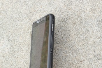
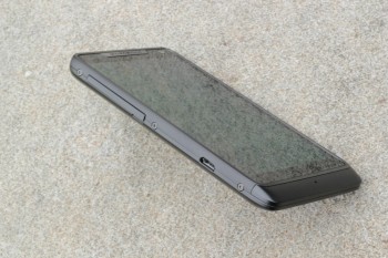
The 3.5mm headphone jack is on the top edge, to the right of the device. On the right edge, you’ll find the power button and the volume rocker. On the left edge, a cover over the SD card and Micro SIM slots, and a Micro USB socket. Both the Micro SIM and SD card can be hot-swapped without rebooting the device. Unlike the Razr HD, there’s no tray for the SIM, and you can change the SD card without removing the SIM from the device.
- Feels indestructible
- Generous 2000 mAh battery
- 1 GB RAM
- Snappy performance, no lag in testing
- Fast data speeds on 3G and 4G
- Hot-swappable SIM and SD cards
- Great loudspeaker
- FM Radio
- HD Voice on Telstra
- 8 MP camera with builtin HDR mode
- Swype keyboard built in
- Only 8GB internal storage
- Yesterday’s Android – Ice Cream Sandwich
- PenTile display
- Motorola icon design
- Non-replaceable battery
- Heavy LTE use causes a battery hit
- Can’t connect to 5Ghz wifi
- Camera sound
- LED flash
Physical Presence
The RAZR M feels great in your hand. The soft-touch kevlar backplate provides some grip to stop the phone slipping out of your hand, while the aluminum frame feels cool to the touch and gives it a decent heft. It doesn’t feel particularly fragile, and I haven’t felt the need to add a bumper or a screen protector.
Adding to the device’s already tough exterior is the water-repellent nano-coating. We saw this demonstrated at the OnDisplay launch event … but have been reluctant to carry out the tests on the review unit.
The device has a slight wedge shape, angling the screen towards you when the device is placed on a flat surface – a nice touch, showing some attention to detail. It also causes the device to feel a little top-heavy. There is also a slight texture to the metallic edges of the phone at the front – while it’s a nice design touch, it probably doesn’t serve a particular purpose.
Special mention should go to the speaker, which is considerably louder and clearer than you would expect for a phone and a speaker of its size.
Performance
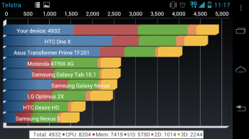
The RAZR M is powered by a Snapdragon S4 processor, the same brains behind a number of phones this quarter. It’s also the same processor as its big brother, the Razr HD. It’s great to see Motorola didn’t compromise on the CPU for the price point.
In day-to-day use, the phone performs well and didn’t suffer from the short bursts of lag that often occur on my Galaxy Nexus. There’s no point at which you feel the software is taxing the hardware too much, which is quite an achievement given that it’s not running Jelly Bean.
Software
Motorola is still running its own customised version of Android. Before you start organising a mob, it’s not MotoBlur and it doesn’t radically change the way Android works.
Motorola explained that their research showed “average users” find Android difficult to use, so their changes are based on that research and the desire to make their phones more accessible. From this perspective, many of these enhancements are actually quite welcome – I’d even go so far to suggest I’d like to see them make their way into stock Android.
The best example of this is the attention that’s been paid to the Launcher. The phone ships with just one home screen. A swipe to the left reveals Quick Settings, while a swipe to the right brings up a wizard that guides you through the process of adding a new homescreen (you can choose from some defaults or just add a blank screen). The app drawer also has a Favourites tab.
Mobile Hotspot functionality also offers a few enhancements, and can now be accessed via its own app. You can now disable the hotspot after an idle timeout (great for me as I often forget to turn it off in the morning and have a phone at 50% by midday), allow devices to connect with WPS, and you can see connected devices in the notification shade.
The lock screen has also had some minor changes, with silent mode mode toggle in the top right and additional apps placed around the unlock circle (Phone above, Text below).
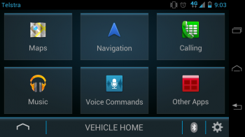
Motorola has also included “Vehicle Mode”, an alternative UI that shows large buttons and text, can read out messages and store a preferring conference call for use while driving. While this is nice, it feels like it’s just a different launcher – once you run anything other than Vehicle Mode’s own Google Maps implementation, you’re into a standard Android app and lose the advantages.
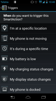
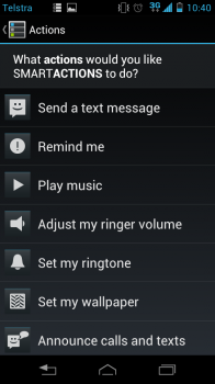
Motorola’s well-regarded SmartAction system is also present here. It pops up from time to time and offers you suggestions to help with battery management or time-specific things like “Sleep Rule”. You can set rules based on time, location, wifi connection (and a number of other criteria) to perform actions from a set list (playing music, changing volume settings, triggering reminders, sending text messages, etc).
HD Voice
In tests with a Razr HD and an iPhone 5, HD Voice produced surprisingly clear audio with little background noise. The effect is rather like a VOIP conversation in that you can just hear compression on the caller’s voice, and there seems to be an audible cut-off when the other party stops speaking. Hands-free calls were especially clear, and the device’s speaker really helps.
Data Speeds
Telstra’s 1800Mhz LTE network is great where you can get it. Speed tests have been consistently above 10Mbps, topping out at 40Mbps+ late on a Friday night in the Sydney CBD. The RAZR M also supports Dual-Channel HSPA+, which pulled down 9Mbps next to my Galaxy Nexus on 3Mbps in one simultaneous test.
Camera
The RAZR M has a good quality 8 megapixel rear camera which produces crisp, detailed photos in the right conditions. The camera has a built-in (HDR) mode which it’ll encourage you to use when it finds overexposed areas on-screen. The HDR results are quite good, allowing you to get proper exposure of the sky and ground detail in outdoor shots, and holding a lot more light in indoor shots with shiny reflective surfaces. In some cases, there’s an absence of detail (eg, leaves on trees), but this isn’t a DSLR and the camera will be fine for most users.
I took a few sample photos around Darling Harbour and Sydney’s inner west to see how the camera performed, and it generally felt easier to get a high quality photo than on my Galaxy Nexus.
The RAZR M can also capture video at up to 1080p, although this eats through your storage space pretty quickly. Video quality is good enough for capturing moments as they occur around you, but you won’t be filming a major motion picture. Lateral movement produces some undesirable results, and while you can tap the screen to refocus on whatever’s front-and-centre, you can’t choose the focal point.
Hardware
While the hardware design gets a tick in my book, the PenTile screen is a real downer. White text and grey icons show noticeable stippling. No matter how annoying this is though, it IS an effect you learn to live with. It would be great to see a premium display – something of the quality HTC used in the One X – make it into a 4.3 inch device.
Button and port placement is a curious choice. I don’t personally find any benefit to placing the USB port on the side of the device. The placement of power and volume buttons on the right edge of the device gave me cause for concern. My index and middle fingers naturally fall on the power and the volume rocker when holding the device left-handed, but holding right-handed just ran my thumb up against the volume up button. If you want to take screenshots, learn thumb yoga, or hold the device in your left hand.
Yesterday’s Android
There’s no getting around it – Ice Cream Sandwich is now a year old and as of today, two major revisions behind the main Android OS. Motorola has promised a Jelly Bean update in early 2013 for the device. It can’t come quickly enough.
I’ve been used to Jelly Bean for a few months now on my Galaxy Nexus, so readjusting has been a bit of a shock. While I don’t find the device underperforms, I’m sure Project Butter will bring an even speedier UI. Text input, corrections and dictionary management are noticeably more difficult and kludgey, and Jelly Bean’s well-known expandable, actionable notifications are noticeably absent.
Additionally, I’ve asked Motorola to advise how quickly they expect to be able to get 4.2 out for these devices, given their statements about remaining “as close to stock as possible” and this making it easier to roll out updates. I’m told my query has gone to Motorola Global, and will update with a response as soon as it’s received. This will be an interesting test for Motorola’s software team – a quick update would go a long way to addressing community concerns with Motorola’s updates since the Atrix II news from earlier this month. We’ll see if they can back up their statements.
Iconography
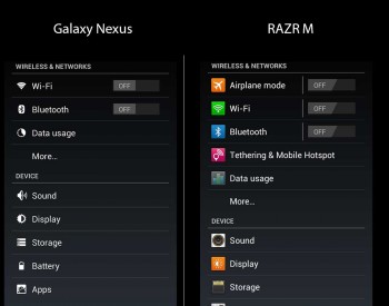
While Motorola has stayed “as close to stock as possible”, they’ve has changed many of Android’s standard icons, in many cases for the worse. The new icons tend to have a square feel and use bright, garish colours. Even the soft buttons have been changed to reflect Motorola’s old physical hardware button designs. It begs the question, why bother changing these details? It feels like change for the sake of change.
These changes seem to run counter to Motorola’s claims that they’ve made Android easier to use – for example, their Personal Hotspot uses a standard Wifi icon, which could be MORE confusing for novice users.
Status Bar / Notifications
The signal strength indicator no longer shows the connection type (E/3G/H/etc) nor Up/Down data icons. These are moved to an adjacent icon which is more like Froyo/Gingerbread, but is less visually appealing owing to the confusing baseline and differing weights of the fonts now used in the notification area.
While we’re talking about the notification area, I don’t think we need to see the carrier name in the top-left. It’s a little iOS-like, and takes up space in the notification area. I don’t see why this information needs to be on display constantly. Hopefully Motorola will change this with Jellybean, which displays the current connection (carrier, or wifi name) in the pull-down notification shade.
Video Playback
I tested video playback withan SD AVI, SD MP4 and a 720p MKV. The built-in video player was able to play the files, although the MKV played without audio.
In general, playback issues can be solved through use of a third-party video player like MX Player, which was able to play all the files without issues.
Quick Settings
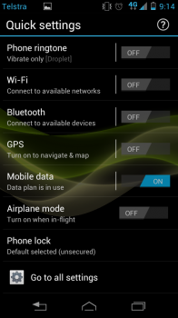
As a concept, this area is a nice expansion of the idea of toggle banks as seen in many power management widgets, but it lacks customisation. Options available are Ringtone, Wifi, Bluetooth, GPS, Mobile data, Airplane mode and Lock mode. There’s no setting for screen brightness, Personal Hotspot, or 3G / 4G data connectivity, and no way to manage the items shown in the Quick Settings screen.
In the end, I installed Power Toggles from the market and used it to construct a notification widget. This wound up being more convenient as the toggles were available from the notification shade at all times, instead of going back to the homescreen and moving left.
Smart Actions
As with Quick Settings, I found Smart Actions useful but only to a point. My scenario for Smart Actions was to turn on data tethering automatically and switch to 4G when I get to my breakfast cafe in the morning.
The first problem I encountered was that to use a location-based trigger I needed to agree to let Motorola track detect my location using its location tracking services. This was a bit puzzling since I already turned on GPS and Google’s location service. Instead, I decided to go for a 1 hour time period from 8am to 9am.
The second problem was that the action list didn’t include Personal Hotspot. Finally, while there was a trigger that allowed me to control mobile data, it’s either On or Off – it didn’t allow me to switch between connection types.
Smart Actions are still quite good for simple tasks (for example, my phone goes to silent mode at 10.30pm each night). I’m hoping Motorola can add better actions and triggers.
Other Niggles
Even when the device is silent, a harsh camera-snap sound (like a photo being taken and a flash discharging) rings out when you take a photo. There doesn’t seem to be an option to disable it. Worse, it also sounds when you take a screenshot. The real annoyance comes when you have music playing over your headphones – the camera-snap sound AND your music plays out the loudspeaker, letting everyone around you know you’re listening to Justin Beiber just because you took a screenshot on a crowded train.
Although Chrome is a headline feature of the phone, the app itself is tucked away inside a Tools folder. There’s no browser in the tray on the default homescreen.
I also noticed that thumbnails were noticeably jaggy in the Gallery and Recent Apps list. I know from my Galaxy Nexus and Nexus 7 that these images should be scaled smoothly. This might be a shortcoming of the graphics hardware, or Motorola’s drivers. It could also be a conscious choice to avoid UI lag.
Motorola RAZR M
- 4G LTE, DC-HSPA 3G
- Android 4.0 (4.1 promised)
- 4.3″ 540 x 960 Super AMOLED Screen
- 2000 mAh battery
- 8 MP rear camera, 0.3 MP VGA front camera
- 8GB internal storage, up to 32GB microSD
- 60.9 x 122.5 x 8.3mm, 126 grams
- Approx. 14.7 hours Talk Time (3G)
- Approx. 250 hours Stamdaby Time (3G)
The RAZR M a great performing device with up-to-date hardware and connectivity. It feels different to its contemporaries with its premium quality materials and solid construction, and shows that Motorola is intent on delivering great performance across its product line, rather than just playing catchup to the giant flagship devices now common in the Android world.
The number of disbelieving looks I’ve received from friends when showing them the phone is quite telling. It’s only after picking the device up and playing with it that they start to change their mind and accept that bigger might not always be better.
It’s obvious some corners have been cut to bring the phone in at the $600 price point, and while it’s easy to cry foul over things like the small internal storage, PenTile display and older Android OS, there are no ACTUAL dealbreakers in the Cons list.
Motorola has delivered in the RAZR M a 4.3 inch powerhouse – something we haven’t seen in a while. It might be a tough sell to the Nexus owners in the community, but to consumers looking for a good price-to-performance balance, the RAZR M is definitely worth a look as either an outright purchase or on a contract.
Addendum
While this review has been in the works for a few days, the stars have aligned in such a way that the new flagship Nexus device – the Nexus 4 – has launched on the same day. Were you to buy outright, the RAZR M would leave you with around $200 less in your pocket, so it’s worth looking at what that $200 gets you.
Firstly, the device size doesn’t change. The Nexus 4 is still a large 4.7 inch device. One of my favourite things about the RAZR M is its 4.3 inch size, and it looks like there won’t be a Nexus class device in this size for the forseeable future.
Secondly, you get 4G LTE connectivity. Telstra’s LTE network – where you can get it – is pretty much the fastest mobile broadband service you can get today.
Finally, you get the ability to use add to 32 GB storage space to your device using a Micro SD card. If you’re watching video on the go this could be an important factor.
It’s also worth noting the benefits the Nexus 4 offers over the RAZR M – wireless video connectivity, a newer Android operating system (2 versions in front).
Updates
- The phone can be unlocked through Motodev, Motorola’s developer site. From reports we’ve received, this is a fairly pain-free experience.
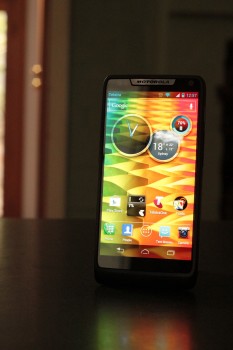
Screen brightness doesn’t disappoint
Quick Settings, no customisation
Icon Changes – Settings Menu
Icon Changes – Standard Apps



I read, RAZR M’s getting Jelly Bean in the US already….why do we have to wait? Is this because Telstra needs all the time to add bloatware?
Just because it’s out in the US doesn’t mean it should suddenly be available here. In all likelihood the delay is simply customisation for Australia (eg, we don’t dial 911 for emergencies) plus the carrier approval process.
The phone comes with the Telstra One app installed and some BigPond homescreen widgets. I don’t think they really count as bloatware.
Your example is poor – all emergency numbers work, all Android software will override lockscreen/airplane mode/no SIM for 999, 911, 000, 112, whatever.
The truth is the update is delayed because Telstra need to cook their shitty bloatware apps into the package. They’re bloatware in that they’re added on by the carrier and serve little purpose – sounds like bloatware to me.
Great review, mate. I’m hoping to get one within a few months when Telstra exclusive deals are over – I hate those kind of arrangements.
I like the fact that the loud speakers are loud and clear so people like myself can use it hands free in the car.
Apologies, you did mention it. That was the killer for me otherwise I would have ordered one already.
Excellent review but worth mentioning the micro SIM for those that like switching between devices.
Great review
I still like the RAZR M. It’s an excellent consumer phone on a plan for someone that wants Android in a similar size to an iPhone.
I got to play with a Razr HD at JB Hifi, and that soft Kelvar back is really really nice. I wanted the phone purely because of that. The old Razr was horrible to hold, but I loved that phone’s feel.
But yeah, as of today it better be pretty effen impressive phone to get a sale.