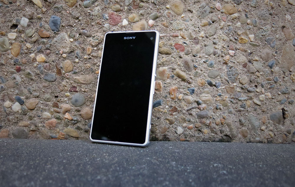
It’s been a long road to market for Sony’s pint-sized powerhouse, the Xperia Z1 Compact. We first heard rumours that the device would arrive in a Japanese-only “Z1 F” incarnation in October of 2013, and Sony was quick to deliver on those rumours at the end of that month. Fast-forward to the end of March 2014 and the device has finally made it to market in Australia.
Size Matters
In the Z1 Compact, Sony is out to prove that bigger doesn’t necessarily equal better. It’s an amusing edict to see in Sony’s marketing materials, given their recent forays into over-6-inch screen sizes with their Xperia Z Ultra and the just-released Xperia T2 Ultra.
If we take a look around at other major players in the market, we see Nokia’s recent efforts to diversify the sizes in which it offers Windows Phone, and rumours that Apple will be “going large” when the new iPhone hits later this year. To me, this proves that there is indeed demand for smartphones at different sizes for different audiences, and a manufacturer should be able to find a market to address at each size increment if done right. Maybe we shouldn’t be so quick to ridicule Samsung’s device-at-every-screen-size approach.
The Android market these days seems to have settled on a 4.7-to-5.2-inch “main” size, with larger (Z Ultra, One Max and Note) and smaller variants (the Z1 Compact, One Mini and Samsung’s Sx Mini range) following the main phone to market. It seems as much a reaction to Samsung’s runaway success with the Galaxy Note series as it is an answer to constant criticisms that phones are getting too big.
That criticism is something I brought out rather a lot between 2012 and 2013, as I went from the Nexus S (4.0 inches) through the Galaxy Nexus (4.65 inches) and Nexus 4 (4.7 inches) and finally settled on the HTC One which also featured a 4.7 inch screen, but in a larger body. Eventually I gave in and now I find that the large “new normal” form factor allows me to type better on my phone’s virtual keyboard and offered other benefits (like being able to read content without squinting).
Having come to terms with that “new normal”, it wasn’t until I got my hands on the Moto G at the end of 2013 that I realised what I’d missed in small phones. The Moto G isn’t exactly small in comparison to some older smartphone forms, but at 4.5 inches it definitely registers as “petite” these days. Being able to handle a phone with one hand without worrying about it overbalancing or stretching my thumb to reach the far top corner of the screen was a welcome change, and my Moto G still finds itself in regular use.
It’s into this comfort zone that Sony delivers the Xperia Z1 Compact. It’s a small phone that – unlike some of the other examples above – manages to retain almost every spec of its big brother – last year’s well-received Xperia Z1.
In our review of the Xperia Z1, we judged the phone a strong contender that ran rings around 2013’s flagships owing to the technology available in its second-half release window. The Z1 Compact has had some of those tables turned on it, but still shines, depending how you look at it.
Can the little brother of one of 2013’s most overlooked devices find a niche against 2014’s superphones? Did Sony go too far in shrinking the big Z1 down to a 4.3-inch screen?
Note: As the Z1 Compact is generally a derivative of the Xperia Z1, we’re going to mainly focus on the differences and selling points of the Z1 Compact against the older Z1.
- Well-specced for a “Mini” unit
- Best screen we’ve seen on a Sony device
- Sony scores again with a waterproof device
- Smaller screen can be fiddly for typing
- Camera button is a bit of a disaster
Hardware
It’s a pretty straightforward story here – the Z1 Compact shares all the design traits of the Xperia Z1, just shrunk down. It fits comfortably in your hand in a way the Z1 never quite managed because of its excessive top/bottom bezels. Those bezels however have also survived the translation to the smaller device, but now they seem less offensive.
One-handed operation of a phone is something we seem to have abandoned in the age of 5-inch phones, but you can handle this on the Z1 Compact with relative ease. It’s kind of like a lost art – one of those things you don’t really notice until you realise it’s possible. Whichever hand you hold the phone in, your thumb can reach the opposite top corner of the screen without having to perform finger gymnastics.
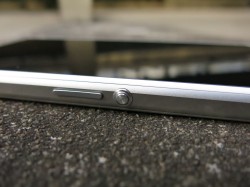
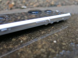
Whichever hand you hold it in, the phone’s physical controls work fairly well. In your left hand, your index finger falls naturally onto Sony’s trademark big round power button on the right edge, and can easily move to the volume rocker just below it. In your right hand your thumb takes on those duties, and while you’ll need to bend your thumb a little more you never feel like you’re in danger of losing your grip on the phone.
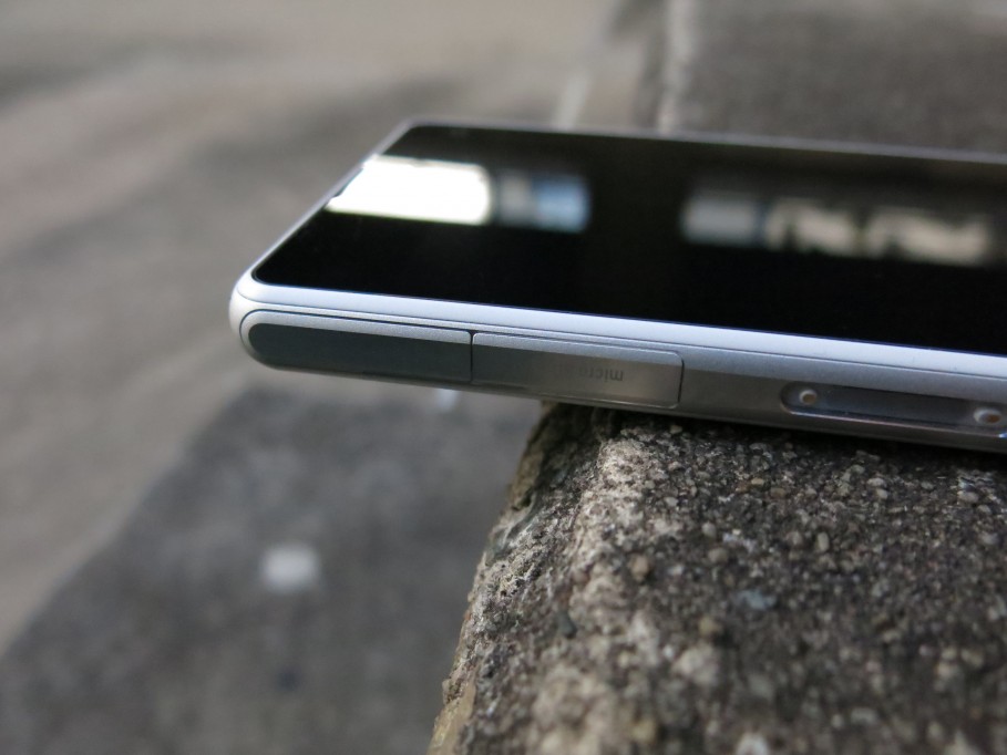
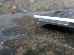
Port placement has changed in the miniaturisation process – everything now lines the left edge of the phone. At the top there’s a Micro USB jack and Micro SD slot, while the SIM slot is at the bottom and in-between is Sony’s proprietary magnetic connector introduced on the Z1 and Z Ultra. This connector is actually pretty a awesome move from Sony as users are able to connect docks and battery cases without compromising the waterproof features of the phone.
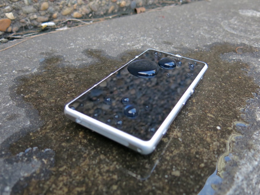
The Z1 Compact shares its big brother’s IP58 rating, accomplished by airtight seals and flaps protecting its assortment of ports. Thankfully – as with the Z1 – the headphone jack is left uncovered but without support for wireless charging – again, as with the Z1 – you’ll need to use the USB port every day, so you’d better get used to undoing that particular flap. The flaps are molded and attached in such a way that they can be moved fairly freely and can be spun around 360 degrees. We haven’t seen any widespread reports of the older model Xperia’s flaps breaking off, so this bodes well for the durability of Sony’s design. Ultimately, the flaps on the Z1 Compact are far less offensive than we’ve seen on the Galaxy S5.
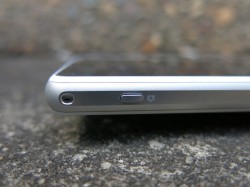
Sony hasn’t moved the built-in speaker (it’s on the bottom edge of the phone) or the headphone jack (top edge). The Z1 Compact’s sound quality stacks up remarkably well against HTC’s BoomSound, now the standard-bearer for phone speakers, and the device provides high quality audio that sounds good even when the volume’s turned all the way up. I don’t recall the Z1’s audio being quite this good.
It’s not all good news, though. The camera button, a popular addition to the Z1, seems like an unintended casualty of the miniaturisation process. It’s also been shrunk down, and it feels like an afterthought rather than a feature. Its position near the bottom of the right edge of the phone means that you actually do need to contort your fingers around a little if you’re operating the phone one-handed, and end up folding the phone uncomfortably between your thumb and index finger. It’s also a two-step button, so it functions like the shutter button of most cameras. A half-press focuses your shot, and a full press shoots. The effort required to actually get to that full press often results in you moving the phone and either ruining the focus or just blurring the shot.
While most of the phone’s physical aspects haven’t really changed much, Sony’s changed a few things about the screen in the Z1 Compact. Most obviously, owing to the smaller size of the device, its now a 720p unit. It also no longer features the controversial protective coating of previous devices, as evidenced by the scratch the review unit seems to have picked up despite being carried around in a protective bag for the review.
The biggest and best difference is the fact that Sony has stopped using sub-par screens in their flagship devices. The Z1 Compact’s screen is sharp and clear, and can be viewed while outdoors. However, it never quite approaches the brightness levels and outdoor legibility of other devices like the Nexus 5 and Galaxy S5.
The one disappointment of the Z1’s hardware might just be that the phone’s design is now starting to feel a little bit same-y. We’ve seen this from Sony in the Xperia Z, it evolved a little in the Z1 and Z Ultra, and even the Xperia Z2. On the Z1 Compact, Sony’s design language delivers a phone that feels a bit thicker and a bit heavier than it should be.
At 137 grams, it tips the scale a bit over the One Mini (122g) and is almost half the weight again of Samsung’s waif-like Galaxy S4 Mini (107g). Ultimately, we’re talking 20-40 grams weight difference though. A smaller phone doesn’t necessarily need to be lighter, so there’s little in it other than a personal preference.
Performance
The Z1 Compact’s quad-core Snapdragon 800 is no longer the head-turner it once was. Times have changed, and our attention is now focused on the next generation silicon that’s coming down the line right now, and later this year.
This doesn’t make the Z1 Compact a slouch, though. The Z1 was regarded as one of the fastest devices around at launch, and the Z1 Compact inherits the silicon, reputation and real world performance.
In general use, the device is snappy and responsive. Apps open quickly, and the OS never misses any touch events on the screen. It feels like the Z1 Compact isn’t really going to break a sweat keeping up with you, and indeed it doesn’t disappoint.
For comparison of the phone’s performance, we go to the benchmarks. The Z1 Compact scores a respectable 33,966 in Antutu (near the performance of a Galaxy Note 3), and 933 (single core) 2,655 (multi core) in Geekbench 3.
Battery Life
Another casualty of the miniaturisation process is the battery. Where the Z1 carried a 3,000 mAh battery within it, the Compact’s smaller body can only house a 2,300 mAh cell. This battery is powering mostly the same hardware as the Z1, with the exception of the screen, and so it does seem to drain a little quicker than I’d like.
To avoid disappointment, you’ll probably want to keep a charging cable on your desk at work. Sony will also happily sell you a USB Battery if you decide you need one.
Camera
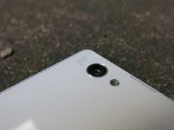
There’s not a lot to say about the Z1 Compact’s camera that hasn’t been said before about the Z1. The hardware setup and software are both the same, and the camera produces about the same results as the Z1.
Shots taken in the camera’s default “Superior Auto” mode (way to be humble there, Sony) are generally clear and crisp. The software is always analysing what you can see in the viewfinder and tells you which mode it’ll use to take the shot as you move around. Put an object close to the camera and it’ll switch to Macro; point the camera at some scenery in the distance and it’ll switch to Landscape; point it at text and it’ll switch to Document.
The same criticisms that were leveled at the Z1’s camera and software again apply here. The 20.7MP camera produces nice results when downsampled to 8MP, but it lacks detail at full resolution in manual shooting mode.
While the results from the Z1 Compact’s camera can look great under the right circumstances, I just can’t personally seem to find a huge benefit delivered by the camera’s huge 20.7MP sensor. Detail in many shots is lost because of the size of the pixels, and the camera seems to shoot maybe a step or two too bright and wash out some of the details. You could address this with manual exposure controls, but that defeats the point of using Sony’s “Superior” Auto mode. In low light situations, light sources in frame tend to bleed fairly significantly and result in a disappointing shot, especially when you put it up against something like a Nexus 5. When shooting cityscapes, the results look fantastic – just don’t look too close.
Sony’s software still isn’t doing enough smart stuff to help users get the best shot. I still had to jump through hoops to get the phone to shoot in HDR (which is hidden away in a menu AND a scene selection once you’ve switched to Manual mode).
The Google Camera can shoot at the rear camera’s full 20.7MP resolution, but can’t access modes like HDR. Other apps like Focal are able to get HDR happening, though the results don’t seem to be as effective as Sony’s own app.
Location Frustration
One aspect I found disappointing on the Z1 Compact was the GPS performance. The review unit took a while to get a reliable location, and didn’t seem to stick in one place for very long.
Setting the phone down on a table outside at a local cafe of a Saturday morning, the current location bounces around a lot within about a 100 meter radius in Google Maps, despite engaging “High Accuracy” mode. The Nexus 5 – right next to it – stays in one spot.
Taking the Z1 Compact out for a walk (OK, playing Ingress), again in High Accuracy mode, the story is even worse. The current location seems to lag by about 30 seconds, and even gets inexplicably stuck in one place fairly frequently. It’s enough to really frustrate if you rely on an accurate location fix.
Software
Out of the box, you’ll get Android 4.3 with Sony’s now-familiar OS modifications and apps preloaded. This shouldn’t come as a surprise to anyone. During the review period, the KitKat update finally landed, but didn’t change much by way of features.
Sony’s historically taken a light touch to modifying Android, and seems to make a few cosmetic changes for changes’ sake. Some of Android’s standard UI elements are redesigned and customised, but the result is still closer to Android’s standard UI than the heavier UIs from HTC and Samsung.
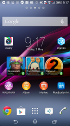
As with the Z1, Sony’s custom launcher is good enough for general use and can of course be changed if you prefer a third-party launcher. I installed the Google Now launcher (download it here) and found that it suited the Z1 Compact rather well – where icons and UI elements were almost comically large on the Nexus 5’s 5-inch screen, the smaller dimensions of the Z1 Compact made everything a lot more comfortable to look at and use.
By default, Sony’s user interface is far more animated and lively than most Android devices. Dialog boxes unfold onto the display and fade the background to black for visual focus, checkboxes animate when checked/unchecked, widgets animate on the default home screen, the launcher leads you around the UI with some subtle movements and screens transition in and out of the display swiftly. It’s a bit of a personal preference as to whether or not you appreciate the effects, and while it wasn’t intrusive I did find it all a bit too showy for my liking. Animation of the OS-wide UI elements can fortunately be (mostly) removed through the Animation Scale settings under Developer Options, but some of Sony’s additions don’t respect this setting.
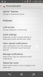
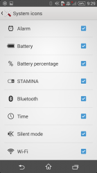
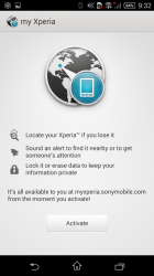
Sony also offers a few welcome extras for configuration. You can change the “system” icons that appear in the notification area, so if you’re really bothered by the location icon showing up when GPS is in use you can disable it. There’s also a My Xperia service to help locate and lock lost phones – a welcome addition that’s becoming standard these days.
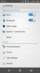
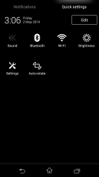
In Android 4.4, Sony has finally embraced Android’s dual-shade Quick Settings UI model, but has implemented it in their own way. The Quick Settings toggles have now been moved to the separate page and redesigned as white/grey-on-black icons instead of buttons, but you can still edit the order in which they appear. Quick Settings appears to be an area in which OEMs are now easily besting Android’s own default implementation, and Sony’s version seems to implement most of the toggles users will need. The recent KitKat update to the Z1 also made the same changes on that device.
One thing I noticed while running Android 4.3 was the camera app – specifically, how many times it crashed, and required a reboot of the phone. The KitKat update seems to have addressed this problem though, and waiting for that update is one of the reasons this review is appearing so late.
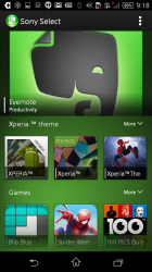
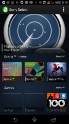
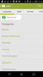
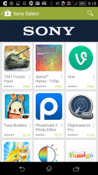
Sony has a fair number of preinstalled apps as you might expect, but also has a number of apps available on Google Play through a custom Sony Select category. Sony Select also serves as an app curation and discovery service on-device, broken out as a separate app store in Sony’s launcher although it ultimately points users to the apps on Google Play for installation.
Sony’s built-in apps:
- Album (Sony’s photo gallery app + more)
- Movies (Sony’s movie store)
- Playstation Mobile
- Power Management
- Sketch
- Smart Connect
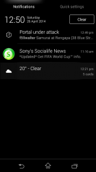
- Socialife News
- Sony Select
- TrackID
- TrackID TV
- Video Unlimited
- Walkman
- Xperia Lounge
Many of these apps also featured on the Z1, and are Sony’s standard install for their devices. There were some notables in that list, though.
Sony’s Album app surprised, disappointed and surprised again. It appears to discover shared servers and playback devices on my home network (including 2 NAS boxes, 2 Sonos Play:1 speakers and a Plex Media Server), but was unable to actually list any video files from either source. The Movies app however was able to browse and play back video properly from my NAS and Plex Media Servers.
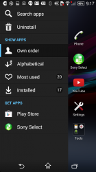
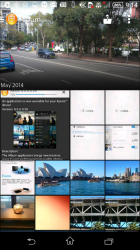
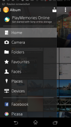
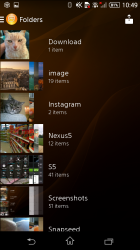
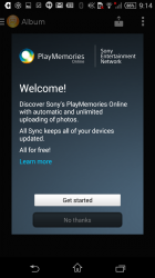
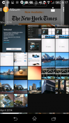
Just as I was getting ready to return the review unit, an update to the app arrived. The new Album features an updated design, with a highlights area at the top rather like HTC’s Gallery arranges photos by month, and lets you zoom in/out to adjust thumbnail size. It includes a proper Android-style navigation drawer and offers integration with Sony’s PlayMemories Online service, to back up and sync photos.
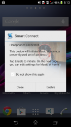
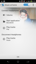
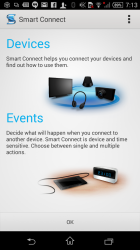
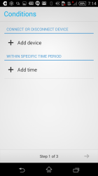
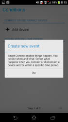
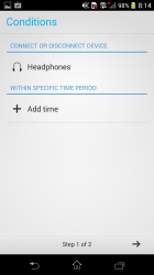
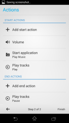
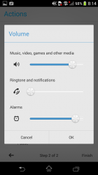
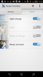
Another useful addition is Sony’s Smart Connect application. This app allows you to automate actions when some things happen – for example, you can turn the volume on your notifications down at 10pm, start a specific app when you connect a certain bluetooth device, or make the phone completely silent when you plug the charger in. Smart Connect’s smarts only go so far, however – it won’t take action based on your location, and won’t detect a trigger like an NFC tag (Sony has another app for that, though).
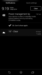
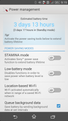
Sony has a few neat tricks to lengthen the battery life of its phones. First of all, it can disable data when the screen is switched off (although personally I don’t really like that approach). It can only turn on wi-fi when the phone knows its in a location where a known wi-fi network exists, and of course it can disable features when the battery is low. These are all customisable through the Power Management app.
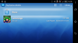
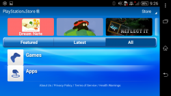
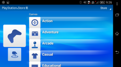
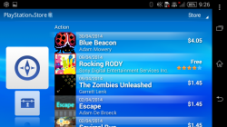
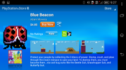
Sony’s PlayStation Mobile service is again present on this device. The app is really starting to show its age, and doesn’t seem to fit with the rest of the modern Android ecosystem – it has its own store, can only be used in landscape mode, doesn’t conform to the UI on the rest of the device and you can’t launch the games outside of the app itself, so it’s completely separate. It seems like Sony’s making an each-way bet on how you should be obtaining apps for your device. It’s not straightforward. I wonder how many sales they’re actually making on the apps sold through these alternative storefronts, or if they’re selling them at all (I don’t know why I’d pay $4.05 for what looks like a Mario clone you can see in the screenshots).
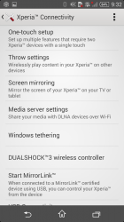
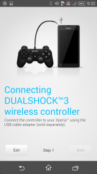
Sony also provides native support for Dual Shock Playstation controllers (useful with this app)
There’s also some bundled third-party apps:
- File Commander
- McAfee Mobile Security (requires registration)
- MobiSystems Office Suite 7 Viewer (upgradable to Pro for $9.99)
- Pixlr Pro
Of course, the Z1 Compact also includes Google’s mobile suite – Play Music, Books, TV and Movies, Games and Newsstand; Chrome, Gmail, Maps, Hangouts, Calendar and YouTube.
Sony Xperia Z1 Compact
D5503
- 4.3 inch, 720p display (342 ppi)
- Quad-core 2.2 GHz Krait 400
- 2GB RAM
- 16GB Storage, microSD (64GB)
- 20.7MP rear camera, 2MP front
- Wi-Fi 802.11 a/b/g/n/ac, Wi-Fi Direct, Bluetooth 4.0 w A2DP, NFC
- GSM 850/900/1800/1900
- HSDPA 850/900/1700/1900/2100
- LTE 800/850/900/1700/1800/1900/2100/2600
- Android 4.3 (4.4 update available)
- IP58 rated – water/dust-resistant
- 2300 mAh battery (sealed)
- 127 x 64.9 x 9.5mm, 137g
It seems the “Mini” devices might always be a generation behind their big brother flagships. Before we get disappointed by the comparison though, it’s worth remembering that the screen resolution compromise usually brought about by the smaller screens usually means the system’s guts actually don’t need to be as powerful as the larger devices. They’re pushing less pixels, so they end up with performance benefits and perhaps even battery life benefits. In this respect, the hardware on offer in the Z1 Compact is actually pretty top-notch.
Is it a phone I’d stick with, long-term? Unfortunately, no. For all the railing I’ve done against huge phones, I’ve come to realise I’m actually rather set in my ways now. The 4.3 inch screen is, by modern standards, perhaps a little too small for interacting with Android if you’re used to the larger expanse offered by 2013 and 2014’s superphones. The body of the phone could certainly accommodate a 4.5 inch screen like the Moto G by simply reducing the size of the bezels around the screen. Ironically, perhaps the Z1 Compact’s draw is also its downfall.
I’m also more likely to stick with my Nexus 5 not because of a preference in form factor or size, but because of the software and the speed at which my device gets updates. Sony managed to bring KitKat to the Z1 and Z1 Compact in April, but it’s still taken nearly 6 months to do so (the Z1 Compact was on the market in Japan for a lot of this time), and the Xperia Z is still waiting.
If you’re looking a compact phone though, you won’t be comparing this with the flagship phones. The competition is really 2013’s S4 Mini (until the S5 Mini makes an appearance) and the One Mini. The Z1 Compact bests both of these phones on features and performance, and despite software issues, the camera will deliver superior results.
The Xperia Z1 Compact is currently exclusive to Telstra until later in May, the Z1 Compact runs $552 outright but is also available on a variety of plans. The handset supports Australian 4G networks, with the exception of Optus’ nascent 4G Plus network.





Hey, do you know if this phone will eventually work on Optus 4G??
Hi Grwhi1, The Z1 Compact will work on Optus 4G, it won’t however work on Optus 4G Plus which uses a different frequency for LTE.
Jason, were you running 4.3 when you tested the GPS on the Z1 Compact?
Did it improve after upgrading to 4.4?
Initially yes, but it didn’t improve under 4.4.
Nexus S was 4 inch.
If you turn on the built-in stamina mode, this thing will easily do 2-3 days of pretty standard use on a single charge, even with the standard communication apps like WhatsApp, etc white-listed. It’s actually kept me from going to a non-stock rom. The camera button actuation force is a serious design flaw though, and for me the screen is still pretty disappointing on viewing angles and contrast.
I’ve had mine for 2 weeks now. Completely agree with the fiddliness of the camera button. I’ve gone back to using the on screen button. The only thing I’d point out, from my use, is that I leave the auto-sync off as I rely very heavily on my Nexus 7 for most browsing/apps, so I’ve easily gotten through two days of casual use from the battery. It’s amazing how much power it takes to keep things synchronised. I also wish you could delete the facebook app. I’m not sure whether to blame Sony or Telstra for making it so I… Read more »
To solve your apps problem, use Root Uninstaller Pro.
It lets you uninstall system apps, which is what Twitter and Facebook are usually set as.
It makes a backup of every app you install or update. That backup feature is worth it for being able to do a roll back when an update is useless.
Thanks JeniSkunk, I’ll give that a try. That backup feature sounds very handy!
Only caveats with the app backup is, it will need a decent chunk of space on your SD card, and that it only backs up the app installers and not the app data.
I still have Titanium Backup on my devices for doing a full apps and data backup/restore.
All told, since I started using it in mid 2011, I have about 2.5Gb in total of individual versions of app installers backed up via it, from use across 4 devices.
Ben, have you hit the same issues Jason did with the GPS?
Not sure. I don’t use the GPS on it in any noticeable way apart from Strava. For navigation I use my N7. What I have noticed is that it never gives an accurate location for where my car is parked, but it does turn on wifi when at a location it should be on.
Thanks Ben.
I was thinking of getting one to replace my LG Optimus One. But if the Sony GPS is flakey, which it seems to be when I check on Google, then I get to keep hunting.
Annoying.