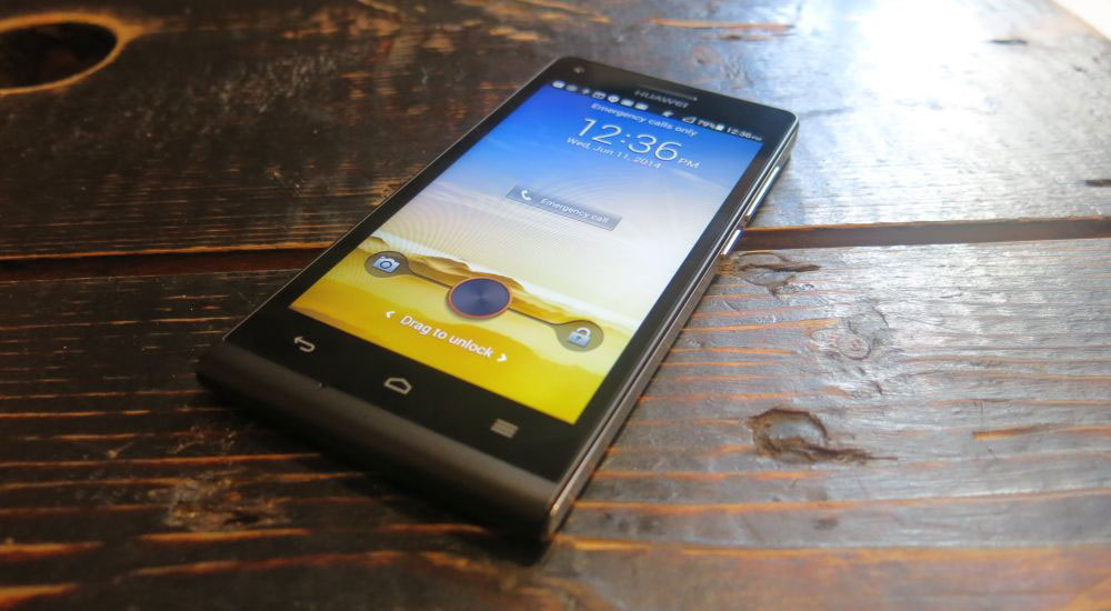
Huawei has been evolving in front of our eyes for the last couple of years. Bit by bit, device by device, the Chinese manufacturer has been releasing handsets designed to appeal to a more upmarket customer than some of the bargain-basement handsets we’ve seen them deliver in the past.
Until recently, a Huawei handset has meant “cheap and cheerful” – device construction nobody would write home about, average internals and – most egregiously for those of us in capital cities who like our data connectivity – 3G-only. Last year’s Ascend P6 marked a turning point for the company, though. Huawei’s design turned heads, won awards and made their phones considerably more appealing to a fashion-conscious consumer – a market they hadn’t previously been able to crack.
Whether or not the P6 entirely found its mark with consumers is open to question. I haven’t seen anyone rocking one on the streets of Sydney, but the attention garnered by the design has encouraged Huawei to stick with it. In the same way that Samsung devices are now recognisably Samsung devices, the Ascend P6 has become Huawei’s “design DNA”. The Ascend G6 shares much of the P6’s design with a few tweaks and updates, and we’re okay with that.
Huawei has finally addressed the major issue that dogged its handset reviews in 2013 – the lack of 4G connectivity. The G6 brings 4G LTE on major Australian carriers and thus puts Huawei back in the fight in carrier stores – it’ll be offered by Vodafone and Optus on-contract to customers, the first time in a while that the Huawei brand has been seen in the postpaid end of the market. You’ll also be able to buy the G6 outright through Huawei’s regular retail channels for the tidy sum of $329.
The G6 made a good first impression at its launch event. Read on to find out if that lasted.
- Small & easy to hold
- Affordable LTE device
- Capable but limited camera
- Last-gen physical buttons
- Software additions aimed at power users
- Android 4.3 – in mid-2014
Hardware
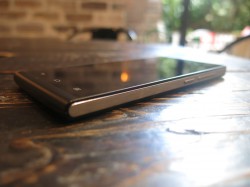
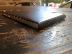
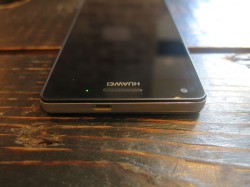
The Ascend G6 is light and comfortable to hold in the hand. The 4.5 inch IPS screen lends itself well to one-handed operation, and none of the controls are ever out of reach. The design of the phone looks a little like a pocket notebook with the black front and back curving around the bottom edge of the device in what seems like a bull nose effect, and there’s a slight but pleasant taper to each of the edges meaning the phone never feels like it’s going to hurt your hand if you hold it too long. It’s an attractive look, and has caused a few people to take a second glance at the phone as I’ve been using it.
In a marked departure for Huawei (which has been trumpeting its own inhouse CPUs for a while now), a quad-core Snapdragon 400 CPU clocked at 1.2Ghz is running the show. It’s paired with a Qualcomm Adreno 305 GPU and 1GB of RAM. There’s 8GB of storage built in, with a Micro SD slot allowing you to expand that by up to 32GB.
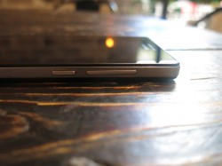
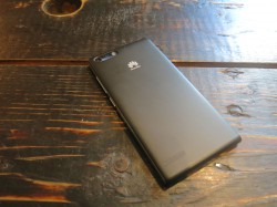
The phone can easily be confused for its older brother, the Ascend P6, and it’s interesting to see where Huawei’s evolved its design. The button configuration on the right edge has been flipped – the volume rocker is now above the power button, which can take some getting used to if you’re coming from a Samsung or an LG device. The biggest difference though is that the back of the phone is now removable – the entire black backplate can be pried off the body, revealing the Micro SD and Micro SIM slots, a sealed-in battery and prominent NFC antenna.
The headphone jack remains at the bottom of the left edge, a placement that’s sure to spark arguments depending on the shape of your headphone jack (my solution is simple – use a Bluetooth headset). The blank headphone jack pin that shipped with the P6 is absent here, probably because there’s no need for a SIM ejector pin any more.
The Micro USB port meanwhile seems puzzlingly located on the top of the phone, in a similar off-centre way that we’ve seen on the HTC One (M8). While it’s a bit bewildering, it probably couldn’t have been placed elsewhere given the curved lower edge of the device. It’s also – annoyingly – what I consider to be “upside down”.
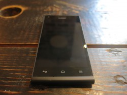
Huawei’s stuck with physical capacitive buttons lining the bottom of the phone’s face in a back-home-menu configuration. While opinion is split in the team as to whether we want onscreen buttons or not, this is a decision that’s allowed the G6’s screen space to be maximised. It’s also nice to see the back button on the left of the device. Huawei’s choice of a menu button might be a little disappointing to see in 2014, but it allows them to neatly sidestep the need for an onscreen menu button in old apps. Its doubling as a multitasking button with a long-press is a bit confusing, though. Google Now is available with a long-press of the home button.
Screen
Huawei’s given us decent screens in their devices in recent years, and the G6 is no exception. The G6’s IPS LCD display may not have anyone raving about it, but its perfectly serviceable for a phone in this price range, and when the backlight kicks in it seems capable of lighting a dark room.
At 540×960 resolution, the phone lags a little behind the likes of the Moto G in terms of pixel density. While Huawei doesn’t seem ready to join the HD ranks at this screen size, the G6’s screen doesn’t feel like it’s particularly low resolution, and it provides decent viewing angles.
Connectivity
Huawei’s big addition to the G6 is a very welcome and very overdue one – it’s finally brought 4G LTE connectivity on major Australian networks to its product range, or at least to the mainstream carriers. The G6 won’t use the coming 700Mhz networks, and support for Optus’ 2300Mhz 4G Plus network is – as is often the case – notably absent, despite the test Optus SIM provided for the device.
Beyond the addition of 4G, the G6 also brings 2G and 3G connectivity on all our networks, Wi-fi b/g/n, Bluetooth 4.0 with A2DP and NFC. There doesn’t appear to be any support for TV-out, which is a little disappointing when you notice one of the bundled apps.
When connected with USB, the G6 acts like an old-school USB device where the storage is mounted/unmounted rather than a more modern MTP-style connection.
Battery
The G6 has a sealed-in 2000mAh battery. It’s not huge, but it’s also only pushing a Snapdragon 400 with a sub-HD screen.
Huawei ships the phone with some power saving controls built in. You get Normal, Smart and Endurance modes which change how aggressively the phone’s CPU and network usage are managed, allowing you to eke out a little extra time if you need it. The software also tells you how much extra time you’ll get by changing a particular setting, which is a nice touch.
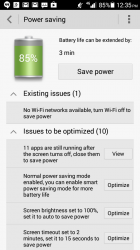
You also get a wizard to provide advice on saving battery power. Although many of its suggestions are common sense (turn off stuff to save power), some of those are things I like to manage myself, so I’d get little benefit from that wizard but other users will find its input welcome.
Sometimes, the recommendations seem almost like a little too much work for a little return like the below example, where I could extend my battery life by a whopping 3 minutes if I changed almost every setting. There’s also a big “Save power” button that you can hit to enact all of its suggestions.
Unsurprisingly, running taxing applications (for me, that means Ingress) will knock the device’s battery life out in a matter of hours. If you do find yourself running out of juice, it takes about 2 hours to fully charge from a 2.1A port.
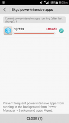
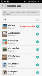
Amusingly, these controls also detect and report on “power intensive” apps so you can shut them down if needed. Besides Ingress, the main culprit appeared to be Huawei’s own Gallery app. Hmm…
Performance
The G6 isn’t running top-spec hardware, so you shouldn’t expect top-spec results. We’re talking about a $329 phone here.
Overall, performance seemed snappy enough while navigating the OS. Installing and launching applications occasionally took a bit longer than expected, leading me to doubt the speed of the device’s built in 8GB storage in a way similar to 2013’s Ascend Mate.
Sound
As you’d expect, it’s no BoomSound, but that’s not really a fair comparison. What you do get instead is a simple rear-facing speaker and a couple of raised dots on the rear cover that stop the speaker getting muffled (at least, that’s true on a hard surface).
The volume on that speaker can go up surprisingly high, although you wouldn’t want to listen to music on it for long periods at that volume because it’ll just distort. It also makes the whole body of the phone vibrate rather a lot. For incoming calls and alerts it’ll definitely be heard. Take it down a few notches though and you’ll be able to listen to music comfortably, for example in a quiet room.
Sound output through the headphone jack is pretty standard, and the volume on offer here is again quite welcome. There’s also an FM radio receiver on offer – as usual this requires your headphones to be connected for use as an antenna.
Camera
Huawei has surprised us with the cameras in their devices for a little while now. While convention would dictate that you can expect nothing good to come of the camera on a phone in this price range, you’ll instead find Huawei’s trademark 5MP front-facing “selfie cam” and an 8MP backside-illuminated camera on the rear.
The front-facing selfie cam is paired up with a wide field of view, allowing you to capture more of the background within your shot. There’s not really a lot to talk about there, except to say that the camera produces good enough shots but won’t be able to compensate for low light situations or fast-moving objects. When it detects a face in the shot it’ll offer an amusing “beauty mode” that’s said to smooth out wrinkles and blemishes, but I don’t actually know anyone who uses that kind of thing.
The rear camera falls somewhere between “good enough” and “surprising”. It’s fine for taking photos in daylight and well-lit situations although it might perhaps over expose a little, depending on the setting. In darker surrounds it pulls in a surprising amount of light, but it becomes vulnerable to slight movements while taking the photo. This is pretty much par for the course on cameras that don’t feature optical image stabilisation.
The camera software itself is basic and inoffensive, with a hint of skeuomorphism about its UI. This is pretty standard as far as Android cameras go. Controls at the top and bottom edge of the screen offer a shutter button (which handily displays the current mode on it), previous photos, a video/still switch, front/rear camera switch, flash and a mode selector. Modes include Normal, Beauty, HDR, Panorama and a number of effects while Smart Mode should select an appropriate shooting mode based on what the camera’s pointing at.
In reality, because Smart mode isn’t the default, you probably won’t use it. It’s hard to see whether this will really have that much of an impact because unlike Sony’s camera (for example), this mode doesn’t really seem to tell you what it’s actually doing or the settings it’s changing, so you also won’t learn anything from its selections.
HDR mode does tend to improve the quality of the still, as you’ll see in the sample images, but shooting HDR isn’t particularly fast and it’s even more susceptible to movement. The camera sometimes errs towards overexposure, even when HDR should pull this error back somewhat.
There are also a number of “gimmick” features like Sound and Shot, Smile Detection, Voice Shooting and Object Tracking. These features work enough that you’ll be able to use them, but they’re buried in the settings menu under the camera app’s own menu button, so they’ll rarely come to mind when you might have occasion to use them.
On a well-lit day, the G6’s camera will serve you well. That’s table stakes though, these days – you don’t get points for taking a good daytime shot any more. In night shots, the G6 captures light quite well (I quite like the picture of Central station below) but more often than not the compensation for low light conditions simply flattens areas of the image and loses detail.
If you can hold it steady, the G6 will produce a decent shot, but it won’t be as sharp as you’d get from something like a Nexus 5.
Sample Photos
Software
Android and Emotion UI
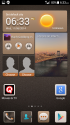
Huawei’s continuing to skin Android with its Emotion UI, this time shipping a base Android 4.3 OS underneath Emotion UI 2.0 Lite.
After seeing the the lengths to which some manufacturers go to change Android with somewhat questionable UI customisations, it’s actually kind of refreshing to see Emotion UI come back around in 2014.
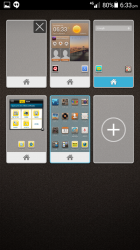
Depending on the configuration, it’s – by comparison – a light touch over Android’s stock feel, with a few new icons, some rearranged settings and a custom launcher/homescreen experience that can be changed wholesale with the use of “themes”.
Emotion UI still believes that the user doesn’t need an app drawer, it still uses round radio-style buttons for checkboxes, and still insists on setting app icons within rounded boxes of uniform height on the homescreen. Those rounded boxes now get a huge ‘NEW’ banner across them until you run the app for the first time. Huawei’s also persisted with their ‘Me Widget’ with its confusing widget-in-widget configuration, but moved it away from the main homescreen. All of these conceits annoyed me last year, but this year I can’t seem to muster that much hatred for them. I’ve seen out-of-control UI customisations, and these are actually fairly tame.
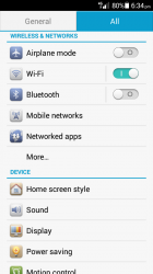
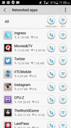
Huawei’s customisations could well be aimed at power users, but the company will tell you that they’re giving users the controls they want. You can choose which apps can run at startup, restrict apps from displaying notifications, restrict whether apps can use Wifi or Mobile data (but not 3G or 4G) and you can also see power-intensive apps that use a lot of the battery. These controls aren’ always executed with the level of pixel-perfect precision you’d expect from a phone coming from Google, but the fact that the options even exist is actually welcome.
Interestingly, Huawei’s chosen to surface the app permission manager Google controversially removed from KitKat – it’ll be interesting to see whether they can hold onto the feature in newer versions of their software.
That question tends to be null and void for Huawei phones, though – the company often simply moves onto a new handset rather than releasing new software, though that could be changing. The Ascend P6 is about to get an update that will bring KitKat, but there’s no word on whether this will come to the G6.
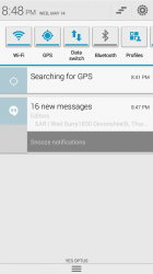
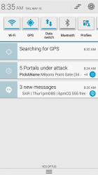
A note on the OS theme and skinning – Huawei’s persisted in making Android’s UI predominantly white, but seems to have made some questionable choices around colours and widget design. This is especially evident in the notification shade, where application icons stand out in a bright blue shade and actionable notifcations have their buttons rendered in a really offputting dark grey.
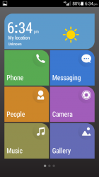
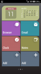
If you’ve ever been concerned that an Android phone might be a bit too complicated for you – or perhaps a family member – to use, Huawei has one more trick up its sleeve. There’s an alternative launcher built into the G6’s ROM called Simple Home. The Simple Home launcher layout echoes Windows Phone’s Live Tile home screens with big, easy-to-press buttons. It’s an interesting alternative user interface for the phone, but you have to remember it’s just the homescreen — there’s no change to the apps, so as soon as you launch something you’re back into the standard Android experience.
Bundled Apps
Huawei’s taken a light touch on the bundled software, perhaps owing to the G6’s limited onboard storage space.
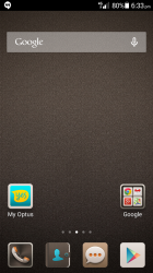
Our review unit came preloaded with a secondary Optus homescreen with the Optus Now widget and shortcuts to the Optus Muic Shop, Games, Zoo and the My Optus and Optus Now apps. These could all be uninstalled.
There’s a selection of ‘Top Apps’ installed – Kingsoft Office, Facebook and Twitter – along with Huawei’s own Flashlight, Sound Recorder, DLNA, File Manager, Weather and Voice Dialer apps.
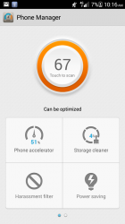
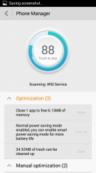
Huawei’s “Phone Manager” app offers a number of “optimisations” that can be carried out via a wizard-style interface that presents a list of options and a big button to enact most of them. It’s meant to be a cebtral hub by which users can access a lot of their additional management options, and also holds shortcuts to the settings panels – phone accelerator, storage cleaner, harassment filter, power saving, a do-not-disturb mode, as well as the settings customisations mentioned earlier.
Huawei has managed to pull off a bit of a coup on the software bundling front though – and I do apologise for burying the lead – with the addition of Quickflix. The company recently pledged to add Chromecast support to its app, so I’m expecting it to turn up on the G6 pretty soon. This partnership doesn’t seem to go too deeply though – there’s no free trial period for new users, for example – but it’s nice to see all the same.
Given the Quickflix partnership, it’s disappointing that Huawei hasn’t given us a way to move the video playback from phone to TV. There’s no TV output supported on the G6, so we’ll have to wait until that Quickflix Chromecast support rolls around.
The G6 comes with Google’s Keyboard installed and set as the default input method. This is a welcome change from Huawei’s previous devices, where their own keyboard disappointed. That keyboard is still present though, and they’re adament that it’s better for entering Chinese text.
Huawei Ascend G6 4G
- 4.5 inches, 540×960 IPS LCD capacitive touchscreen
- Qualcomm MSM8926 Snapdragon 400, quad-core 1.2 Ghz
- Qualcomm Adreno 305 GPU
- 1GB RAM
- 8GB Storage + microSD (up to 32GB)
- 8MP Rear Camera, BackSide Illuminated
- 5MP Front Camera
- Wi-Fi 802.11 b/g/n, Bluetooth 4.0 with A2DP
- 3G HSPA 850 / 900 / 1700 / 1900 / 2100
- 4G LTE 800 / 1700 / 1800 / 1900 / 2100 / 2600
- Android 4.3
- 2000 mAh battery, non-removable
- 131.2 x 65.3 x 7.9 mm, 115 g
There’s a lot of things that the Ascend G6 doesn’t do, but almost all of them are excused by its $329 price point. There’s no wireless charging, no HD screen, no IR blaster and no all-day battery. None of these things matter. Huawei has delivered an attractive, eye-catching device with enough power to drive users’ needs and it’s skipped over the bells and whistles that would drive the price up.
Everyone who’s picked up the G6 has commented on the balanced weight distribution – not that there’s really that much weight to distribute – and the phone’s attractive design. It’s simple and light, does its job, does it well and does it on 4G.
I’m not sure you’d be happy in a year’s time or even two year’s time if you were to get the G6 on contract. The hardware isn’t current by our standards, and runs the risk of being left behind in the specs arms race and on the software front. We don’t know whether Huawei plans to keep the software on the device up to date – it’s already a major Android point release behind, and we’re likely to see another arrive around Google I/O time at the end of this month. So, retail then …
It’s hard to recommend the G6 over something like my Nexus 5, but you can’t walk into a shop here and purchase a Nexus 5 for $400. It’s competing in the retail space, which means it’s up against phones in and around its price range in those retail stores.
The main competition for the G6 at its price is the Moto G, coming in about $50-70 under the G6’s price. For that extra money with the G6 you’ll get 4G connectivity, a Micro SD slot and a better camera, but you’re going to lose out on software updates. Two of those quibbles with the Moto G will be addressed by its forthcoming 4G incarnation, but that’ll also put the price up.
If you’re looking for a well designed phone with internals that get the job done, the G6 is a good buy. The phone’s low price forgives many of its shortcomings, its spec sheet stands it in good stead, and its good looks pique the interest of enthusiasts who catch a glance of it on the street. I’m not sure Huawei’s brought such a strong contender to the market for a long time.




Optus sell it outright now for $239 on the optus network. Pretty good. Although now you can get LG F3 $199 outright on telstra network with a much larger battery and 4g as well.
I read in a other review that the outgoing sound quality (when you make a phone call) is very bad. Have you also tested the sound quality when you make a phone call? What was your his experience?
I didn’t experience any sound quality issues (other than being a phone call) through the front speaker.
It’s $239
Suggested retail price as advised to me by Huawei is $329. Though it’s possible the person who sent that email did make a typo. 🙂
All the links throughout the review text result in 404 errors.
Nice review
I think I saw a typo somewhere, but no one cares