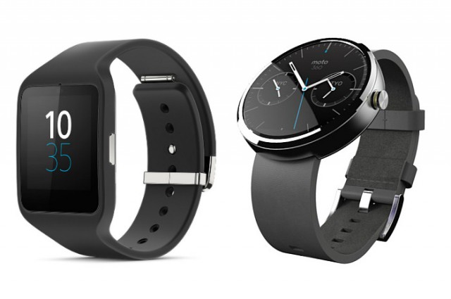
I’ve had the privilege for the last week or so of having both the Moto 360 and Sony’s new Smartwatch 3 in my hot little hands (or rather, on my wrists). I’m going to write a full review of the Sony Smartwatch 3 next week, but for now, I’d like to preview it with you and compare it against another hot favourite in the Android Wear space.
Firstly, I want to do a spec comparison so you can easily compare each of these watches like I have, and then I want to talk a little about what it’s like to use them both, and in comparison to each other.
Comparison of specs
| Specs | Moto 360 | Sony Smartwatch 3 |
|---|---|---|
| Screen: | 1.56″ Backlit LCD | 1.6” Transflective |
| Resolution: | 320 x 290 | 320 x 320 |
| Processor: | Texas Instruments OMAP 3 | 1.2 Ghz Quad ARM A7 |
| RAM: | 512MB | 512MB |
| Storage: | 4GB | 4GB |
| Bluetooth: | 4.0 LE | 4.0 LE |
| GPS: | No | Yes |
| Heart Rate Monitor: | Yes (PPG) | No |
| NFC: | No | Yes |
| Ambient Light Sensor: | Yes | Yes |
| Sensors: | 9-Axis Gyro, Accelerometer, Compass, Pedometer | Accelerometer, Digital Compass, Gyro |
| Battery: | 320mAh | 420mA |
| Colour Options: | Silver or Black | Black or Yellow wrist strap |
| Strap: | 22mm watch band (some issues) | Proprietary |
| Dust/Water Resistant: | Dust and Water Resistant (IP67) | Dust and Water Resistant (IP68) |
| Dimensions | 46mm diameter by 11.5mm high | 36mm W x 51mm L x 10mm D |
| Weight | 49g (124g metal band) | 45g core unit, straps vary |
| Charging | Qi wireless charging, dock included | Micro USB on device |
| Price RRP | $329 | Not yet released in Australia |
A real life comparison
Firstly, let’s compare what’s in these beasts.
On paper they’re very similar units, with some notable differences. The Smartwatch 3 excels in processor power (it’s significantly faster) and battery life (though, in practical use, both last around a day and a half to two days). However, it falls behind the Moto 360 in that it has no heart rate sensor, and while the band is interchangeable, it’s not a standard 22mm band like the Moto 360 uses.
Sensor-wise, the Smartwatch 3 might be the more useful of the two; measuring heart rate is quite easy without a monitor (finding a vein and counting is something just about anyone can do) but measuring exact position without a GPS sensor is a bit harder. The Smartwatch 3 has a GPS built right in, and so when used with a compatible app (e.g. Google’s MyTracks) you can track your movement even without the watch being paired or within reach of your phone.
Charging is something that Motorola has got right with the Moto 360. Very right. Qi charging for a watch is the most logical thing I can imagine, and it makes charging so much easier than using a proprietary dock which you have to carry around with you. It’s also a lot easier than using a MicroUSB charger, which Sony have gone with for the Smartwatch 3. You have to use a fingernail to flick open the metal port cover on the back, and it’s a bit fiddly. Fortunately you only need to do it every other day.
Us Android users have quite a few MicroUSB cables floating around, and so charging the watch on the go is probably not too difficult; you might have a MicroUSB in the car, one at your desk at work, and at home. With Motorola’s Moto 360, you’d need a Qi charging pad with you to charge the watch, and that’s not something that many of us can afford to have a few of just lying around.
What do these differences mean, in practical terms?
The most notable difference between the two, besides the physical difference, is that the Smartwatch 3 is much more responsive. It gets voice recognition right first time, just about every time. The Moto 360 quite often muffs up the recognition, Googling for a search result with whatever I’ve said rather than interpreting it. I have no idea why this is, because we’re told that Android Wear processes speech recognition on the phone, rather than on the watch, but Sony gets this right just about every single time.
The difference this makes alone is amazing. I got to the point with the Moto 360 that I simply didn’t use the speech recognition anymore, because it was so unreliable that it made me angry. After three days with the Smartwatch 3, I’m back to using it quite a lot, and it gets it right almost ALL the time. I can use it to send messages while driving or jogging at the gym, and it gets it right. No mistakes (or minor typos at worst), and best, no frustrating anger when the watch gets things wrong.
In terms of screen readability, the transflective screen on the Smartwatch 3 is superior. It’s easy to read in direct sunlight and in every scenario below that, through to pitch black. Moto’s 360 covers the range well, but it doesn’t perform quite so well in direct sunlight. Your mileage might vary on this.
In waterproofing, both are similar. Motorola with IP67 and Sony with IP68. The difference? The Sony watch is waterproof, not just water resistant, meaning you can happily go for a swim with the Smartwatch 3 for as long as you like and it won’t suffer the effects, whereas the Moto 360 can only be submersed for about half an hour before it could start to experience issues.
In look and feel, Moto 360 might just be a little ahead in that the offering of leather and metal bands appeals to a more professional look. On the other hand, the Smartwatch 3’s silicone band is very comfortable, doesn’t look worn and ratty after being worn for a while, and doesn’t leave black stains on your wrist (unlike Moto 360 which leaves black marks from the low quality leather they’ve used).
So, which one is actually best?
Honestly, it’s a really tough choice. After tossing between the two watches for days and using them both extensively, I came to the following conclusion:
The Moto 360 is the better watch. The Smartwatch 3 is the better Android Wear device.
The reason is simple. Moto 360 looks more like a watch, has more different band choices like a watch, has a big, beautiful, round watchface, and the customisable watchfaces really are top notch. They’re beautiful.
But in terms of being Android Wear, it sucks. Voice recognition is slow. Reading notifications on the round screen is difficult. Swiping gestures are inconsistent because the round screen makes those sensors less sensitive. It just feels like a watch with some smart features, rather than a true smart watch.
The Smartwatch 3 addresses ALL of these concerns, and it doesn’t look too shabby either. It nails voice recognition. It displays notifications better (more on screen, and they’re easier to interact with). Swiping is always consistent and it never fails to react properly. It’s a true smart watch (as the name might imply) and it just does Android Wear properly.
It does miss out in a few areas; the watchfaces on the Smartwatch 3 aren’t too configurable, and are a bit ‘standard’. The use of non-standard bands mean changing the band is difficult, and not cheap. Really, though, these are minor gripes.
Which one would I spend my money on? I think I’ve made that pretty clear!
If you would like to get your hands on the Sony Smartwatch 3, you can grab one from Expansys, who provided our review device.


You take a pulse by finding an artery, not a vein…
My experience with the Sony matches Chris, except battery life. I get more like a day or less. I guess I play with mine more.
That was a nice comparison. Showed up what to look for. Well done.
I have no complaints of my 360. I bought a much superior custom strap though. It simply looks like a very nice watch, which is what most people stick on their wrist. The Sony looks like something from the 80’s.
I’m still happy with the Gear Live. The Sony Smartwach would go nicely with my Z3 Compact though.
Tbh…i didnt see the clear distinction…
Surely someone has a Pebble laying around, can you please show a comparison photo of the two next to the OG Pebble? It seems to be the only watch that looks proportionate on my female-like wrists but I’m itching for an upgrade to Android Wear. :'(
Is the voice command performance really *that much* worse than the LG G watch?
the 2 watches are good but however the problem for those 2 product is accessibility (MOTO 360 is not stock is most shops) if the 2 devices r accessible then both then u can have these discussion
hey chris, do you have issues when using the GPS and listening to music via bt on the sw3? some people have been having issues apparently and its keeping me from buying one so far
I still think its going to be the Zen watch for the win.
I love round watches, and love my 360 but Chris hit the nail on the head, whilst for me round is the perfect watch shape, square is better for the current Smart watch/ AW interface at least at the moment
What Chris is pointing out is that the better smartwatch isn’t always the prettier timepiece. I hope when the Zen and the G Watch R are in their hands they do another comparison like this.
Isn’t that what I said? Any way couldn’t agree more.
In terms of style, I think the comparison should not happen.
Each smartwatch is looking at a different market segment.
The Moto 360 is going after the Traditional Round Watch users.
The LG G Watch R is going after the Sports Analog users.
The Sony Smartwatch 3 is going after the current fashion followers.
The Asus is going after the Traditional Rectangle Watch users.
4 different watch designs, 4 different markets.
Gonna wait for the Moto 360 2nd Gen…which could easily be released in 5 months. IP68 is a big plus on the Sony.