Before we even talk review, we need to acknowledge the elephant in the room; the second-generation Moto 360 Android Wear watch was released around this time last year; that’s right, this is 2015 hardware, which was only just released in Australia this month. Motorola are only too well aware that there has been quite a delay in getting this watch to Australia, and they’re perhaps also aware that given this delay, it might not sell extremely well.
However, Moto might just be selling themselves short. While the Moto 360 was released last year, if we look at 2016, there haven’t actually been any major Android Wear releases of note. We know there are some in the works, including the Nixon Mission which I can’t wait to get my wrist on, but most of the common Android Wear watches were also released around this time last year.
In fact, our most popular Android Wear watch to date — the Huawei Watch — was released in September 2015 as well, and in that light, we shouldn’t harsh too much on Moto.
So, we might be a little late to the party reviewing this watch, considering most international reviews were published in October last year, but given that it’s just landed here, we took an objective look at it, and were pleasantly surprised. Let’s take a walk through.
Moto 360 Design and Build
2015’s Moto 360 builds on the successful design and build of the original Moto 360, and just makes it better in most ways. Yeah, there’s still the ‘flat tyre’ but I honestly don’t notice it, or even care. Sure, Huawei did away with it, but Moto have kept it, and that’s their choice, but you probably just won’t really care about it that much once you’ve tried it on.
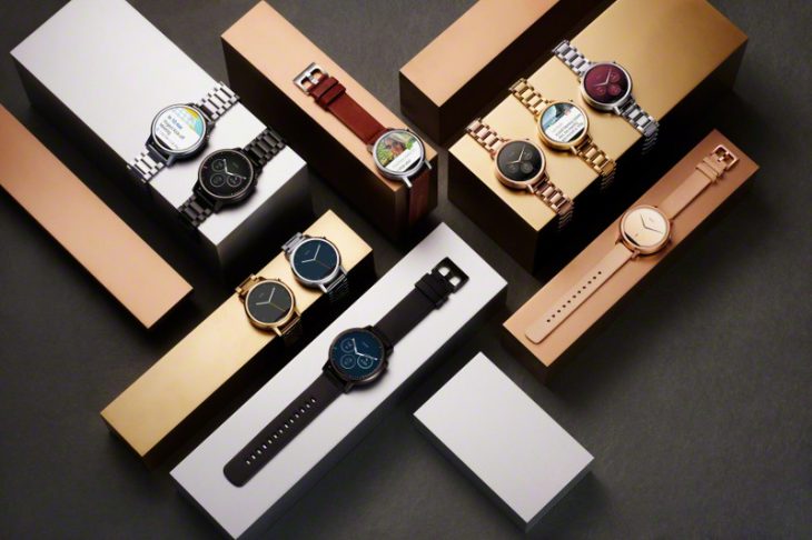
There’s a lot of positives to be found in Moto’s design. First of all, there’s two sizes: a 42mm version which is better suited to those with slimmer wrists, and a 46mm version which is more appropriate for those with meathooks like mine. Regardless of your choice, the Moto 360 (we’re just going to call it that from here on in) is still 11.4mm tall, but you wouldn’t know it from looking. Instead of the watch band disappearing into the base of the watchface as in the original, the updated Moto 360 features some nice lugs which makes it look more like a watch. The bands are more easily changeable too. In short, this is the watch you’ve been looking for if you want easy customisation, or a watch that actually just looks like a watch.
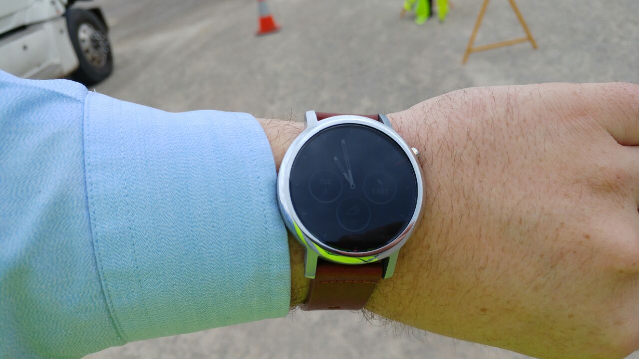
Like Huawei’s Watch, the Moto 360 crown has been moved off centre to a 2 o’clock position; this stops accidental button presses when your wrist bends back, and is otherwise just as easy to use as a 3 o’clock crown.
With standard band-sizes — 16mm for the 42mm watch, and 22mm for the 46mm watch — you can make Moto 360 your own, and easily. Any watchmaker will carry a range of bands to suit, and you can easily order them online as well. Just because you and your mates have a Moto 360 doesn’t mean they will necessarily look the same; in fact, there’s a good chance they won’t, and that’s good.
Moto 360 Display
The flat tyre is back, as we’ve already noted, so if you’re turned off by that, then you can probably stop reading (but trust me, you’d be cutting your nose off to spite your face here). The new Moto 360, like its predecessor, has a small black bar across the bottom of the screen which houses a couple of sensors, and while it isn’t as pretty as a fully-round watchface, if you’re using a dark watchface (as many do), you’ll barely notice it.
While others have made fully round Android Wear watchfaces — Huawei, Samsung and LG have all managed it — it’s a bit of a trade-off. LG’s Watch Urbane has a huge bezel, and Samsung’s Gear S2 isn’t much better (though it is a much smaller watch overall). Huawei’s Watch is a nice compromise, but Moto 360’s slim bezel and big watch-face are a perfect match; it just looks great.
In terms of display technology, a backlit LCD isn’t the best display for a watch, but it does the job admirably. We’d prefer an AMOLED, but we can’t have everything. Moto 360 is plenty bright enough to read in bright sunlight, and thanks to the ambient light sensor hidden in the flat tyre, the screen auto brightens and dims according to ambient light, so that it doesn’t blind you in the dark by being too bright.
It’s a compromise I’m quite happy with.
Moto 360 Features
The very nature of Android Wear means that there isn’t much — besides design — that can really differentiate one watch from another; the software is all but controlled by Google, meaning that manufacturers don’t get to deviate too much from a fairly standard interface. Of course, they can differentiate on hardware, with the inclusion of GPS and various heart-rate, pressure, Sp02 sensors and more, but with the Moto 360, there’s no stand-out features hardware-wise. Yes, the heart-rate sensor is there, but there’s no GPS.
Does anyone really care? Probably not. Fitness fanatics that must have GPS included will probably look elsewhere; Android Wear doesn’t do this as well as more dedicated fitness devices.
What has Moto done, then, to sell this watch to us? Well, there’s a good number of well-designed watch-faces (one of the areas where manufacturers can really differentiate), and there’s live dials so you can show steps, battery level and more on many of theses faces.
Moto’s heart rate monitor makes a return, and there’s a Moto-designed app called Moto Body which reads this, and other metrics, to produce a bit of a fitness profile. You can of course use Google Fit to do much the same, and Moto Body even interfaces with Fit, but if you’re like me, your only real interest in this stuff is to see your daily step count; the rest of the stats are a bit superfluous.
Moto 360 Guts and Glory
One of the things we noticed about the original Moto 360 was that it was slow. Very slow. While other Android Wear watches were rather snappy, the original ‘360 wasn’t, and it showed. Software updates improved this, somewhat, but there’s only so much software can do without a hardware change.
Well, that’s not the case with the new Moto 360; a Snapdragon 400 CPU inside is nice and quick, and makes Android Wear enjoyable and smooth to use. Another bonus of this is the battery life; Moto 360 now lasts two days with ease (unless you’re saying OK Google every five minutes), and charging is brilliant — Moto have easily the best charging solution on the market with wireless charging and a beautiful dock/charger. As beautiful as Huawei Watch is, charging it is a royal pain in the ass, and while the Gear S2 has wireless charging too, it also runs Tizen, which is less than great.
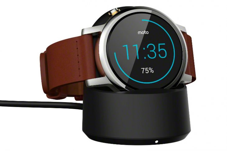
On that topic of battery life, the smaller 42mm watch has a smaller battery, which Moto claims will last around a day to a day and a half, tops. The larger 46mm watch has a 400mAh battery, which we’ve found will easy last that magical two day period for a weekend away, but you do have to be careful how much you use your watch if you want to guarantee it won’t go flat on day two.
The Moto 360 is rated IP67, so it’ll take a splash of water or even a swim without drowning, but we wouldn’t recommend actually swimming with it; it’s more if you happen to fall in a pool, or jump in and out quickly, you don’t need to take your watch off. Also, it’ll survive in the shower just fine, but the beautiful leather band might not. If you’re the kind likely to get the Moto 360 wet quite often, you might want to look at a metal or rubber wristband option.
Moto 360 Conclusion
There aren’t too many occasions where, when asked to return a review device, I push back quite hard, and the Moto 360 is one of those occasions. In fact, without a moment’s hesitation I offered to buy the review device from Moto, because if that hadn’t been possible, I’d have been ordering one from the Moto store this weekend.
I quite liked Samsung’s Gear S2. I loved Huawei’s Watch. However, I think the mantle for the best Android Wear in Australia has now changed hands, and the Moto 360 is it. It offers every benefit of the Huawei Watch, and adds a couple of its own: the charging solution is better, the lugs holding the watchband on look better, and the ambient display ticks a lot of boxes for me.
In short, if you like a round smartwatch, and you’d have been considering the Huawei Watch, you must try the Moto 360 for a comparison point, because I think you’ll be pleasantly surprised. Further, with an RRP of $479, it’s also quite affordable as Android Wear watches go.

I am currently using the Moto 360 2nd gen (bought it for AUD$350).
Much better than the original Moto 360 in pretty much every way.
Battery life is surprisingly good though I don’t use Ok Google functionality all too often.
If you aren’t too fussed about the extra hardware features (i.e. speakers, gps etc) then this is a good watch to go with. Its probably one of the better watches on the market in terms of design.
Spot on.
Thanks for the review. I don’t have a wearable and have been holding out for a new model from someone with GPS and good battery. Based on your comments maybe I shouldn’t hold out for GPS. But it sounds like there may be lots of new wearables at IFA so I’m going to wait til then.
If I were spending my own cash in a month or two, I’d definitely be looking to see what comes out of IFA, and also I’d be keeping an eye out for the Nixon Mission; that watch looks epic.
Yeah, but it has no GPS.
We will hopefully this year get the Fossil range also, been keeping an eye on some of them.
I still don’t get why anyone would choose this over the Huawei Watch. What really lets it down is the screen – aside from the flat tire and poor brightness and outdoor visibility, using an LCD instead of AMOLED is just unacceptable. I have a Huawei watch and trust me when I say the AMOLED screen is key to the ambient mode (which the watch spends 95% of its time in) being unobtrusive particularly at night. The one thing I prefer with the 360 is the wireless charging, but Huawei’s charge dock really isn’t much of a pain to use.
If the 360v2 had an AMOLED, it’d be absolutely perfect; you’re right, it sometimes is a bit too bright at night, especially if its charging on your nightstand etc. However, I don’t agree on the topic of Huawei’s charge dock … over time, the pins can become less bouncy, and the watch can become much harder to easily sit on the dock.
The inclusion of the speaker in Huawei’s watch is a good selling point too, though.
no speaker no buy
At this stage, at least, you don’t really need a built in speaker, but I can see a growing need for it as we go forward.
Hell yes Moto!
Hell no Moto!