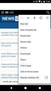
One of the biggest complaints about the biggest phones is that it can be very hard to use them single handedly. Many apps, including Google Chrome, place vital interactive elements at the top of the screen and this can mean using a larger phone with one hand isn’t as easy as it should be. In Chrome, for example, you can’t easily access the address bar, switch tabs, or access the menu … and that’s something that Google might be looking to change (at least, as an option).
Called simply ‘Chrome Home’, the new flag which appears in Chrome Dev and Chrome Canary, moves the address bar, tab icons and menu icon to the bottom of the page instead of top. This little tweak can make the browsing experience on a larger phone — like the Pixel XL or Samsung’s S7 Edge or Note 5 — a lot more enjoyable. Here’s how it looks when activated:
This feature is clearly just in testing — as evidenced by its limited inclusion in just Chrome Dev and Canary — and you can see that it isn’t quite finished; where the address bar would otherwise be there is just blank space, which eventually moves when you scroll around on a page. Why it’s called Chrome Home is equally puzzling, because the name doesn’t fit the actual results, but… let’s face it… it doesn’t really matter.
You can enable this in Chrome Dev and Canary by pasting chrome://flags/#enable-chrome-home into Chrome, tapping the highlighted select menu, tapping Enabled, and restarting the browser.


About time! I’ve been saying this, and the google search bar (or now the pill) on the home screen should be down the bottom, not aligned to top.
Good step in the right direction.
Something that windows phone internet browser has since win phone 8.0