Material Design has been part of Google’s design ethos for over 2 years now, but some services are still waiting for a makeover but one of the largest holdouts in Google’s App catalogue, the Calendar, is about to get one according to a leak on reddit.
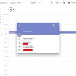
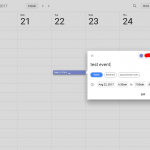
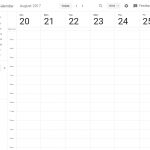
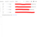
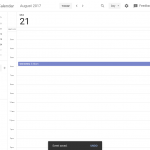
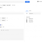
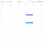
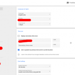
According to screenshots shared by /u/xDawnut on reddit, the new screenshots are from an internal build of Calendar which appears to be almost ready to roll out. The design looks consistent, clean and everything seems to line up nicely, check it out:
While the redditor isn’t sure when we’ll likely see the update, it hopefully won’t be too far away.
What are your thoughts? Does this look good to you?
Source: reddit.





Looks good. But all I really want is a button so I can easily see/dismiss the event description.
It looks good, but this is one app that was way overdue in getting a refresh.
Even some of its UX should get a look over as well and maybe with the pop up layers from material this will correct that.