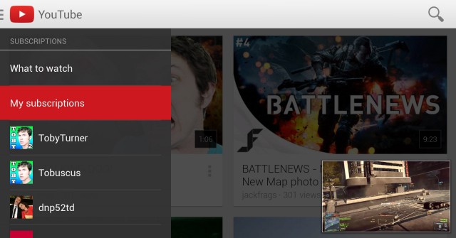
Google have given their official YouTube app an overhaul to bring it up to parity with their other official apps that have been updated over the past few months. The update hasn’t yet hit the Play Store so there’s no official list of all the changes, instead Android Police have gone through and found them all themselves.
Changes
- New Icon — Now the same as the desktop site
- Cleaner Holo design, Cards UI
- New slide-out slightly-transparent left menu
- In-app multitasking — slide the video down into a box in the corner and continue browsing YouTube
- Quicker access to your own account’s settings in the slide-out menu
- Search for playlists
- Quicker access to video ratings (thumbs up/down) and reporting
- HD and CC buttons removed from video overlay, now sit in the settings menu
- Tablet UI completely re-worked, now works better on 7-inch tablets — Enjoy, Nexus owners!
- YouTube now conforms to global-rotate settings. If you want to rotate just the video, you can do so by pressing the expand button.
Overall, the changes are very nice, and the app looks super clean and performs well. I just wish they’d bring back the option to show your subscription’s uploads only and not the ‘recommended for me’ videos.
You can download the app right now from here: Download YouTube 5.0.21
Source: Android Police.


Looks great!!! Love the multitasking I was actually watching some videos 2 nights ago on my nexus 7 and wanted to flick through other videos and now I can 🙂
Maybe this is a sign of things to come in 5.0?
New version hit my Play updates this morning… looks GOOD
Bit of in app multi tasking… good to see that they are able to build it into the app and not requiring to wait for an OS update.
They love to push the “recommended for me” content.
This new update is SO good. YouTube was already a killer app on Android. Now it’s simply gorgeous with a whole heap of welcome changes. Brilliant stuff!