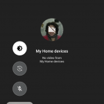
There’s a lot of work going on all the time in the Google world, some apps get a lot more love than others. Duo has been a good addition to the capabilities Android, but seems somewhat forgotten at times. A little tweak to the UI has been spotted by Android Police that suggests that has changed.
Over time as our phones have been asked to do more and more by users, they’ve increased in size. This has resulted in users not being able to use phones with a single hand and a UI redevelopment has been needed to bring that accessibility back.
Enter the bottom navigation bar as part of Material Design and the Floating Action Button. Both of which are coming to Duo soon.
The FAB was only recently added to Google Keep and much like keep, this looks to be a server side change.
While the differences are easy to see: The convenience of having the in call navigation at the bottom of the screen is great. No longer is it a two handed operation to switch your camera, turn the camera off or mute the call. The changes are yet to appear on any of my devices, so it’s either a regional or staged rollout to users.


