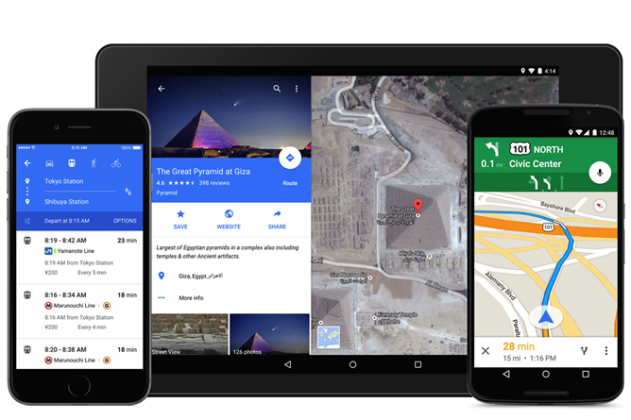
 Google has announced (and released!) the Material Design update for Google Maps, and it’s pretty.
There’s not much to say — just look at the gorgeous layout of the new app in the picture above. You’ll see changes in the way the info sheet shows for local businesses and other places on Maps, and our friends in the US now have direct integration with OpenTable to book restaurant tables from within Maps itself. Uber Integration has also been improved, though I’ve had mixed results with this — it works sometimes, and not others.
While the functional changes are minimal, the design changes are significant, and it just brings one more app up to speed with the latest (and arguably most delicious) design.
You can grab the updated Maps APK here directly (thanks to APK Mirror), or you can wait for it to be pushed out to your device in the next week or so.


I’m sorry, but under what stretch of the imagination is that ‘gorgeous’? Screen sizes go up, resolution goes up, and what do we get? Horrific wastes of space such that three, count them three, options appear on a fullHD screen. In Fisher Price colours. And if you want to compare different modes of transport – taking the car vs taking the train say, well THAT requires a different tab. Or maybe an info panel so devoid of actual info that it could be encapsulated in three lines of text. No ‘opening times’ or ‘costs’; you know, actually useful info. Or… Read more »