One part of Android which has been lagging behind the competition has been in the accessibility options for vision impaired users. In Android 5.0, Google has addressed this adding in accessibility options for people with ‘low vision’ or who are colour blind.
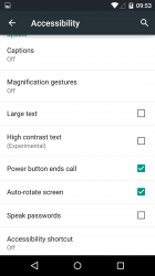
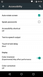
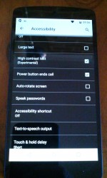
The accessibility options introduced in Android 5.0 include an option to boost text contrast, or ‘invert colours to improve legibility’ and ‘Adjust display to improve color differentiation’. All of these options are stored under the Settings > Accessibility menu.
At this stage, whether it’s just in the developer preview or a foreshadowing of what will come in the final release of Lollipop, all these settings are marked as ‘Experimental’. You can certainly turn them all on and check out the results but be warned bugs may crop up as you use them.
One note, we’ve used the US spelling of Colour in this to keep in the theme of what you’ll see in settings etc. we all know that Color is US only.
High Contrast text
High Contrast text enlarges text overall, it makes the text a two toned with a white body and black outline. As you can see the results below the text does stand out a fair bit. It’s not uniform though, with some text staying the same and some displaying as High Contrast.
Color Inversion
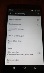
One quite interesting new feature in the accessiblity options is Color Inversion. It essentially inverts all the colours on your screen. The change is done at the panel level, with the results not able to be captured by screenshots. it’s quite useful on white backgrounds, which invert to black, but where it gets quite hard to see with no vision impairment is on brightly coloured backgrounds.
Color Correction
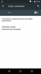
Color Correction is the option which Google has introduced in Android to address Deuteranomaly, or as it’s more commonly known: Colour Blindness, specifically in this instance, red/green colour blindness.
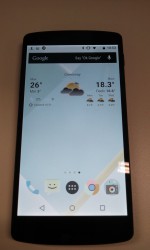
Just like Color Inversion, the results of Color Correction can’t actually be captured with a screenshot. Again, it’s a change to the settings on the display. So you’ll have to excuse these fairly rudimentary captures to show exactly what the results of switching on Color Correction :
The success or failure of how these new accessibility options fare will come down to users who actually require them. Without the facilities to test out their reception we look forward to feedback from people who’ve been waiting for these inclusions. Hopefully these updates help.
Check out the Android 5.0 Archive


