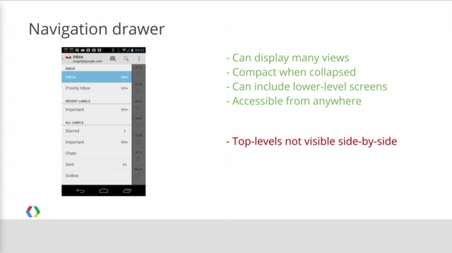
Looks like the new Gmail Android app got an outing at one of the IO developer sessions. At a session called ‘Structure in Android App Design’ Jens Nagel showed the slide above which shows the use of the navigation drawer as opposed to the action bar currently used in the Android Gmail app.
The new navigation drawer brings the GMail app more in-line with current Google App design trends such as that on Google+ which has used the Navigation Drawer as opposed to the Action Bar for the majority of its life. As explained in the talk, the navigation drawer contains different layers that are accessible at all levels within the Gmail app, which is an advantage over the Action Bar as it’s currently implemented.
When the new app is due to be released or if this will actually be released as it’s shown has obviously not been announced. Perhaps we’ll see this as part of the rumoured Android 4.3 update that could be coming any day now. It certainly adds to the cohesive design language that the Android team are going for these days with their apps and would add to the beautification of Android as a whole.
The session in question, like all the other sessions from Google IO, is available to watch on the Google Developers YouTube channel. The navigation drawer makes its appearance just prior to the 23 minute mark.


