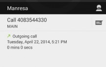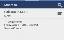
Google is consistently working on updating their core Android apps, that’s a fact, they’re also constantly testing those apps by giving them to staff to ‘Dogfood’ them before going public, and it’s this process that slipped someone in Google’s social media teams mind this morning when they showed off a new dialler app with an updated coloured action bar.
Nothing earth shattering here, but it shows the way that Google may be going with their design. The design has up till now been fairly drab with the grey theme. Google IO is only a short time away and we generally see a taste of what’s to come at the developer conference so maybe we’ll see something like this soon.
Source: GoogelNexus Twitter.
Via: AndroidPolice.


What they need to do with the dialer is to have an in call volume slider on screen . that would be an improvement, they could even make it blue.
Something weird in those pics.
The old one has a date of Tuesday April 22 2014
The new one has a date of Friday April 11 2014
The new one dated Tuesday April 22 2014 is a comparison image probably created by Ausdroid so that the text remains consistent with the “leaked” one.
This is indeed true – it’s quite easy to do so I thought I’d give people a look at both with the same info for a direct comparison
Thanks Dan
🙂
Seems consistent to the other leaks I’ve seen. Which according to what I read looks like ios7