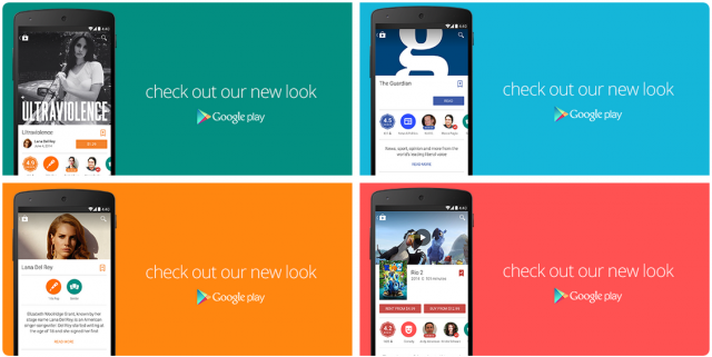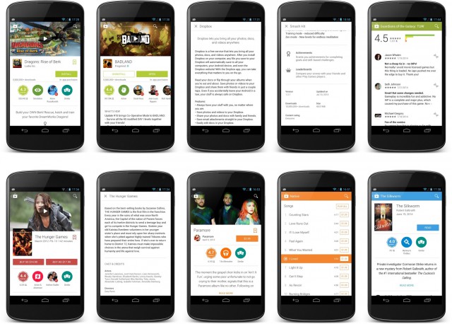
After a new look Google Play store design leaked only a week ago, the new Material Design look Google Play update for Android is rolling out now according to the Google Play Twitter account.
The new look design has also been announced by Googler Kirill Grouchnikov on Google+ who supplied more screenshots of the new look Google Play. The version number attached to the screenshot is version 4.9.13, upgrading from the current version – 4.8.20.

The new look Play Store features images heavily, with more prominent Google+ sharing and ratings on apps. The rollout is beginning now and should reach all devices with a week or so if previous rollouts are any guide.
Edit: I literally just got it. Have at it:
Mirror 1
Mirror 2
Mirror 3
Have you received the new look Google Play?


Nice one. Cheers for the mirrors!
On CyanogenMod with the Android L keyboard. If only i can change the color of the material design keyboard….
Bad, really, really, bad.
So bad you think they are joking, and then they roll it out.
WOOOT. Combine this with the power (and bugs) of the Android L preview, and I’m riding the future baby