
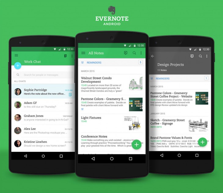
If you’re a fan of note-taking app Evernote and Google’s Material Design, then opening your app should bring a smile to your face. Evernote has updated their app with a Material Design makeover offering a new flatter look with bolder colours and a few new features like improved navigation and customisable quick notes.
The app is rolling out in Google Play now, but their Adroid product manager Theresa Pittappilly and designer Adam Glynn-Finnegan took to the Evernote Blog to talk through the update and explain a few of the details.
According to Pittappilly, the design refresh also took into account user feedback to make the app more polished, this includes taking into account feedback on the new note button.
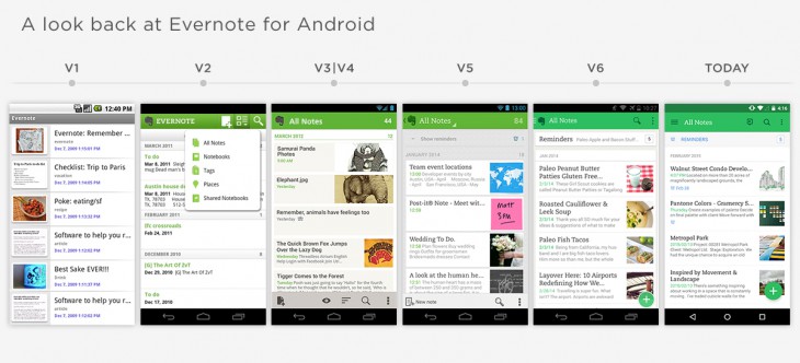
The Material Design makeover though is fairly subtle in this release, which is explained by Glynn-Finnegan is due to the major update in version 6. Even though it’s similar there are still changes, which you can sort of see in this visual history of Evernotes design.
New visual cues for features such as Evernotes collaborative work function ‘Work Chat’ have been included, with a picture of a colleague now showing in a shared note to indicate they’re in there editing or viewing a particular note.
The full ‘What’s New’ from Google Play:
Customizable quick notes
– Long press to add or remove quick note options
Revamped navigation
– Simpler navigation drawer with direct access to shortcuts
Improved note editor and note view
– Cleaner layout and controls
Editable tags
– Support for renaming and deleting tags
Numerous bug fixes and enhancements
If you’re an Evernote user head over to Google Play to check for the update, if you’ve never tried Evernote it may be worth a shot.
[pb-app-box pname=’com.evernote’ name=’Evernote’ theme=’discover’ lang=’en’]


