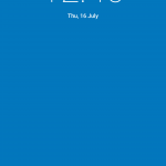
Ok, Clock nerds, it’s time to get a new look for your stock Android clock. That’s essentially the summary in the latest clock update for the stock Android clock which only landed on Google Play last month.
The summary actually includes fixes for duplication brought about by splitting the app out from the Android ROM itself, as well as a fix for the timer button. But, the major focus is on the ‘More neutral colors’ option in the update. The blue/pink combo has been replaced with a more muted earthy orangey/red on a darker blue, it’s not much but it is what it is.
- More neutral colors
- Fix for the duplicate provider installation issue
- Fix for the timer button issue
Note: This app may not replace the pre-installed Clock app on your device. You can disable your existing Clock app to hide it.
If you haven’t downloaded the latest version of the clock you will be prompted in Google Play when the update is available – or you can grab it early if that colour change is really that important.


The new colour is terrible. vibrant blue with a earth brown. Nope. Not a good palette. The color before was miles better. I figure once they launched it on Play, insecure men complained that they didn’t like see a bit of purple and pink on their phones so they had to change it to more ‘non-gender’ specific colours. Sad to see a design take a step backwards, just because of a few colours. Just shows how important getting the colours right is. To me the colours clash badly and look like colours someone who designed windows ME would have get… Read more »
I looked at it, still not very subtle.
Tone it down more Google.
Calm down the dialer a bit too.
Can finally update it on my cm12.1 nightlies. Either CM fixed it or the following fixed it.
Fix for the duplicate provider installation issue