
Google’s Eddie Kessler took to the company’s official blog today to announce a reimagining of the company’s social platform, Google+. The service is seeing a major redesign on the web, with the Android and iOS apps following suit “in the coming days”.
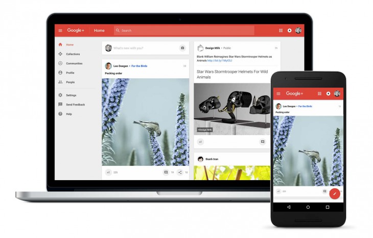
Google+ officially split into “Streams” and “Photos” products (alongside Hangouts) earlier this year. We’ve seen Google’s standalone Photos product launch to wide acclaim (and it also saw a few important enhancements today), but the company has been quiet on the “Streams” product until now. Today’s Google+ redesign brings Streams front and centre and offers a redesigned home stream. It’s focused around interests, bringing collections and communities – some of Google+’s most popular and well-regarded features – to the fore.
As with many Google products, you can switch between the old and the new Google+ interface at will – once the new one’s available to you. Luke Wroblewski notes in a post that users will see a “Let’s Go!” prompt on login that will take them to the new Google+, although that option hasn’t yet appeared for any of the Ausdroid team. If you do get to switch to the new Google+, be aware that not all features have been brought over to the redesign, so you might need to switch back.
From the screenshots, it looks like the new Google+ embraces some of the newer Material Design principles that the company’s rolled out across its products. There’s a big, bold and colourful navigation bar across the top of the page, and a beautiful friendly and responsive UI spreading across the page from the leftmost menus and section identifiers. It also looks like communities will be able to choose some aspects of their colour scheme.
These are welcome changes, with the web and app experiences showing some wild inconsistencies until now – the Android app was one of Google’s first attempts at spreading Material Design, and has long held some frustrating UI choices, including eschewing the Navigation Drawer on the app arguably most in need of it.
The new Google+ is also lighter on the browser side too – it’ll never download more than 60k each of HTML, Javascript and CSS according to a new case study on the Google Developers site showing how the team took Google+ and made it fully responsive. If you’re a developer and want some behind-the-scenes information on the redesign, head over and check it out.
It’s great to see Google+ get a shot in the arm. We can’t wait to get our hands on the new web and app experience.
Do you have access to the new Google+ redesign? What do you think? Tell us in the comments!


Nothing for me yet. I have high hopes because I don’t really like the UI. It’s nice looking but I feel everything requires more clicks than it should
I’ve got it on mine.