Google Now can sometimes be taken for granted, or even forgotten about if you’re using a 3rd party launcher, but it’s actually a very useful and powerful tool. One of my biggest desires is for Nova Launcher to include a swipe right from home to bring up the service. IF you do use Google Now you may be pleased to know that the latest update to the Google app is bringing some minor changes.
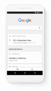
The traditional all in on feed of Google now is being replaced with a new two tab UI, one for the customary ‘feed’ of your favorite topics and the other for Upcoming events with all of your day’s activities and reminders in one spot.
Users in the USA will also get a new card that allows them to ‘tell Google what they care about’. This ability will apparently be rolling out to other countries of the coming months so keep an eye out for it and let us know if you spot it.
As for the update itself, it may have a server side component as I have the latest update (I think) but don’t have the new UI as yet. If it’s a normal rollout it will take a few weeks to fully deploy, and as is the way it always seem to be the most engaged users who get it last! Seriously Google you need a uber nerd rollout group or something!
Let us know if you spot the new UI.


The new UI is here for my ZMAX Pro, and it is pretty interesting. I did more prefer the old way because I had more screen real-estate, however the update is quite nice.
I can attest to the likelihood of this being a server side rollout, as I’m running Google in beta along with the N dev preview and have had no luck as of yet. Hopefully I’ll get to check it out soon!
Must be a server side switch, as I’m a beta user for the google app and still don’t see the new layout. Stay patient, fellow nerds!
Did you get the update? As I am still waiting for it.. and now it is becoming frustrating :/