In March 2015 Google gave their Google Contacts web page it’s first material makeover, since then we’ve seen a few enhancements and minor cosmetic changes. Now Google has launched a new take on the sites Material look and feel as well as bringing the web version of Contacts into feature parity with theAndroid app.
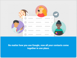
If you go to contacts.google.com you’ll be greeted by a few new info cards and then be let into the new material look site. From a design perspective, the only real change I can see is the background is now white instead of a light grey, let us know if you spot anything else. From a feature perspective the new improved duplicate manager seems to now have been added, that said the web version could previously handle duplicate contacts.
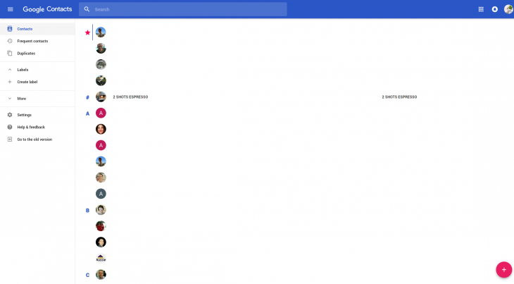
While it’s always good to see Google working to improve their core apps, I don’t think I’m alone in asking where the Material redesign of Google Calendar on the web is? It’s been years since Material Design launched, I think it’s time Google, perhaps you could spare a few engineers from your several messaging platforms to spruce up Calendar on the web a bit?




Right there woth you- nice to see anohlther Material update to Contacts, but Calendar is the single most needed Google service in need of a new coat of paint!
Still not simple to email a group.
The web version is now mobile friendly, the old one wasn’t.
“View Recent Conversations” was broken in the current version of contacts but the new one seems to have removed (rather than fixed) that…