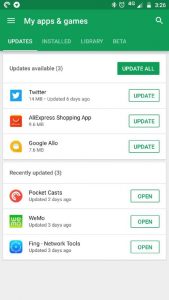
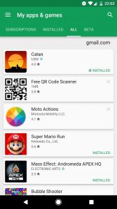
We noticed a nice new update to the Google Play Android app had rolled out to one of our devices earlier today. A few hours on it looks like it’s beginning to roll out to more device. The major change appears to be in the My Apps tab where the whole look and feel have been refreshed and the tabs slightly changed.
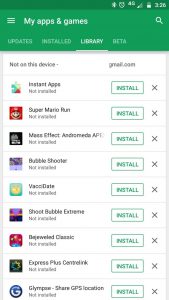
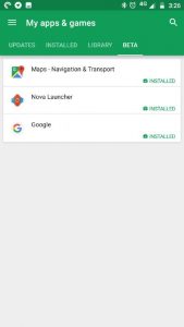
The three big changes are the separation of Updates into their own tab, the removal of the Subscription tab 🙁 and the All tab being replaced by a Library tab.
New Google Play app
Old Google Play app
You may also notice that in the new UI you can now sort how the apps are displayed in the Installed tab, you can choose between Alphabetical, Last Updated, Last used or Size. The last one may just be handy to find that app you need to get rid of to free up some much-needed space. Unfortunately, there are still no sorting tools in the Library area which remains a reverse chronological list of every app you’ve ever bought or installed.
We’ll keep playing with the new version of the app and see if we find anything else.








Thanks for sharing about this topic. 🙂
Another thing with this new layout is that it shows how long ago the app was updated. I am seeing things pop up for updating where the app was actually updated weeks before.
I wish there was a way to just automatically update only certain apps like Messenger, Facebook, Twitter…you know just the important apps I use all the time and need notifications from.
Yep, much prefer this. Way better overall.
One bit of functionality that is now gone is the ability to select multiple apps on the All tab and install them en masse. That said, it’s now one less tap to do basically the same thing, since they all have an Install button next to them now. Also note that Library only shows apps that you don’t currently have installed.
I like the new layout and functionality.