YouTube Music has finally delivered some gorgeous interface updates, starting with the artist profiles. It makes so much difference (despite how good functionality is) to users’ impression of your platform when the user interface is easy to navigate.
Not very long ago I was pretty critical of Google for not committing to and finishing a music app. I’m now as happy with YouTube Music as I’ve ever been with Google Play Music.
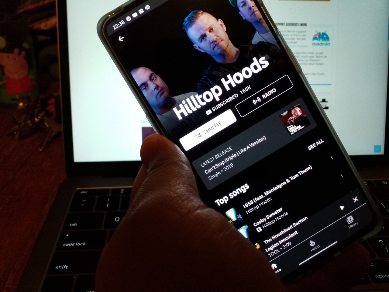
The redesigned artist profile page offers users a better, rounded experience visually and with interface. Users will see a simple offering of shuffle – tracks just from that artist. Radio – music from that artist and other similar artists. Directly below that, you can subscribe to the artist.
A new addition is the latest release button which takes you directly to your favourite artists most recently released album. I listen to a lot of music, but just this week I’ve discovered albums I didn’t know had been released from artists I like.
As was the way with the older interface on YouTube Music, you can look through albums and singles. It’s a simple way to find your favourite songs by artist and create yourself some new playlists.


Still can’t transfer your music from GPM. Untill that is resolved , it’s another gimmick from Google .