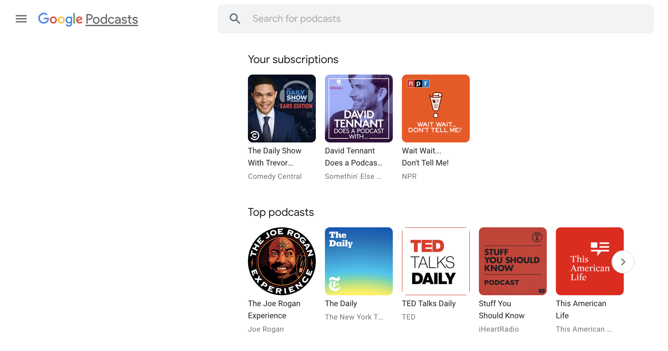
Google Podcasts is one of the quietly achieving products they produce. In the early stages, it was mobile only, then a “hacky” way to get to a web interface and finally, an official web interface appeared.
Now the web interface has become significantly more useful to users with a subscription list.
The change is simple but means that users can easily access their subscribed podcasts via the web. The presentation of your subscribed podcasts is the first carousel of options at the top of the page. For people like me, it means that the app instantly becomes usable during the workday on my pc. For others who perhaps have a media centre PC, it brings Google Podcasts closer to parity with the market leader Pocket Casts.
This change also brings the web interface close to the functionality list that the Android App gives to users. But that, and the web interface is not yet ready for heavy users to fully engage with. It’s worth noting that the app has recently added a bottom navigation bar that closely matches with YouTube Music’s navigation options. It seems Google may be looking to instil consistency with their products.
What features do you want added to Google Podcasts for you to make the move from your chosen platform?


It needs the ability to add podcasts by URL for premium feeds from Patreon. What’s taking so long?